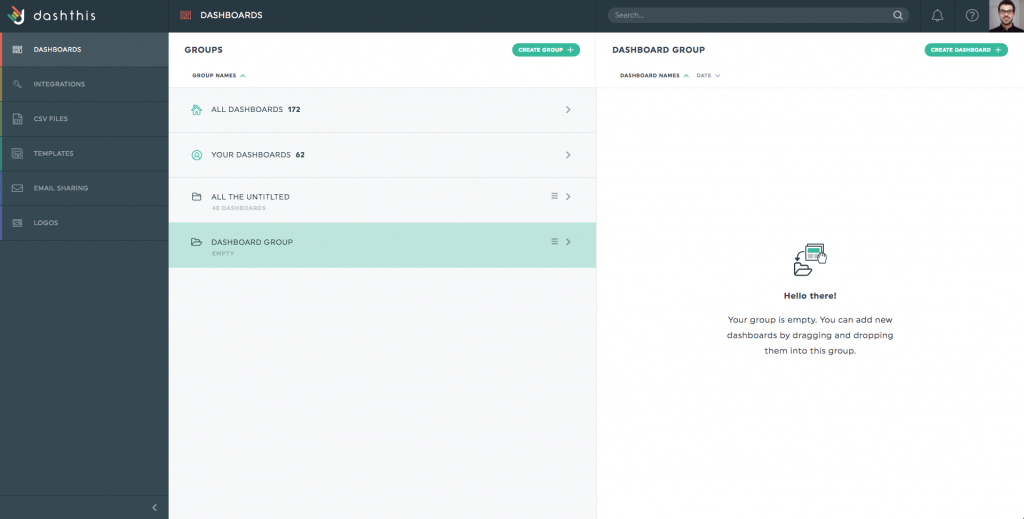
One underused great feature of DashThis is the report grouping. At first, it doesn’t look like we need this but once we’ve taught a client how and why to use this, it changes a lot of things.
First, the Why.
Naturally, we are used to putting information vertically. That means we will put as many KPIs as we can in a report. It makes sense for the analyst, but for the reader, too much information tends to kill information. Heavy reports with lots of KPIs are scary!
On the other hand, if we split a long report into smaller chunks and display several reports horizontally, it becomes way easier to read (and understand).
Then, the How.
Well, it couldn’t be simpler. You select any dashboard on the right side of your dashboard manager. Then you drag them into the dashboard group of your choice.
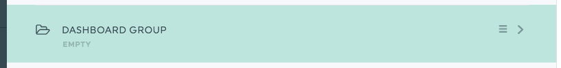
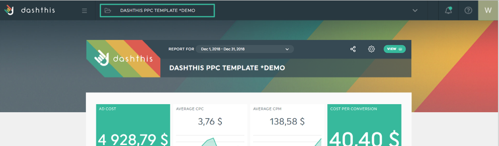
Once dropped, a group is created and you get a new URL. This is the URL you use to access the group. Notice the navigation tabs at the top.
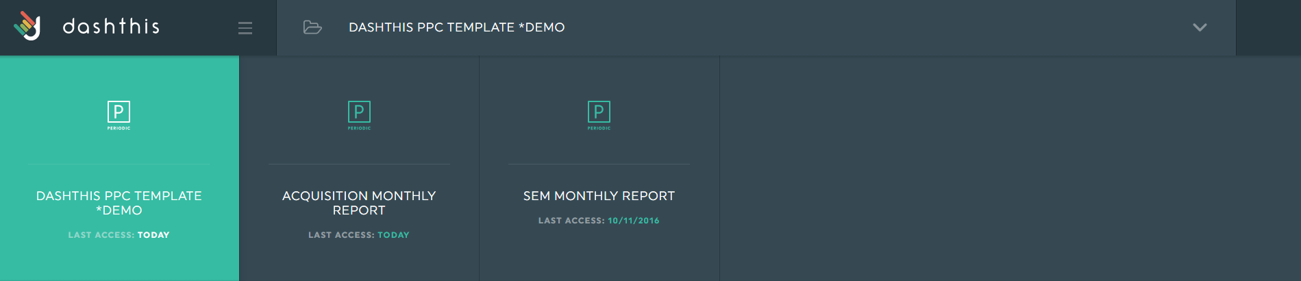
It’s as simple as that. Now you can create smaller reports easier to digest and still be able to get the information quickly by switching between reports.