How to Explain Bad Results to a Client (Without Losing Their Trust)

Every marketer faces it sooner or later: a report period where results don’t meet expectations.
Maybe traffic dropped. Maybe leads slowed. Maybe ad spend went up while conversions stayed flat.
Bad results are uncomfortable, but how you explain them can actually strengthen client trust rather than damage it. The key isn’t to spin the data: it's to contextualize it, communicate clearly, and shift the conversation from blame to insight.
Below, we’ll walk through the most common “bad results” scenarios, provide ready-to-use scripts, and show how dashboards (and DashThis) can help keep the conversation productive.
Table of contents
- 5 Common “Bad Results” Scenarios (and How to Frame Them)
- Scripts Marketers Can Use (Without Sounding Defensive)
- How to Contextualize Bad Results Using Dashboards
- How DashThis Helps Shift the Conversation to Insights
- Bad Results Aren’t the Enemy, Poor Explanations Are
5 Common “Bad Results” Scenarios (and How to Frame Them)
1. Traffic Is Down 📉
This is one of the most emotionally charged metrics for clients, especially if they equate traffic with success.
How to explain it: Traffic alone doesn’t tell the full story. Algorithm updates, seasonality, or changes in traffic sources can all cause dips that don’t reflect poor strategy.
Reframe the focus:
- Compare year over year instead of month over month
- Highlight traffic quality (engagement, conversions)
- Segment by channel to show what changed
2. Leads or Conversions Decreased
When leads drop, clients often assume something is “broken.”
How to explain it: Conversion volume is affected by many factors outside marketing control: sales capacity, pricing changes, form updates, or even client-side delays.
Reframe the focus:
- Show conversion rate vs. volume
- Compare performance by channel
- Highlight qualified leads vs. total leads
3. Ad Costs Went Up
Rising CPCs or CPA can feel like wasted money to a client.
How to explain it: Ad platforms are competitive ecosystems. Costs fluctuate based on auction pressure, seasonality, and market demand, not just campaign quality.
Reframe the focus:
- Show impression share or competition metrics
- Compare cost vs. revenue or lead quality
- Emphasize long-term efficiency trends
4. Results Are Flat
Sometimes the problem isn’t decline, it’s stagnation.
How to explain it: Plateaus often indicate that a channel is reaching maturity and needs optimization or diversification, not abandonment.
Reframe the focus:
- Show cumulative impact over time
- Identify diminishing returns
- Use data to justify testing new channels
5. Goals Were Missed
This is the toughest scenario, especially if goals were clearly defined.
How to explain it: Goals should evolve. Missing a goal doesn’t automatically mean failure; it often reveals assumptions that need adjustment.
Reframe the focus:
- Revisit goal realism and timeframe
- Identify partial wins or supporting metrics
- Present learnings and next steps clearly
Scripts Marketers Can Use (Without Sounding Defensive)
Having the right words ready helps remove emotion from the conversation.
When results decline: “This period shows a drop in performance, but when we break it down by channel and compare it year over year, we can see the broader trend and what influenced it.”
When a client is disappointed: “I understand why this feels frustrating. Let’s look at what the data is telling us, and more importantly, what actions it points us toward.”
When explaining external factors: “This change isn’t tied to execution quality. It aligns with market and platform-level shifts we’re seeing across accounts.”
When pivoting to next steps: “Based on these insights, here’s what we recommend adjusting next month and why.”
How to Contextualize Bad Results Using Dashboards
Bad results feel worse when data is fragmented or unclear. Dashboards help replace emotion with clarity.
Effective dashboards:
- Show trends over time (not isolated numbers)
- Combine multiple data sources in one view
- Highlight context with annotations and benchmarks
Instead of explaining results verbally from scattered tools, you let the data tell a coherent story.
How DashThis Helps Shift the Conversation to Insights
DashThis is designed to make difficult reporting conversations easier for marketers, especially when performance isn’t moving in a straight line. Instead of defending individual metrics, you can guide clients toward understanding trends, context, and next steps.
With DashThis, you can:
- Visualize trends clearly using consistent, client-ready dashboards
- Combine channels (SEO, PPC, social, email) to show the full picture
- Highlight insights, not just metrics by focusing on what changed and why
- Standardize reports so clients know what to expect every month
- Add context with comments, goals, and comparisons
Instead of reacting to a single “bad number,” clients see performance as part of an ongoing strategy.
AI Insights Pro takes this one step further by helping you interpret the data, not just present it. Instead of starting every meeting by explaining charts, you can lead with ready-to-share insights.
With AI Insights Pro, you can:
- Automatically surface key changes and anomalies in performance
- Get plain-language summaries that explain what happened and why it matters
- Quickly identify talking points for client calls and reports
- Spend less time analyzing data manually
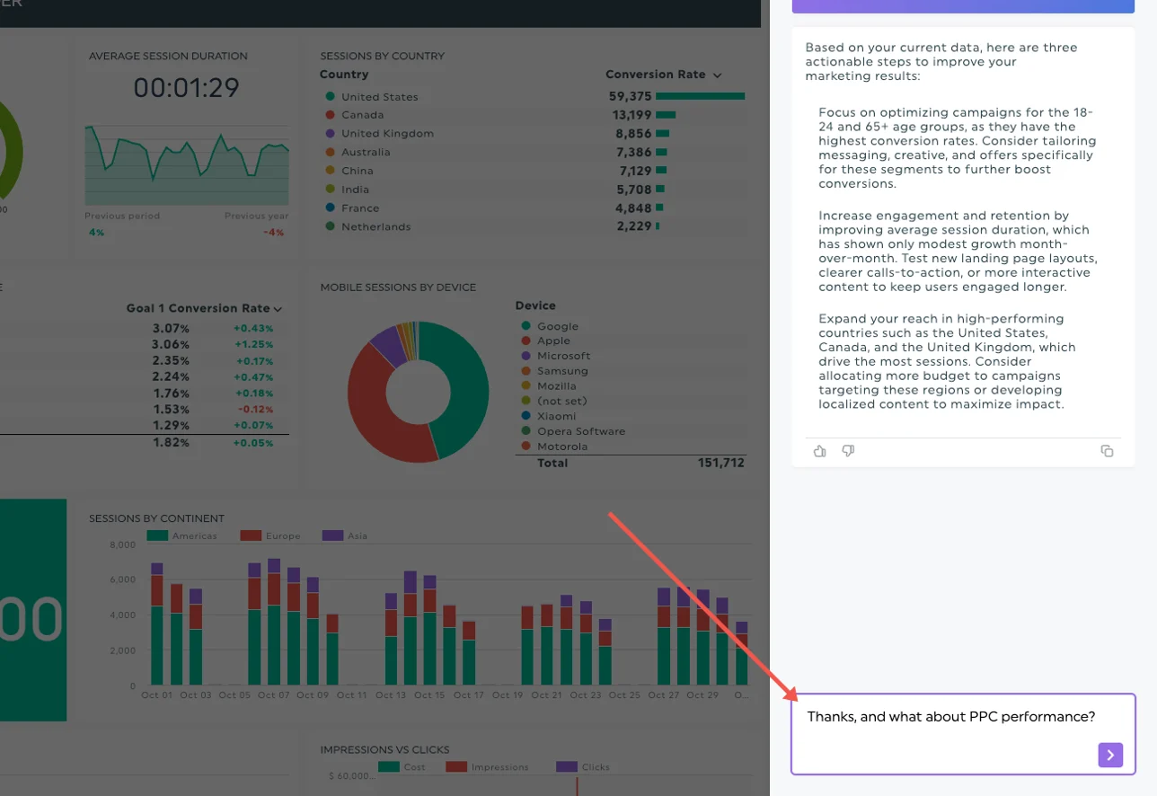
This makes it easier to move the conversation from “Why did this number drop?” to “Here’s what we learned, and here’s what we’ll do next.”
Bad Results Aren’t the Enemy, Poor Explanations Are
Clients don’t expect perfection. They expect honesty, clarity, and direction.
When you explain bad results with context, confidence, and insight and support your message with clear dashboards, you position yourself not as a vendor, but as a strategic partner.
And that’s what keeps clients long-term, even when the numbers aren’t perfect.

Try our new AI insights PRO today!
Read More

Don’t miss out!
Follow us on social media to stay tuned!
Automate your reports!
Bring all your marketing data into one automated report.
Try dashthis for free