How to build a helpful management dashboard for your busy executive (+ templates)

Think of management dashboards as a mission control center for your executive team, powered by real-time data.
They carry the fundamental key performance indicators (KPIs) in one place to help your executive team:
- Track business performance across all departments in real-time
- Summarize data and turn them into actionable recommendations
- Review progress toward goals and get notifications if something needs attention
- Crystallize a core vision or goal for team members
- Make strategic project management or task management decisions for the business
Management dashboards focus on high-level key metrics like financial performance, daily customer sign-ups or customer churn to provide a quick overview of all business areas. There may be specific sections to analyze the performance of a particular department in more detail.
What metrics to include in a management dashboard?
It depends on the story you want to tell.
What is the aim of your dashboard? Is it to summarize financial performance for this quarter? Or to make a case for more budget to get an initiative approved?
Some examples of suitable metrics according to common business goals.
Sales team performance. Daily customer sign-ups, average revenue per account, year-on-year growth, net revenue.
Customer satisfaction. Customer churn or retention over time, average net promoter scores (NPS), and customer feedback.
Financial performance. Monthly recurring revenue (MRR), monthly cash flow, burn rates.
Why use a management dashboard?
Effective decision-making relies on quality, unified data.
For a study of 60,000 CEO working hours, CEOs spend nearly half (46%) of their time reviewing information and making strategic decisions.
Naturally, they depend on processing data quickly and accurately for their decisions.
Reporting and data analytics tools simplify the tedious process of presenting data from multiple sources in one place.
Management dashboards bring isolated data sources into one place. 88% of stakeholders consider executive dashboards a valuable input for decision-making, whether it is reviewing team performance, competitor intelligence, or product pricing decisions.
How to create an effective management analytics dashboard
Besides the right metrics, you also want to format your management dashboard for easy reading.
Here are some tried-and-tested tips you can use.
1. Add engaging visuals:
Visuals help summarize essential information and deliver it more effectively.
Go beyond Excel spreadsheets and make your report interactive with dashboard reports. Add graphs, tables, and charts that help your management team focus on what the data is trying to say and support fast decision-making.
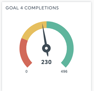
You could use a gauge instead of a plain number to show progress toward a goal and the remaining time until completion.
Business dashboard tools like DashThis templates all include a variety of visuals to spice up your dashboards. Try them out!
2. Use color and structure to direct people to important information
People don’t read every word or statistic in your report.
Instead, they scan, stopping every once in a while to read a couple of sentences.
Eyetracking reports suggest people randomly read reports without section breaks, illustrations, or visual hierarchy.
So what does this mean for you? Rather than presenting all the information haphazardly, think of how you can structure the information to fit how people read.
Help guide your reader to the vital information in your report. Here are three techniques you can put into practice.
- The traffic light system. Use red, amber, and green icons to draw people’s attention to essential metrics or what needs attention. Stick to one or two icons, and define what the colors mean in your report (tip: use a note or comment to embed this information in your dashboard without clutter)
- Use call-out boxes to emphasize takeaways: Summarize information or a series of charts with call-outs. You can add valuable notes and comments in any chart within DashThis to add supporting context, or you can also summarize takeaways with a subheading or label.
- Add section breaks to break up the flow of the report and guide your reader. Section breaks add structure to the report, summarizing each chart's point for faster comprehension. Doing this ensures nothing in your report is left to ambiguity.
3. Establish context with your metrics
Which piece of information is more valuable?
- We got 80 new customer sign-ups this month
- We got 80 new customer sign-ups this month. This is a drop from the previous month when we had 200 and below our average sign-up rate of 100 per month.
In the second example, your executive might find this more beneficial, as it might mean something has changed drastically in the sales and marketing efforts. In contrast, the first example lacks context. Does 80 mean good or subpar performance?
Context gives your metrics additional power. Absolute numbers and metrics need context to be valuable, like comparing metrics month-on-month or reviewing historical performance.
How to establish a context in your report
- Establish a benchmark for your data. Industry averages or reviewing past performances are good ways to start.
- Use ratios to establish cause-and-effect between variables. Ratios help, especially when establishing ROI between marketing activities, expenditure, and performance.
- Use annotations to draw attention. Started a campaign in September that will affect a conversion metric? Use annotations to show when the campaign started when plotting graphs covering a longer time.
4. Make data actionable with recommendations
You’ve used the charts to make a point. Now what?
What can your executive do with the data? Develop actionable recommendations based on the data, and relate them to the business goal your executive is reviewing.
Going back to the customer sign-up rate analysis, you could add a recommendation to review the customer sign-up landing page or analyze the form performance on your homepage to understand why there’s a significant drop in sign-ups this month.
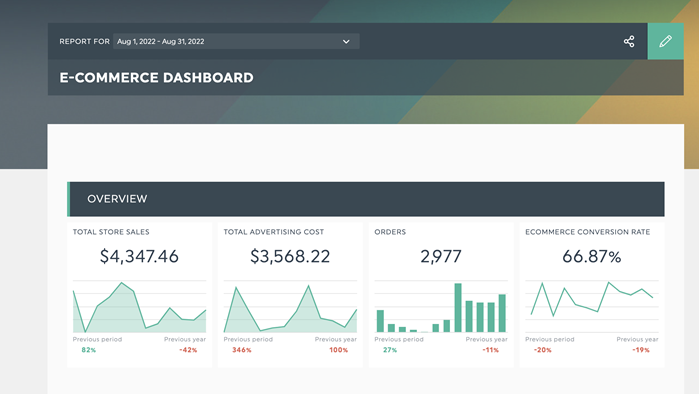
5 management dashboard examples and dashboard templates you can use today to make your data actionable.
Executive report template
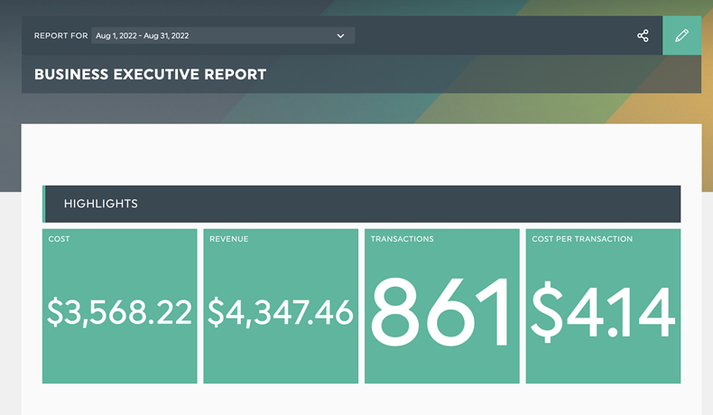
DashThis’s executive report template. Get it with your data.
Simplify decision-making for your busy management team with DashThis's management dashboard template. Highlights easily capture cost and revenue, while graphs track performance over time and progress toward business goals.
Relevant metrics:
- Cost and revenue metrics
- Revenue by source
- ROI tracking over time
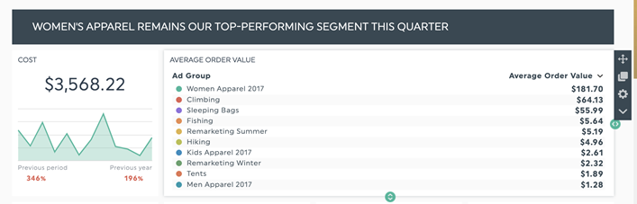
Sales report template
DashThis’s sales report template for e-commerce businesses.
The sales and marketing performance report helps your executive team stay on top of sales and marketing. Besides tracking the performance of crucial sales channels, such as your website and conversion landing pages, you'll also view the performance of each campaign to review your marketing effectiveness.
Relevant metrics:
- Total sales revenue vs. total marketing spend
- Top performing traffic sources and landing pages
Digital marketing report template
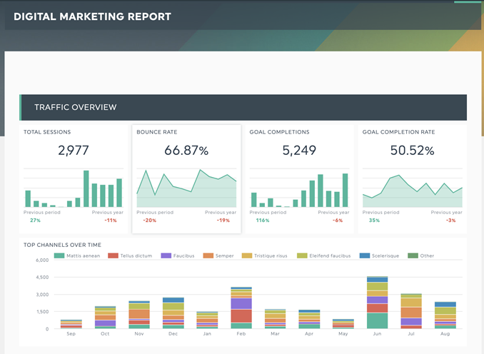
DashThis’s digital marketing report template. Get it with your own data!
Reviewing overall marketing performance for this quarter? We’ve got the template for you.
This dashboard will track your marketing budget allocation and which channels generate the most revenue.
Relevant metrics:
- Goal completion and goal completion rate
- Conversions and revenue across channels and campaigns.
Advertising campaign report template
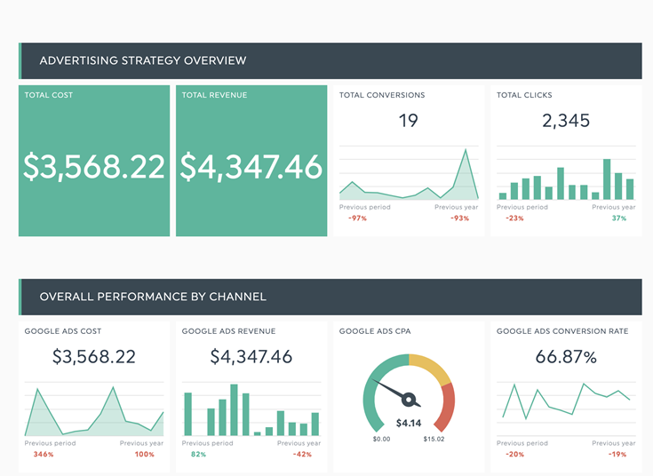
DashThis’s advertising campaign report for busy executives.
Make strategic decision-making easy with all your advertising campaign metrics in one place.
Relevant metrics:
- Track total cost/revenue of all advertising campaigns
- Track campaign performance across campaigns and countries - useful for regional coverage and market analysis
Law firm marketing report template
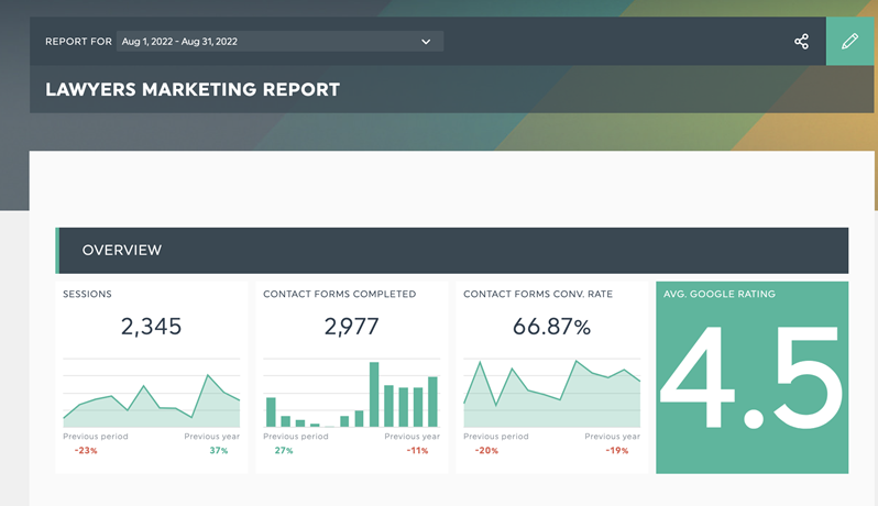
Get 20+ dashboard templates just like this one with DashThis. Try it with your data here.
Consistently attract and keep your legal clients with intelligent marketing efforts. Use this dashboard to analyze the performance of your website contact form, SEO, and paid advertising efforts.
Relevant metrics:
- Contact form submissions
- Cost per contact form submission
- Contact form submission by visitor type
How to create a management dashboard with DashThis in minutes
Step 1: Sign up for an account with DashThis. Our free 15-day trial allows you to see if our dashboard software is the right fit for you.
Step 2: Choose from over 40+ integrations and connect your marketing tools and data sources in seconds.
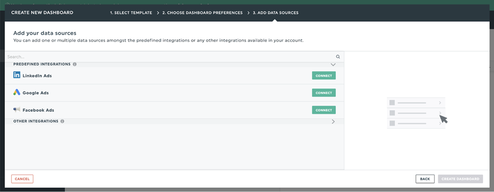
Step 3: Select the metrics to include in your report from DashThis’ preset widgets.
Step 4: Add as many data points as you need to set up your report. Once done, save your completed report as a template so you can reuse the template for future monthly reports and clients - saving even more time!
Step 5: View and share your dashboard. Share your dashboard with your busy executive, internal teams for review, and project stakeholders.

Ready to build your management dashboard?
Read More

Don’t miss out!
Follow us on social media to stay tuned!
Automate your reports!
Bring all your marketing data into one automated report.
Try dashthis for free