Life in Pictures: Why Web Data Should be Visual

The power of data visualization
You know how you tend to stick on Tweets or Facebook posts that have images more than those that don’t? It isn’t just you.
Now imagine if you could make someone stick on your web performance data as much as you stick on an image-laden Facebook post. Well, you can. Just make your data visual.
90% of the information your brain receives is visual, and visual information is processed approximately 60,000 times faster and more efficiently than text or verbal information.
When we read something, we’re required to think about the words were reading in order to derive meaning. This thinking occurs in the cerebral cortex-part of the brain, which is relatively slow and inefficient. However, when we see something, our visual cortex-part of the brain is the one working. By switching to this area of the brain, this shifts the cognitive balance and allows for exponentially faster and more efficient assimilation of data.
Basically, the quickest way to get into someone’s head is through visual communication.
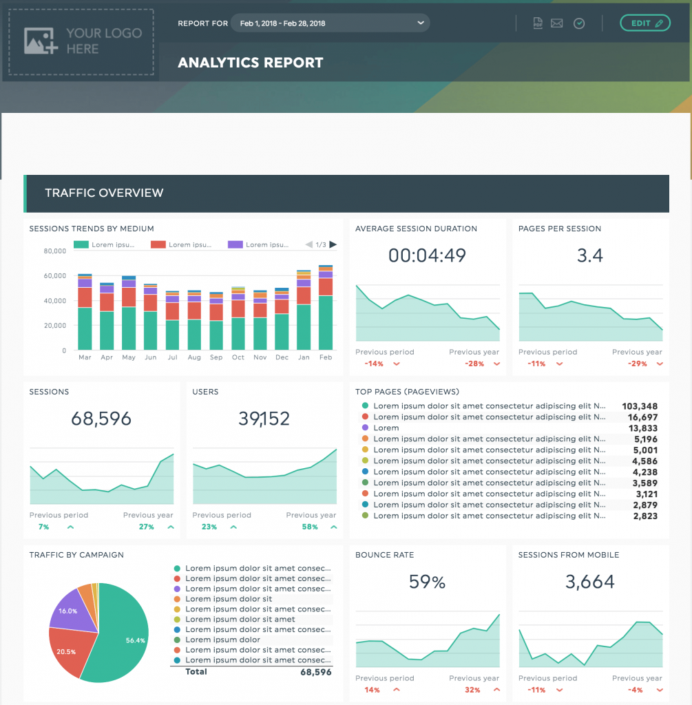
How dashboard reports feed off our natural cognitive tendencies
Straight up data can be, without a doubt, one of the most inanely boring things to look at. However, data visualization – which is the use of graphic images to transmit data information – feeds off our naturally visual cognitive tendencies.
It would be easy to look at an Excel spreadsheet for hours without noticing any discernible trends in the data, since our brain will use verbal processing to understand it. However, by arranging the data through graphic displays, our brain will use visual processing instead – which, as we know, is infinitely quicker. Behold, the power of data visualization!
How to create your dashboard design with this in mind
So now that you know that dashboard reports are the way to make your data easily digestible to your audience, how do you make sure that you’re optimizing it for all it’s worth?
1. Keep it simple and organized
If some data is good, more must be better… right? Hmm… not so much. Too much data and too many graphs can be very overwhelming for your audience. The last thing you want to do is inundate the person so much that they feel that they need to put a fine-tooth comb to the data to understand anything. Too many visual cues can be as difficult to understand as no visual cues! Also, don’t forget to organize your dashboard in a visually cohesive manner (pie charts organized in a clockwise manner, legends organized alphabetically or in ascending/descending order).
2. Choose the right visuals
Data visualization is clearly the secret to making sure you’re transmitting your information in the most efficient way possible, which means that choosing the right visual is uber important! So which graph is best for which data?
To see trends: If you’re looking to see trends in your data over time, the ideal visualization would be a line graph or a column graph.
To show internal makeup: If you want to see a detailed composition of a particular data set (for example, your website’s visitors based on device type: desktop, mobile, tablet, etc.), pie and doughnut charts are usually your best bet. Any stacked bar or column charts could also do the trick.
To see the relationship between multiple data sets: If you want to see the connection between different data sets, dual-axis line plots are the way to go.
To compare data: If you’re looking for the most basic of data comparison, you can choose anything from column, line, or bar charts.
To determine goal-setting and goal-reaching: If you want to see how far you’ve come in respect to a specific goal you’ve set out for yourself, a gauge image is best.
3. Use a clean design and colour palette
What visualization would be complete without some colour?
However, just as it’s important not to overwhelm someone with too many graphs and charts, it’s also important not to overwhelm with too many colours. Again, you’d be pulling the person’s focus in too many directions at once.
The best is to use a few, complementary colours to distinguish between elements, as well as design choices such as bold, underlined or italicized labels. This way, the eye can pinpoint the most important elements in order to quickly discern the main point.
This is also true for each graph in and of itself! For example, instead of making a pie chart with 100 tiny slices in it, utilize the “other” category by showing only the 10 to 15 biggest, most important slices, and putting everything else in “other”.
What you want is for someone to be able to glance over the data quickly and understand exactly what’s going on.
Want to be understood? Put it in pictures!
Once you understand how basic human cognition functions, it’s easy to see why dashboard reporting is so effective.
Data is only useful when it is understood properly.
Since visualization and contextualization is the key to making the human brain understand something quickly and efficiently, clearly, well-formulated dashboard reports are the way to make your data easy to interpret.
And isn’t that the whole point of sharing your data, after all?

Ready to automate your reporting?
Read More

Don’t miss out!
Follow us on social media to stay tuned!
Automate your reports!
Bring all your marketing data into one automated report.
Try dashthis for free