Unleash the power of Google Analytics' Data Table

***Before you continue***
If you master 100 % of Google Analytics’ features, this article may not be written for you. Otherwise, if you are like 98 % of Google Analytics’ users, you are probably not using it to its fullest potential. If you consider yourself part of the second group--don't be shy. You may want to read this one. While the entire world is going crazy about big data, multiple fancy data analysis tools are appearing on the market. Just search for « big data analytics tool » and you will be submerged with reviews presenting the one million of the best tools available in the entire universe.
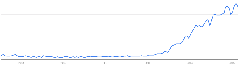
Big data" query usage on Google since 2004. Source: Google Trends.
Am I missing something here? Is it just me or while everyone is getting drunk on big data tools, we're forgetting the big picture. These tools are not the Holy Grail just yet. Let’s be realistic: whatever tool you use, whatever functionality it has, I am pretty sure it won’t tell you exactly what to optimize on your website and most certainly not how to optimize it. Here is why.
Tools don’t make the web analyst
No matter the data analysis tool or software you use, in order to do a perform a kick-ass website analysis, you must :
Know your digital goals inside and out
By mastering your digital goals, you will be able to translate them into key performance indicators (KPIs) and concentrate on statistics that are meaningful for your organization. I once read in Avinash Kaushik’s blog: "Good analysts are great assassins. They are great at finding lame metrics and dimensions and assassinating them." This quote represents, to me, one of the most important ideas about web analytics. At the end, web analytics is all about finding the right metrics and making 'em talk in a meaningful way to your business.
Be able to contextualize the data you dig into
Statistics can be interpreted in various ways when observed in different contexts. We all know that, but we tend to forget this fact when it comes to sharing data with others. Alone, an overall rebound rate or time on a site doesn't mean anything. In other words, presenting a statistic analysis doesn't mean copy/pasting numbers into a beautiful report. We must invest time to analyze the numbers we highlight to give them a meaningful interpretation.
Use your website statistics software like a boss
It would be a mistake to neglect the importance of the performance of the website monitoring software you use. Indeed, you must not be limited by any software. But frankly, I have never encountered such a situation. People rarely push their statistical tools to the limits. Let’s be even more honest. Most people use Google Analytics since it’s free and they often don’t event benefit from its most basic features. And that’s exactly what we will try to change.
Google Analytics’ Data Table: full-throttle potential
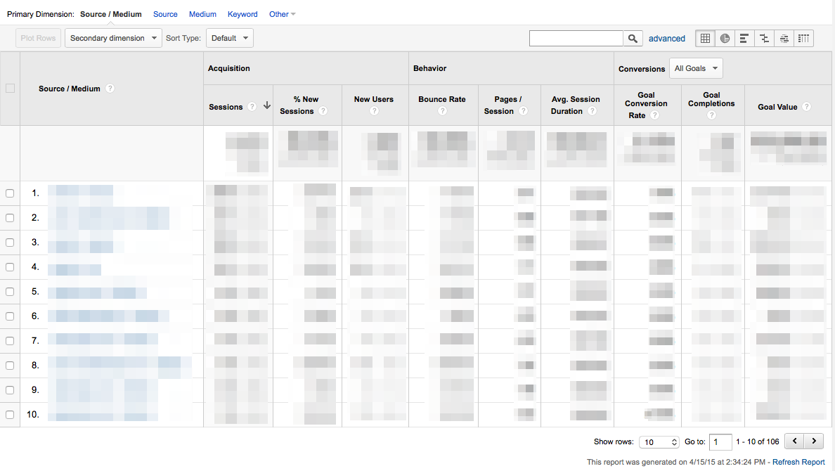
As Google calls it, the « Data Table » is probably the thing you use the most without even knowing its name. And that’s fine because we absolutely don’t care how it’s called. But, if this is not the case, you should be able to use it like a boss. In fact, if there was one thing you should be able to manipulate with ease in Google Analytics, I would say it’s the « Data table. » So let's go to the Real-Time Report, the Data Hub Activity and other fancy reports for a minute. Ok, ok. WTF? This is the core part of Google Analytics: the big table under the graph, the report Google Analytics generates each time you run it. It looks like this:I hear you thinking: "Duh! I already know how to use this thing." But wait until the end of the article before judging. Without any more wait, here are some cool (and underdog) features found in Google Analytics' marvelous Data Table! Pop open a cold one and watch the magic.
Dimensions
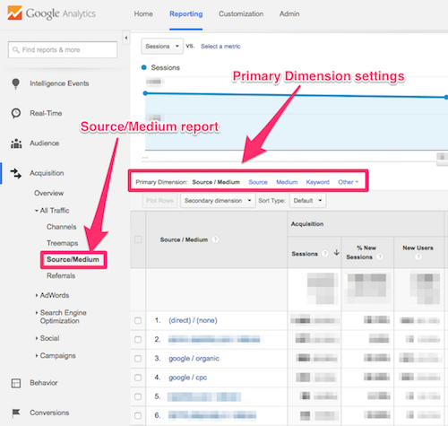
The primary dimension is the report’s main focus and is determined by default when selecting a report. The metrics (numbers) are aligned with it. In this example, in the Source/Medium report, the Primary Dimension is, without any surprise, Source/Medium. But few people know that they can change it. It can be a fast and simple alternative to switching reports.
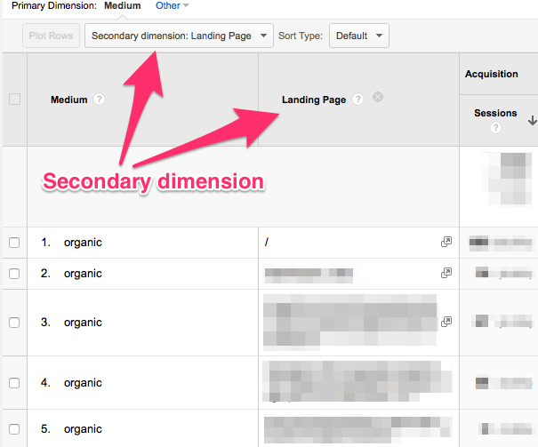
But honestly, adding a secondary dimension is the whole point of having dimensions settings in the Data Table. It is probably the easiest way to cross two metric types. For example, if you want to identify the pages that get the most visits from other search engines, you will have to use a secondary dimension. In this case, use « Medium » as « Primary Dimension », click on « Organic » and add « Landing Page » as « Secondary Dimension. »
Just remember that you can use dimensions to look a numbers from different perspectives and I will have reached my goal.
Plot Rows
Let’s say you are looking at the pages that get the biggest amount of traffic from the search engines and you would like to see the evolution of a particular page. This is an easy one!
- Click on the checkbox at the left-end of any line in the report.
- Click on « Plot Rows. »
That’s it! You can now compare the organic traffic received on a specific landing page (in orange) to all organic traffic (in blue). Whoooo.
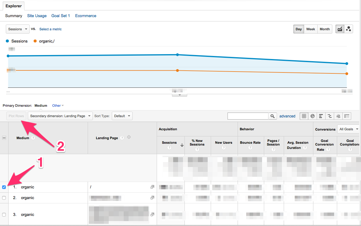
This feature is extremely helpful when trying to rapidly identify what really caused important variations in a graphic at a certain date. From now on, you won’t have to change dates multiple times until you identify which element caused the variation (yeah, we all do this).
Sorting features
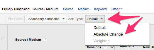
There are several ways to sort the data presented in the Data Table View. By default, a report in Google Analytics sorts data alphanumerically (high to low). You can change this by clicking the column header. You can also change the metric on which the report is sorted by clicking on its column header. Let’s say you want to have a look on the sources that generate the biggest amount of conversions, click on the column header of the specific conversion. The sources that have generated conversions will be found on top of the report. When comparing two date ranges, you may want to have a look at the elements showing the biggest absolute variations. To do so, click on the Sort Type dropdown menu and select « Absolute Change. »
Otherwise, you would have to search in the table which elements have the biggest variation.
Table display
At the upper right-hand corner of the data table, there are some really helpful display options. Here is a brief presentation of each one of them. Note that playing with them is highly recommended to fully understand their potential.

The first one is the default view, the Data Table as you have always seen it. The good old view! The second one (pie chart) is the percentage view. It shows the contribution of each selected metric as a percentage. It helps to see the importance of each element in the active report. The third one is the performance view. Like the percentage view, it shows the most important metrics in the report. It's also really useful when it comes to comparing performance (conversions, events, etc.). Next is the comparison view. It displays how each metric is performing compared to the site average. The second last is the term cloud. The name says pretty much everything. To me, Google Analytics added this one to please its users. Unfortunately, I don’t really find any value in it. Maybe you will like to use this one when analyzing keywords reports. But that's about it. The last (but not the least) seems like a weird beast at first sight. With it, you can visualize the relationship between two dimensions. It presents the numbers by pivoting on the second dimension you have chosen. This one really has to be tried to be understood!
Conclusion
If you make it through here, you really want to use the full potential of Google Analytics. It’s a good things since you probably won’t find a more useful web analytics tool at that price (note that I almost didn't write « at that price » since it is the one I prefer). The features presented in this article are really helpful and simple to use. So now that you know they exist, don’t hesitate to use them as much as possible. Again, the idea is to look at the same data from different perspectives. But don’t forget: you have to be searching for something in particular to find uber-meaningful stats. The gold nuggets won’t jump in your face just because you are doing a clicking marathon. Like we said, tools don’t make the web analyst. Using your web analytics tool like a boss is necessary, but not enough. Make hypotheses and try to validate them--all while being 100% neutral. Be curious and resilient. The gold nuggets will come!

Ready to automate your reporting?
Read More

Don’t miss out!
Follow us on social media to stay tuned!
Automate your reports!
Bring all your marketing data into one automated report.
Try dashthis for free