The 4 Features That Made Me Love The New AdWords Interface

For the past few months, like thousands of other advertisers, I’ve been able to try the new AdWords interface in its beta form. And like probably a bunch of these same advertisers, I was skeptical to click on the “Try the new AdWords BETA” button. I gave it a try for a few days, but I quickly came back to my good old “classic” AdWords.
To be honest, I really didn’t like the new AdWords interface. At first.
Why would they change a tool that’s always been easy to use in the first place? Why, dear Google, do you want to make my life more difficult by making me re-adapt myself to a new layout? Why are there so many “expanding 3-dot menus”? Am I ready to make major changes in my campaigns using an unfamiliar platform?
A month ago, Google announced that the new AdWords Interface was finally available for everybody. For me, it was a sign that I had to make the leap. It’s like when you have to boost your 1996 Honda Civic for the 12th time… maybe it’s time to move on.
I’ve been using the new version for 3 weeks now, and I have to say, I should have used it earlier. I knew that there were a few great new features, but I really underestimated them. Even if I’ve still got a lot of new features to discover, here are 4 reasons why I won’t ever go back to the old UI.
Improved Account Navigation
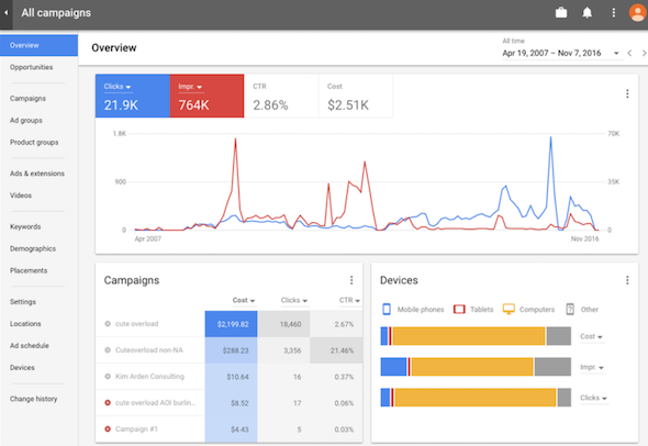
The new interface isn’t just sexier, it’s also faster. According to Google, the platform is now actually 20% faster. Any marketer that works with AdWords every day knows that 20% more speed is pretty nice.

Not only does everything load faster, but you can accomplish more with fewer clicks. Sure, at first, everything seemed to be written in Chinese. Every time it took me more than 4 seconds to find something, I would instinctively come back to the old version. The problem is, that’s not the way you learn to use a new UI. If you force yourself to get to know the new navigation, you’ll quickly see that the big changes are only in the layout, and it’s just that the tabs are now more horizontal than vertical. After a few days, it’s obvious that the adaptation is worth the effort. The new version isn’t just more colorful, it’s more intuitive.
New Quality Score Metrics
I’m sure that you already know how important Quality Score is in AdWords. It’s one of the most significant measurements in Google’s algorithm when determining your rank and CPC. Knowing how important it is, you’ve probably tried to follow a keyword’s Quality Score over the course of a campaign by re-writing the quality score over and over in a spreadsheet (crazy, right?).
That’s all in the past though. Google heard us and subsequently added 7 new columns in its Quality Score metrics column.
Why is this important? Because now, you can easily determine why a keyword is performing (or why not) by directly seeing its Ad Relevance, Landing Page Experience, and Expected CTR. Even better, if you segment your data by day, you’ll be able to follow your Quality Score over time (as far back as January 2016). Thank you, Google!
The “Landing Pages” Page
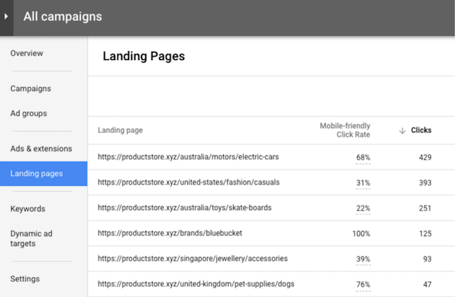
Yup, Google has really called this new page the “Landing Pages” page. It may not be original, but it’s effective. Now, why should you be excited about it? Because this new section will give you advantageous insights about your landing pages more easily than before. I’m sure this will make you want to improve your whole user experience, especially for mobile users (the new metrics actually exclusively target mobile users).
For each landing page URL, Google shows you its:
- Mobile Friendly Click Rate
- Valid AMP Click Rate
- Your regular performance metrics such as clicks, cost, conversion rate, etc.

The Mobile Friendly Click Rate is the percentage of mobile clicks that end up on a mobile-friendly page, as defined by Google’s Mobile-Friendly Test. This metric gives you an idea of which landing pages result in the most or least mobile-friendly experiences.
From now on, considering that Google now has a dedicated column for AMP’s (Accelerated Mobile Pages), we can assume that having effective AMP landing pages will clearly help your Quality Score.
Furthermore, the new page will now thoroughly analyze your landing pages by accounting their CTRs, remaining time on page, and how much their content fits your user’s needs. The main point of this new section is to help you improve your user’s experience through clear and effective landing pages.
Promotion extensions
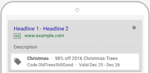
Christmas is at our doorstep and the new Promotion Extension will soon be your best friend. This new option is the perfect way to quickly and automatically promote your services or products during special occasions.
But what does it entail? The Promotion Extension lets you display a discount directly below your ad copy. The promotion icon indicates 6 main things: Occasion, Promotion Type, Item, Promotion Requirement, Promotion Dates, and Details.

This new extension is really useful because you can apply it at any level – Campaign, AdGroup, Keyword – and it allows you to add a lot more information in your character-limited ad copy.
As you might have guessed, this new feature is a great way to sky rocket your CTR’s, if used wisely!
Bonus: The New Reporting Section

Have you noticed the new reporting logo in the AdWords header? While the new reporting section is cleaaarly not as complete and awesome as DashThis, AdWords really enhanced its reporting game. There’s now a lot more ways to visualize your data through AdWords.
Managing AdWords day-to-day can be pretty exhausting and time-consuming. This section has been made for marketers so they can get quick and useful insights about their campaigns without having to search through their entire account. For instance, I personally use it every morning to quickly visualize my campaign performances (clicks, conversions, and cost/conv) over the preceding week.
But here’s why you shouldn’t use it as a client reporting tool: that’s just not what it’s for. Even if you only had to manage AdWords accounts for your clients (which is unlikely), the reporting section is not an easy-to-use tool to create pretty dashboards; it’s an easy-to-use tool for data analysis.
In other words, if you need to do client reporting, try DashThis for free for 15 days!
Enjoy!
Now that the new AdWords interface is available to every marketer, don’t hesitate to really get your hands dirty. It’s definitely the tool’s biggest improvement in 15 years and it’s awesome! Google’s team has not only reworked AdWords’ colouring so it fits with the new look of Analytics, they’ve also redesigned it for greater efficiency! I think we can all agree that the platform really needed this new freshness.
Oh, and be patient! There are still plenty of options that have not been transferred yet!
Ready to automate your reporting?
Read More
Don’t miss out!
Automate your reports!
Bring all your marketing data into one automated report.
Try dashthis for free

