The Practical Marketing Campaign Presentation Guide for Beginners

If marketing reporting week means exporting data from multiple tools, reconciling mismatched numbers and spending hours fiddling with PowerPoint, we’ve been there.
This guide shows a simple way to build a client-ready campaign presentation with DashThis, so you can prove ROI, explain what happened this month and why, and walk out with clear next steps. All without spending hours cleaning up spreadsheets.
Before we build anything, let’s get clear on what a marketing campaign presentation actually is.
Table of contents
- What is a marketing campaign presentation?
- Why is a marketing campaign presentation important?
- How to create an effective marketing presentation
- Choose DashThis to create marketing campaign presentations your clients will love
What is a marketing campaign presentation?
A marketing campaign presentation is a visual slide deck that updates your clients on your campaign's key results this past reporting period, why it matters to your clients and explains what you’ll do next.
Campaign presentations usually take two forms:
- Reporting presentations update clients on your campaign's key results, explain why they matter, and outline next steps to address issues or seize opportunities.
- Marketing strategy pitch decks present your proposed strategy with the reasoning behind it. You'll set short and long-term goals and identify which metrics will track progress.
To bring your campaign plan or report to life, you'll use tools like Google Slides, Microsoft PowerPoint, or automated reporting platforms like DashThis. For example, if you're presenting to busy executives, an executive report template can help you quickly highlight just the key campaign metrics they care about.
Get this executive report template with your own data!
Why is a marketing campaign presentation important?
Think of a marketing campaign presentation as a communication tool to keep your audience’s attention. How you plan and present it determines whether your clients see value in your work and adopt your recommendations. These presentations help you to:
Communicate your thought process
If you’re planning a marketing campaign, a marketing strategy presentation demonstrates your thought process and the rationale for your recommendations. These apply regardless of whether you’re:
- Pitching a social media marketing campaign to promote a new product
- Sharing an email marketing plan presentation to boost customer retention
- Analyzing an influencer marketing campaign's results
- Reporting on your yearly content marketing efforts
How you organize your thinking should align with your presentation's goal. When pitching a new campaign, Mike Bruce, founder of Mike Bruce Design, starts by pinning down the client’s primary objective and how success will be measured. He also maps any constraints inside the organization. After that, he builds the marketing pitch deck around a five-part flow:
- Context and goal
- What we observed
- What we recommend and why
- What to expect and key risks
- Clear next steps
When reporting campaign results, start with what happened, then explain the reasons, and close with the next steps. This shifts the focus to performance and lessons learned:
- Campaign objectives
- Key results and metrics
- What worked and what didn’t, with reasons
- Your recommendations for improving performance
- A clear call-to-action, like what you’re doing next and what you need from them
Focusing on your client and using a logical structure helps you avoid 'death by PowerPoint (PPT)': dense, boring presentations that nobody enjoys sitting through.
Earn stakeholder credibility and buy-in
Beyond tracking your marketing efforts, a presentation is an opportunity to share your thinking and show your understanding of your client’s world and priorities.
As Brian Clark, founder and CEO of United Medical Education, puts it: “The one campaign proposal that stood out to me was the one that seemed to have come from someone who had previously been sitting in my seat.
But how do you show that you can understand your client’s priorities? Ali Hassan, CEO of Rabbit Roofing, shares how he reviews an agency pitch in practice.
“My business problem is the first thing presented during the presentations that cause me feel they understand what’s happening. They clearly articulate what is broken, what will be altered and how the success will be gauged with terms that are relevant to operations rather than vanity measures. “
It's worth taking the time to plan your campaign presentations, starting with researching your client’s business (we’ll cover this later). Doing so builds confidence in your recommendations and makes it easier for clients to say yes, whether they're approving a new project or signing off on a budget.
Improve decision-making
Do you feel like you’ve got more data than ever before, but you somehow know less about what’s actually working? With more than 15,000 martech tools on the market, each collecting different metrics, 53% of marketers in North America cite data analysis and insights as the top bottleneck slowing marketing cycles.
Your clients don't want to sift through multiple dashboards and disconnected data points. They want answers to their questions today. Use a marketing campaign presentation to give them exactly that, a clear story that ties your numbers together and turns scattered metrics into practical takeaways.
Focus on the handful of metrics that matter most to your specific audience. For example, an e-commerce manager preparing for Black Friday doesn’t need to see 50 different numbers. They need to know:
- Are we hitting our Black Friday revenue target?
- Which marketing channels deliver the best return on ad spend (ROAS)?
- Should we reallocate channel budget before the weekend rush?
Show these three points with simple visuals so they can decide in minutes.
How to create an effective marketing presentation
Creating a winning marketing campaign presentation starts with understanding your client's world. In the steps below, we'll show you how to research their business priorities, then structure and design a deck that speaks directly to what they care about.
Step 1: Know your stakeholders and what they need to hear
Start by getting crystal clear on what success looks like for this specific presentation. What decision do you need your audience to make? What action should they take after seeing your slides?
Once you have a clear goal, learn how your audience thinks and works. Study specifics such as how their business operates and what keeps them up at night, then define success from their perspective.
When you truly understand your client’s world, it shows in every slide. Kate Ross, a PR specialist at Irresistible Me, says that when agencies do their research, they’re more likely to get to the heart of what clients want to see in their presentation.
"It was the one that didn't start with 10 slides about the agency. They opened with our goals, our pain points, and the metrics we care about. It felt like they had been listening the whole time. The strategy was tied directly to outcomes, not generic marketing jargon. That alone made it stand out."
For agencies, the research stage lays the groundwork for a confident, convincing presentation. Be specific during onboarding and when planning a campaign. Keep these questions in mind, or ask your client directly:
- Business goals: What specific outcomes are you trying to achieve?
- Pain points: What have you tried before that didn't work, and what went wrong?
- Success metrics: Which measures most influence your business?
- Internal constraints: How do your budget cycle and approvals work? How much time can your team dedicate to this campaign?
Document these insights thoroughly. These findings become your filter for everything that follows. Each metric you include in your presentation should tie back to something specific you learned here.
Step 2: Collect data and findings
When preparing your campaign presentation, you need to know which channels are working and contributing to your results, and which ones aren't.
But it's messy to make sense of data across channels. Each platform has its own dashboard and metrics, and may label the same thing differently. Facebook's Link Clicks and Google Ads Clicks sound similar, but track different actions. Link Clicks count only visits to your site, but Google Ads Clicks cover any click on the ad.
Easy to mix up when you're building slides, right?
Now, you could import your data by hand. That means exporting from each platform and fixing slide formatting. But this consumes hours that should be spent on strategy.
Instead, reporting platforms like DashThis automate key parts of your workflow so you can spend more time polishing your proposal and crafting opening slides that grab your prospect’s attention.
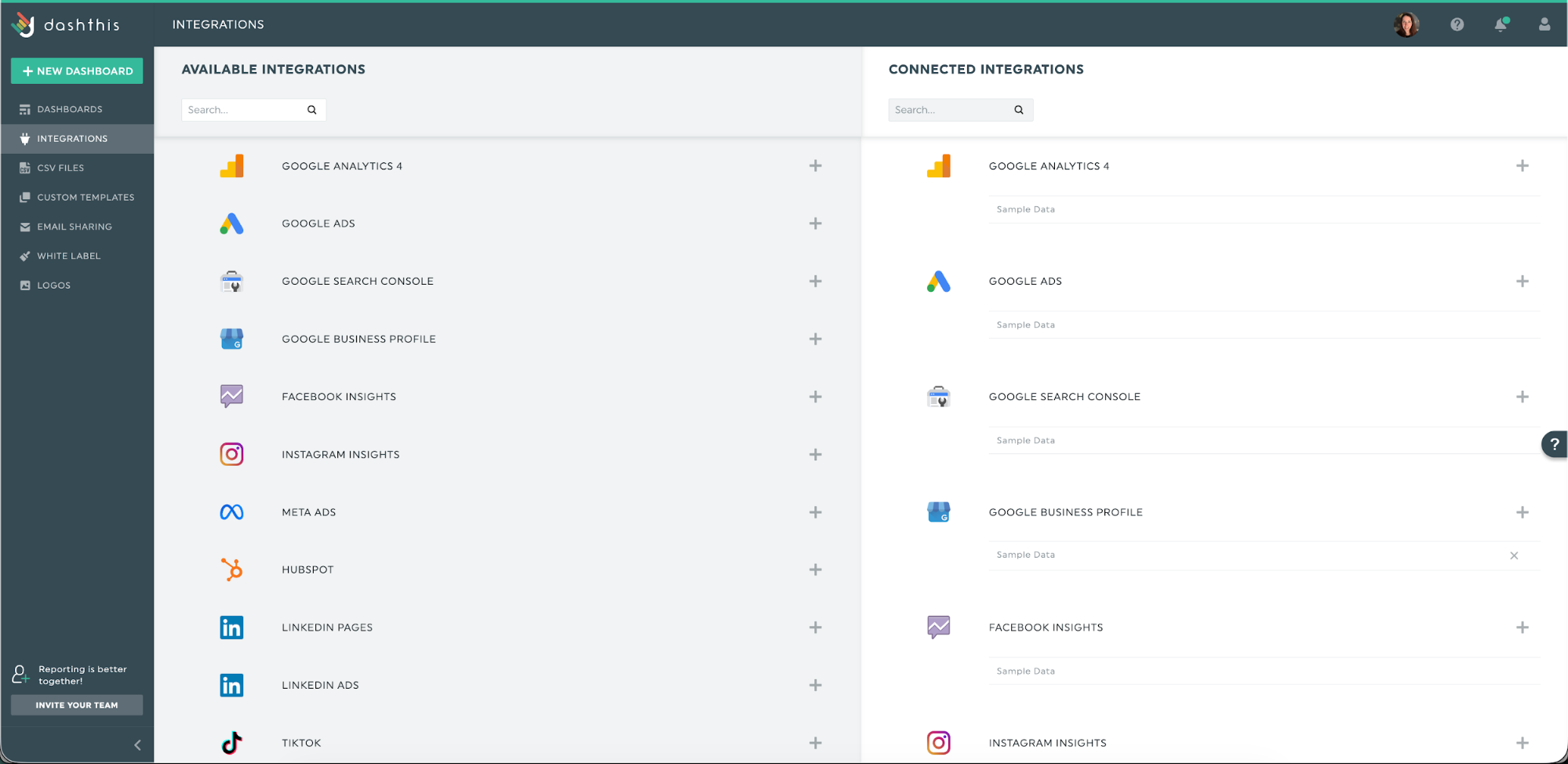
Connect your integrations once, grant permissions, and your data imports automatically into presentation-ready dashboards. You’ll spend less time wrestling with exports and more time crafting the story your presentation needs to tell.
Step 3: Structure your presentation
You don't need a complex framework to structure your presentation. In fact, the simpler your structure, the easier it is for clients to follow along and say yes to what you're proposing. Here's what needs to be in your deck, and why each slide matters.
Key sections to cover in a marketing campaign presentation include:
Cover page and personal note:
This first slide sets the context and is the most important. Storydoc’s data on presentation decks shows that 31% of viewers leave within the first 10 seconds without clicking or engaging, and another 15% drop off within the first minute.
Personalizing your deck is one of the key ways you can pique your reader’s interest. And personalization doesn’t need to be complicated. Storydoc found that adding a prospect’s name, a personal message, a brand logo, and a few custom slides increased engagement by 47%. These decks were shared internally 2.3x more often.
In other words, take a few extra minutes to add a personal touch. It’s worth it.
Executive summary:
After your personal message, surface the metrics your client cares about most in your executive summary
This is the slide that decides whether people read your entire presentation deck. Across all presentation types, Storydoc reports that 82% of viewers who reach the first three slides finish the entire presentation. For Pat Ahern at the SEO agency Intergrowth, the executive summary is where he invests the most effort:
“I spend the most time on page two - the executive summary. This slide highlights the 3-5 core KPIs that the client cares about. If I nail this page, the rest writes itself. After that, every slide either elaborates on those KPIs, explains why we hit our targets, or explains why we missed them and what we're doing differently next campaign.”
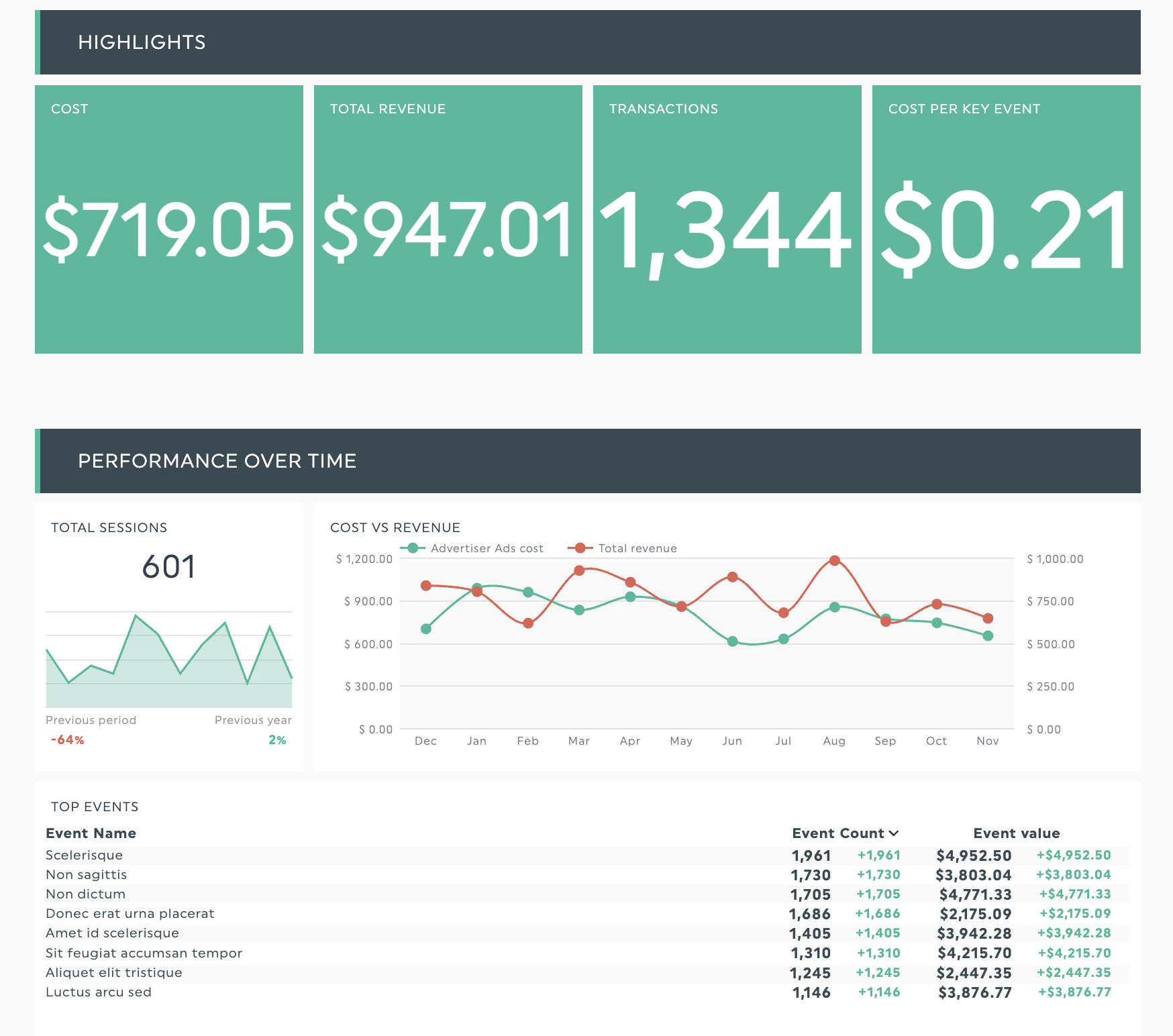
Start by asking: What does your client really care about? Then narrow your executive summary to 3–5 metrics that speak to those priorities.
Key results
After your executive summary establishes the overall picture, use your key results slides to tell the story behind each metric.
This means understanding what success means for your client's role and responsibilities. A sales manager isn't looking at engagement rates or impressions; they want to see how your marketing campaign affects the sales pipeline and revenue.
For Caitlin Agnew-Francis, Commercial Sales Manager at Desky, this means prioritizing results that drive sales when she opens an agency campaign report.
She says:
“Everything should tie to what it can do for us.” I need to see how many leads came in, how many turned into paid opportunities, the deal size and what we paid for each customer. Good reports show how the campaign moved buyers through each stage, which is one way the agency shows they understand how our business works. When a report includes feedback from customers or notes from our sales team about lead quality, I know the agency cares more about the results they bring.”
You could spend hours pulling data from different platforms and wrestling with the formatting. (Yup, we've all been there.)
Or you could let DashThis handle the grunt work. Connect your platforms once, and your data automatically flows into presentation-ready dashboards. No more export-copy-paste marathons.
Recommendations and next steps
After showing your 3-5 key metrics, dedicate 1-2 slides to actionable recommendations. This is where you connect the data to the next steps, such as:
- Explain what's working
- Address what needs improvement
- Share the roadmap for improvement
For example, if your sales and marketing data show LinkedIn brings in potential customers with bigger deal sizes compared to Facebook, your action plan might include:
- Shift 20% of Facebook budget to LinkedIn
- Test LinkedIn's audience expansion features
- Create case studies featuring customers gained through LinkedIn
Framing all your key results in this structure makes sure you can explain all your numbers. When you structure your presentation this way, setbacks become insights. Underperforming channels or flopped campaigns become valuable data pointing you toward what will work.
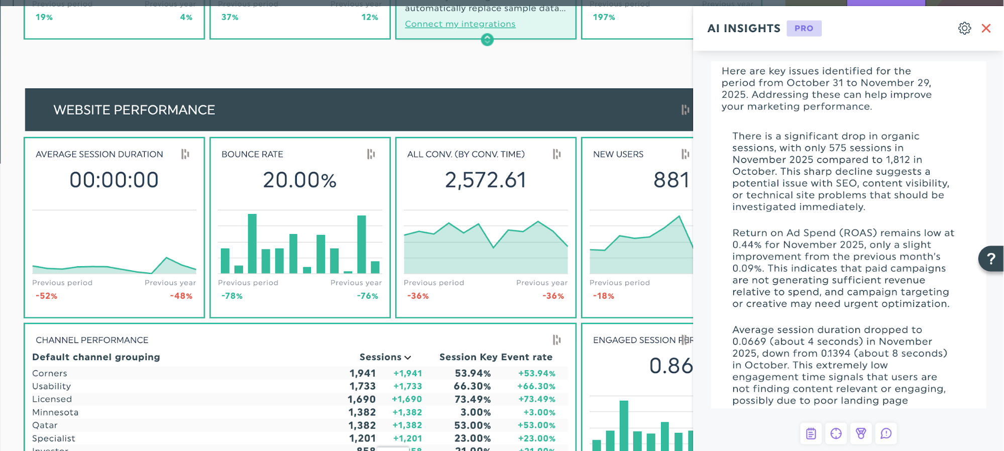
DashThis’s AI reporting tool automatically surfaces these metrics with our Wins and Issues lenses, so you don’t have to play detective with your metrics and can get on with the analysis.
Supporting slides
With those four sections done, you've covered what most clients need. These remaining slides provide additional context for team members who want to see the thinking and plan behind the results.
Based on your audience, available time, and presentation goals, the supporting slides might include:
- Campaign context and strategy:
For stakeholders who weren't part of planning, share the campaign's goals and plan, and explain how success will be measured so they can get up to speed. - Spend allocation and ROI:
For executives or finance stakeholders, break down the budget and return on investment split by channel. - Target audience insights: For teams planning follow-up campaigns, share demographic and buyer persona data on who you reached and how they engaged.
- Creative concept and messaging:
For brand teams or creative reviews, showcase your creative approach, ad copy, visuals, and how messaging resonated with your target market.
Step 4: Design slides that tell a clear story
Once your numbers tell a coherent story, you can focus on how your slides look. Add visuals such as graphs, and follow slideshow design principles, such as the 5/5/5 principle, to give your slides extra polish.
Some practical tips to follow as you design your slides.
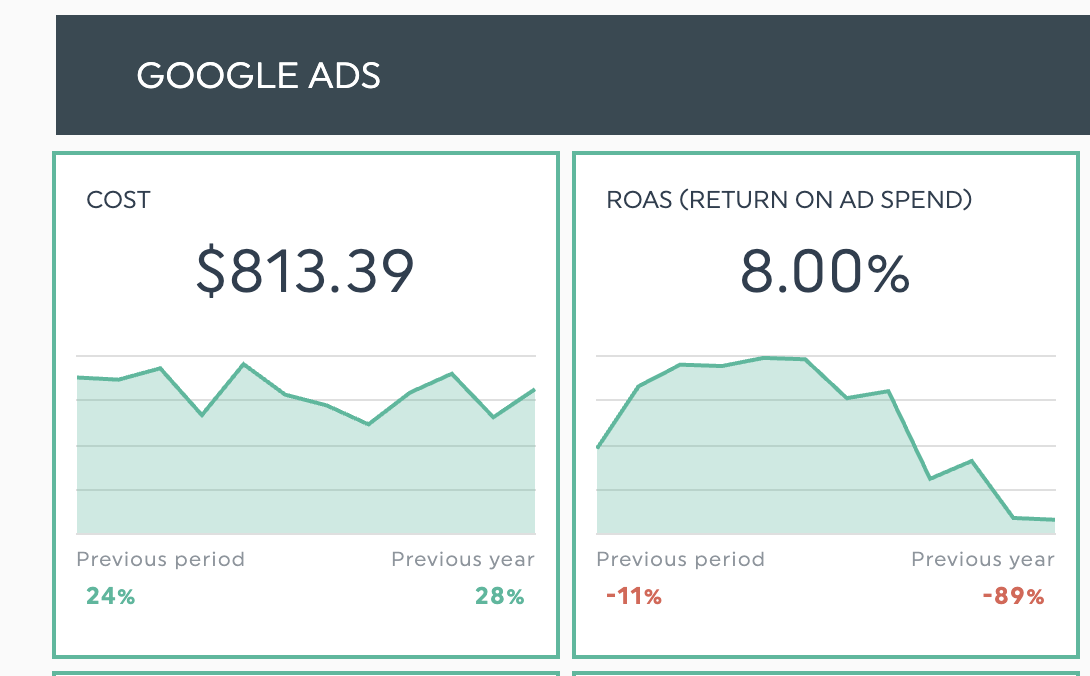
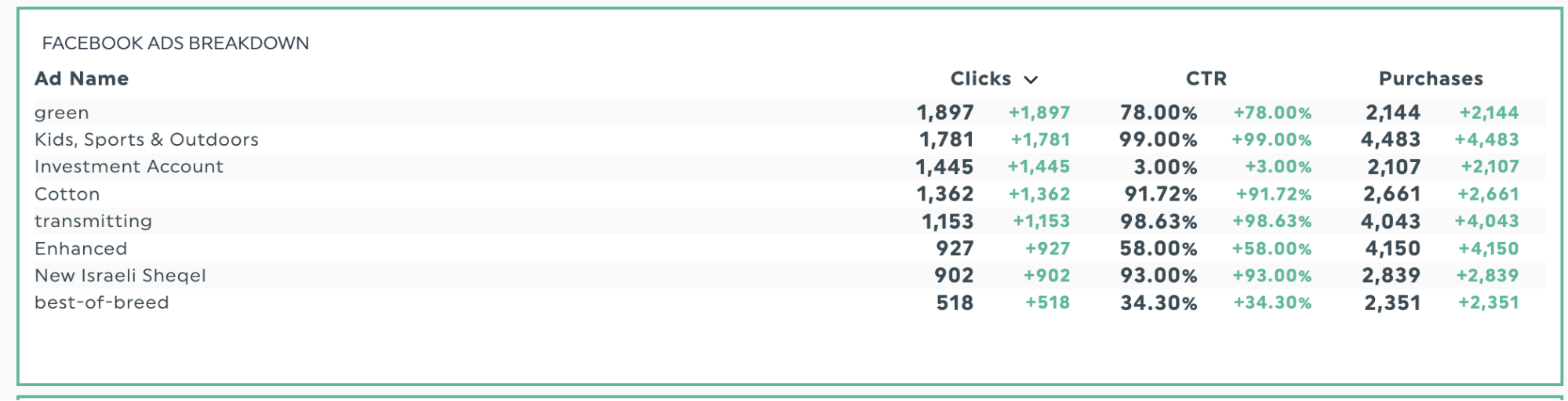
Focus on one key metric per slide:
Make each slide answer one question. For Facebook ad performance, use one slide for ROAS and another for cost per acquisition, rather than cramming everything into a single slide.
This one-metric-per-slide approach changes how clients absorb information. Matt Bowman, Founder of Thrive Internet Marketing Agency shares his reflection.
Each slide has one metric front and center, supported by essential content; no more cluttering slides with lots of data points. I can remember one presentation I made that failed because you simply couldn’t get all the traffic sources onto one slide ,When I did them individually they were understood better and the resulting questions were very different too.
Use visual cues for quick clarity
Simple additions like green for growth or exceeding targets, red for underperforming metrics, or large font to emphasize a point, make data easier to review.
Example: Two charts with red and green numbers showing growth or decline in a performance metric add context to the data.
Show context with data comparisons
Context helps your results make sense. Explain why the outcomes occurred, not just what the numbers show.
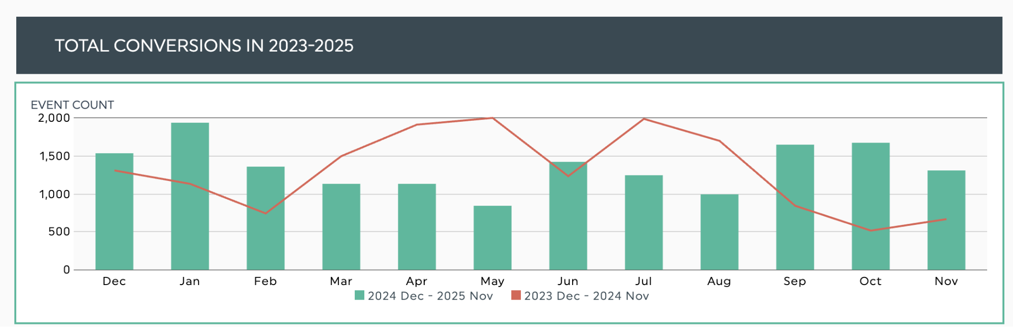
Trends over time: Is a metric going up or down over time?
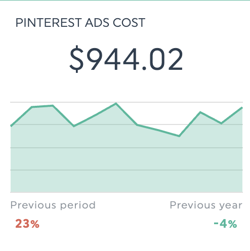
Previous time period: How did this week's performance compare to last week?
Same time period, previous year: How did the number of checkouts change?
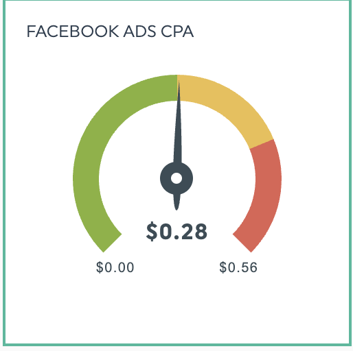
Target goal: Is performance meeting the benchmark, exceeding it, or falling short? Gauge charts are a clear way to show progress — perfect for your key results or executive summary sections.
And if you're using AI Insights? Even better. It automatically identifies the 'why' behind your numbers. Maybe it's a seasonal trend boosting conversions, or an unexpected spike in ad spend. Either way, you'll know what's driving the change with minimal guesswork.
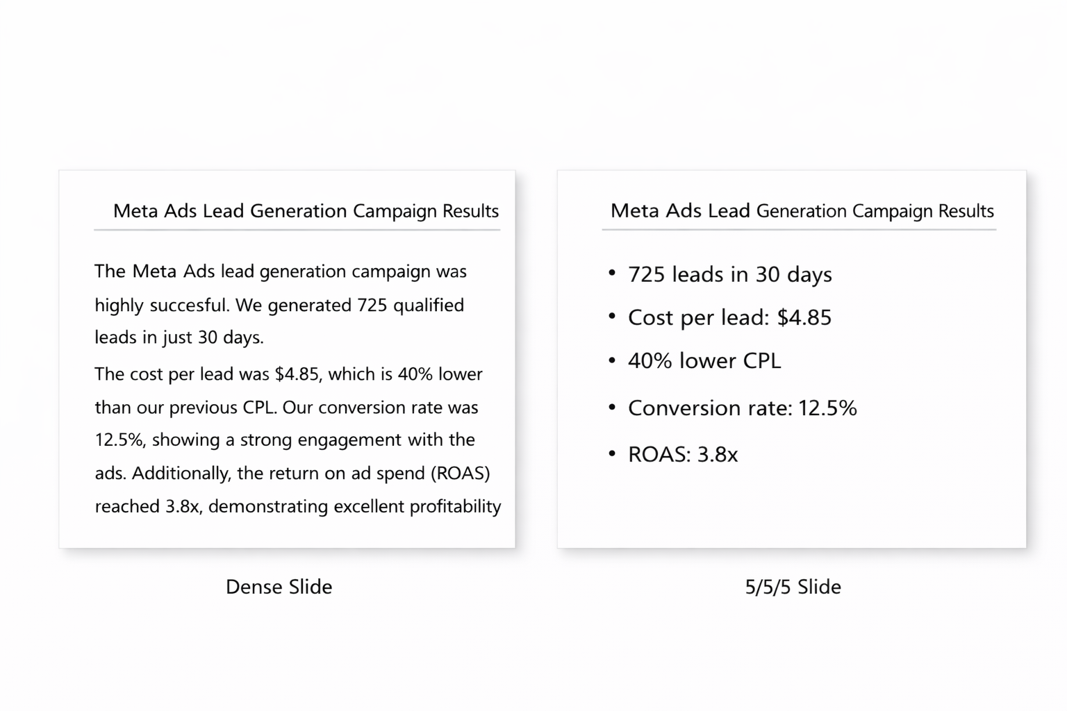
Keep your text scannable
When slides are packed with text, your presentation starts to feel like a reading assignment. People skim ahead and stop listening. Keep them with you by using fewer words on each slide.
Here's where presentation guidelines like the 5/5/5 rule come in handy.
- 5 words per line
- 5 lines of text per slide
- Up to five text-heavy slides in a row.
But if your text doesn’t fit, not to worry! Move these details to your speaker notes or leave it in your follow-up materials, where people can explore further after your presentation. This way, your slides support your story without competing for attention.
Creating these visuals by hand means exporting data from each platform, formatting charts in PowerPoint, then redoing them whenever the numbers change. With DashThis, you skip the tedium. Connect your platforms once to turn your data into charts ready for your presentation deck.
Step 5: Practice and gather feedback to improve future presentations
You've done the hard work so far, give yourself a pat on the back! Now it's time to prepare for delivery and set yourself up to improve with each presentation.
Before: Prepare and practice your delivery
Start by choosing your presentation format: will you present live in person, over a video call, or send the deck by email for async review? Each format calls for a different kind of preparation.
For in-person presentations or video calls:
- Practice your presentation with a teammate or in front of a mirror until your story flows smoothly
- Prepare talking points that cover notable trends and oddities, along with suggested next actions
- Run a tech rehearsal to make sure your slides, screen sharing, and tools work properly
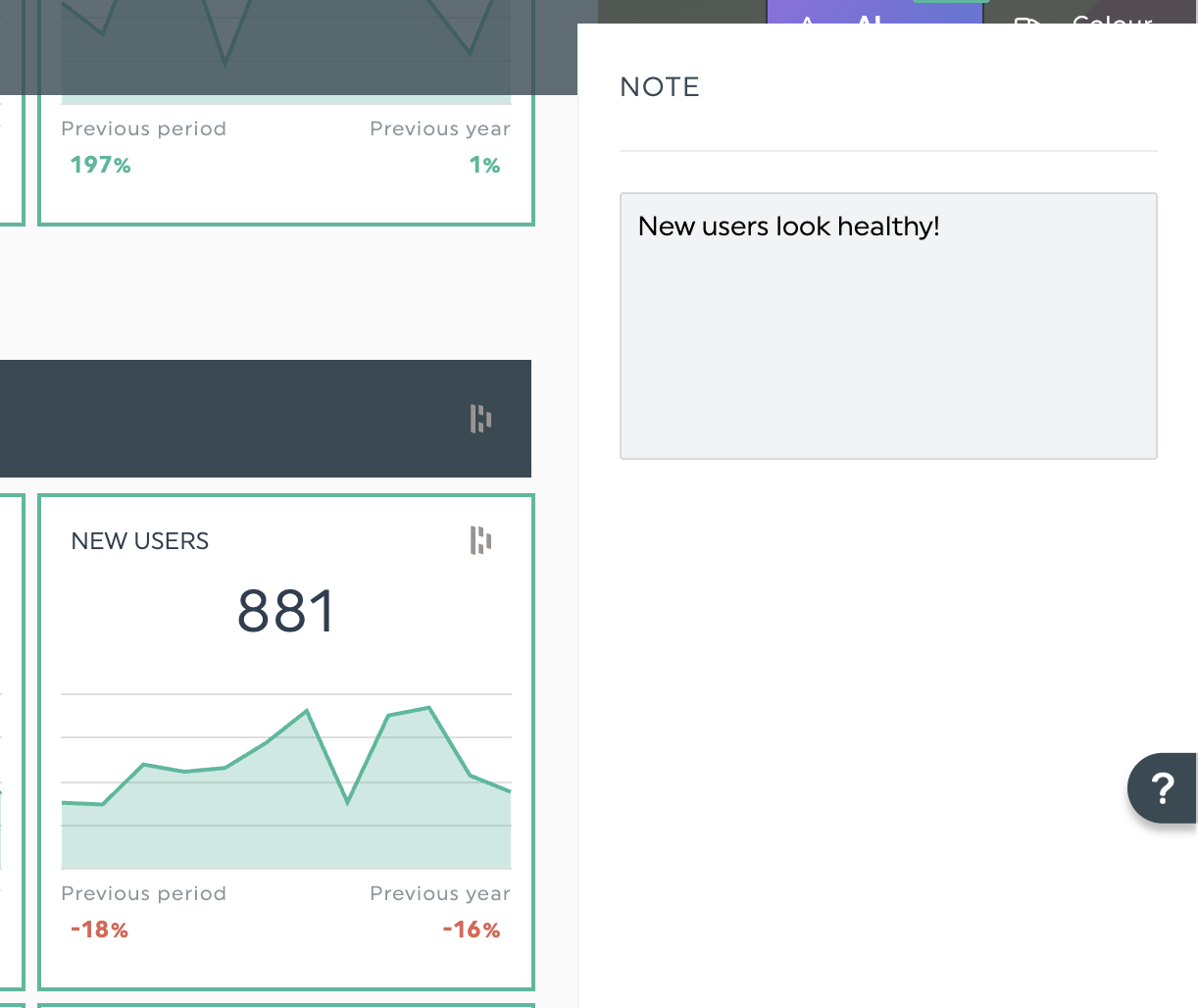
Use annotations to add context for email-only presentations:
When sending reports by email, add explanatory notes using DashThis's notes and comments widget. These give recipients the context they need to understand your numbers.
Ask questions that spark actual conversations during the presentation
Pat Ahern at Intergrowth made one small presentation change that shifted how clients viewed his agency. Instead of ending presentations with "Any questions?" He now asks: "How can we be a better partner to you?"
He explains: "For years, I'd end presentations with 'Any questions?' and move on. Once I started ending every presentation with 'How can we be a better partner to you?', real conversations started happening. Clients stopped seeing us as vendors and started treating us like strategic advisors."
After: Collect feedback to improve future presentations
Vicki Lesage, Digital Marketing Strategist at Thoughtprocess Interactive, recommends: "The first time you present, you'll have to take an initial guess at what data they want to see, how they would like it presented, and how often they would like to see it. During your digital marketing presentation, take notes and collect feedback on what they would like to see next time."
This feedback loop ensures each presentation gets better, more relevant, and more valuable to your specific client. Better yet, save what you've learned as a client-specific presentation template in DashThis, so your next presentation practically builds itself.
Choose DashThis to create marketing campaign presentations your clients will love
Keeping your clients engaged during a marketing campaign presentation doesn’t have to be difficult. A good presentation shows clients what worked and why, then maps out next steps.
With a well-structured deck built around your client’s goals and challenges, you’ll have a document that makes the presentation flow and sparks a useful discussion, keeping clients engaged and confident in your work.
With DashThis handling the tedious parts, you can free up your time to refine strategy and deliver thoughtful analysis. Those are details your clients love! Ready to create presentations that clients look forward to? Start your free 14-day trial of DashThis and see how much faster great reporting can be.

Ready to kill your next marketing presentation?
Read More

Don’t miss out!
Follow us on social media to stay tuned!
Automate your reports!
Bring all your marketing data into one automated report.
Try dashthis for free