Pricing information accurate as of July 2026
Databox pros: What are real customers saying about Databox?
What are real users saying about Databox? We analyzed verified reviews from G2 and Capterra to find out what works well and where the platform falls short.
Easy to use and works reliably well
With an overall rating of 4.4/5 from 194 reviews on G2, reviewers say Databox does what it sets out to do, producing solid reports for both internal and client-facing use. Marc W says Databox "transformed how we report both internally and to clients," citing its "rock solid data reliability" and AI summary features.
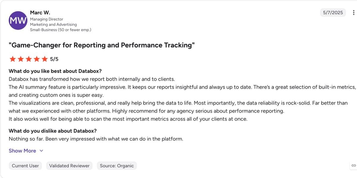
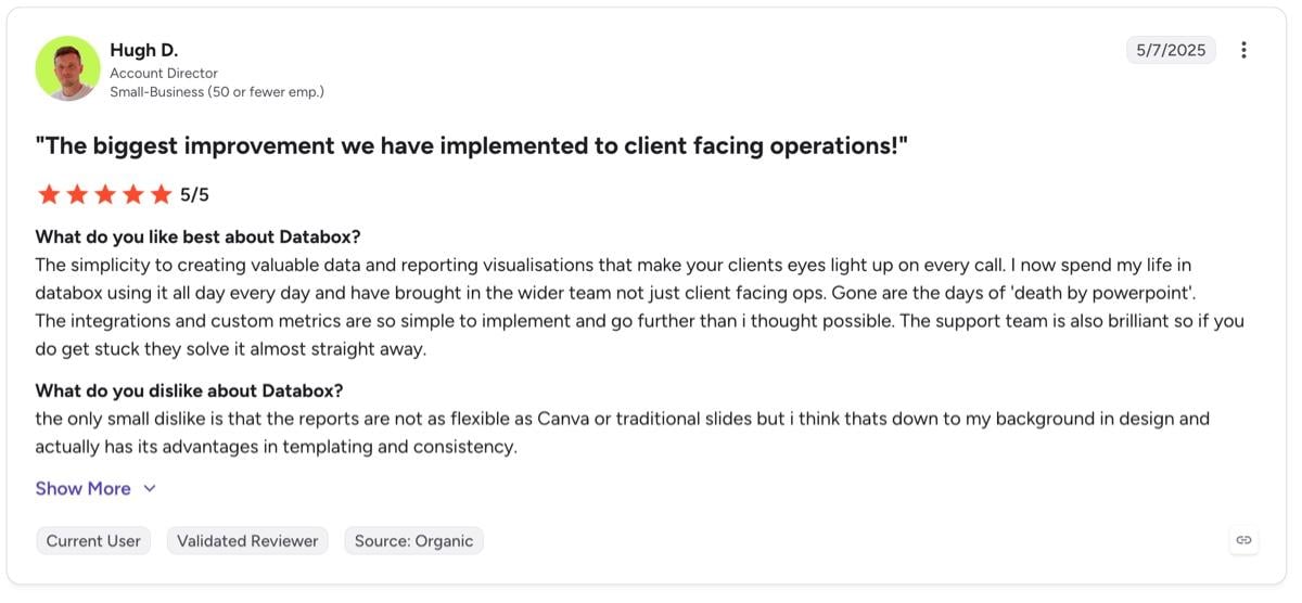
Ease of setup comes up just as often in reviews. Account director Hugh D says the platform and its integrations are easy to work with, calling them "so simple to implement and go further than I thought possible." He now spends most of his time in Databox and has brought his wider team onto the platform.
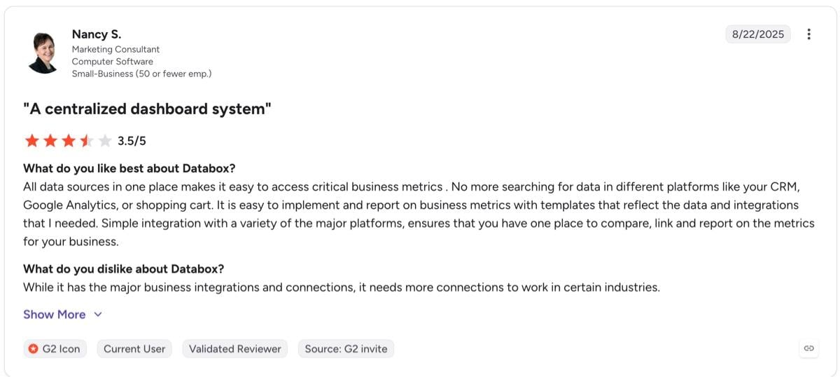
Another reviewer, Nancy S., points to a related benefit: having every data source in one place means no more hunting across platforms for the numbers you need.
100+ integrations, covering more than marketing platforms
Databox's 100+ integrations matter most if your clients report across a lot of platforms at once. That variety extends past marketing tools into sales, finance, and operations, so agencies and in-house teams can pull performance data from across the business into one place.
Like Robert R on G2 said: "I can easily sync it to my Google Analytics, Hubspot, Adwords, LinkedIn, and other tools to get a precise view of marketing attribution and follow the data to discover holes in strategy."
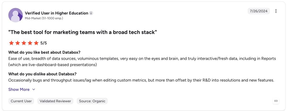
Another reviewer echoes the same point, praising Databox as the best tool for teams with a broad tech stack:
Databox cons: Common frustrations faced by users
Two frustrations come up consistently in user reviews.
Nickel-and-diming approach to pricing
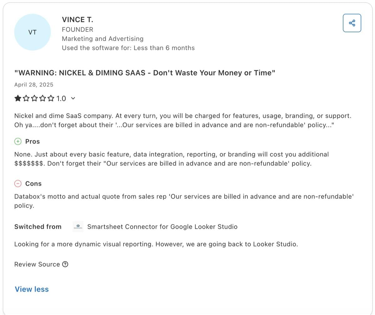
Databox offers a lot of breadth in features, but that breadth comes at a cost. Vince T, in a 2025 Capterra review, says nearly every basic feature comes with an extra charge: "just about every basic feature, data integration, reporting or branding will cost you extra money." After less than six months, he switched back to Google Data Studio (formerly Looker Studio)
Read our hands-on review of Google Data Studio here.
What's different here is that Databox treats white-labeling as its own add-on with a separate charge, rather than something you get once you're on the right plan. AI features are free to use during early access, though usage is capped daily. Once early access ends, Databox will shift to a credit-based system tied to your plan, so you'll have another usage cap and fee to keep track of.

A satisfied 5-star reviewer also mentioned on Capterra that the "annual subscription cost is considerable for a small business."
When you invest in a reporting tool, you need to know how much you're spending to forecast your costs accurately. Databox's complex pricing model adds a layer of opacity that makes this difficult. DashThis transparent pricing makes it clear how much you'll pay, with our only add-on related to AI usage. Beyond that, you'll understand exactly what you get on every plan, including your number of dashboards and data sources.
Mixed experience with customer support
Reviews also paint a mixed picture of Databox's customer support experiences. Some reviewers found the support team excellent to work with, others less so.
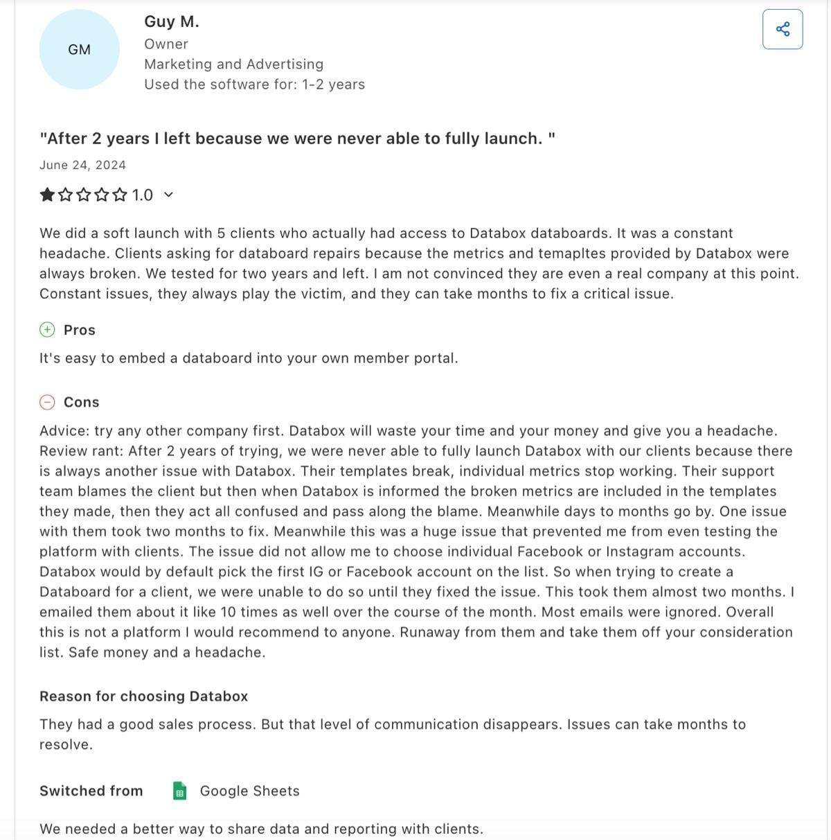
Guy M., an agency owner, spent two years trying to launch Databox with clients and never fully managed it. Broken templates kept forcing databoard repairs, and when he raised it, he says support "blamed the client," then "act[ed] all confused and passed along the blame" once it turned out the fault was in Databox's own templates. One issue took two months to resolve.
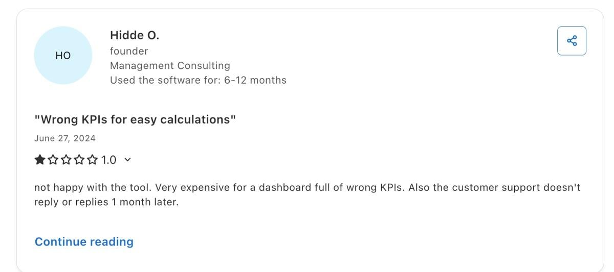
Founder Hidde O. hit the same unresponsive support on top of what they called "a dashboard full of the wrong KPIs." Support, in their experience, was slow and unresponsive.
Alan M., Head of Marketing Operations, draws a before-and-after contrast in a 2023 G2 review. Support used to be "super-helpful and super-responsive," he says, but that's changed. Now, he's "not sure what has happened with the customer support team at Databox but they are fairly unresponsive these days."

This isn't a one-off complaint. Reviewers raised the same issue across 2023 and 2024, mostly describing support as unhelpful or slow to respond, which is a problem since every minute spent waiting is time you're blocked on crucial work.
In our hands-on testing, we found Databox's support team responsive, as long as you're contacting them during their US Eastern active hours. Outside that window, expect to wait longer.
DashThis Tests: How does Databox compare with DashThis for small teams?
Here's how Databox held up against what we set out to test.
1. Data and integration coverage
Databox's integration coverage
Databox has 100+ integrations, covering more than the usual marketing tools. Some examples of platforms supported here:
- Marketing platforms like HubSpot, Mailchimp, ActiveCampaign and Marketo
- Digital advertising, social media and SEO platforms
- Sales CRMs like Salesforce and Pipedrive CRM
- Analytics platforms like GA4, Adobe Analytics, Mixpanel and more
- Project management tools like ClickUp and Jira
- E-commerce platforms like Shopify for e-commerce business owners and data analysts
- Spreadsheets and automation tools like Google Sheets, Excel, and Zapier
Because it's built for cross-team use, Databox covers tools your customer support and finance teams might already rely on, like HelpScout and Intercom, and accounting tools like Xero, FreshBooks, and QuickBooks.
Databox supports custom integrations on the Growth plan and above, even if they aren't natively supported. It's straightforward enough to set up without a developer, which is handy if you have proprietary tools or internal software platforms you want to pull into Databox for analysis. API access is available on all paid plans if you'd rather connect unsupported tools yourself.
Integration availability across plans
Not every Databox integration is available on every plan.
Agency Starter, the entry tier, only includes cloud integrations. These are the pre-built connectors for tools like HubSpot, Google Analytics 4, and Facebook Ads. If you're just looking for a way to combine all your marketing data from multiple platforms under one roof, this limitation won't bother you much.
But if you're handling data from spreadsheets or a proprietary database rather than a native integration, these integrations are only available on the Agency Pro plan and up.
Our verdict: Databox offers a wide range of integrations. Compared to reporting alternatives like Whatagraph, AgencyAnalytics, and even DashThis, Databox's 100+ integrations are the highest count in this comparison, worth considering if you need to cover data sources that go beyond marketing alone. Databox connects to platforms used by sales teams, finance teams, and other departments, which fits its use case as a tool multiple teams within a business can use.
DashThis caters to tools preferred by marketing agencies. We reviewed Databox's own integration directory and found only around 40% are tagged as marketing tools. The rest cover finance, sales, ops platforms, and data warehouses. If your reports don't touch these departments, you won't need these integrations. For agencies that only report on marketing performance, DashThis's 30+ integrations cover your needs.
2. Report building and ease of customization
First impressions
At first glance, Databox's interface feels dense. The Metric Library sidebar surfaces all the metrics from the tools you've connected before any filters are applied, and the left-hand navigation packs more than eight menu items with no labels attached. If you're new to reporting tools, that's a lot to process.
Once you get past that initial screen and start building your databoard and refining the layout, the overall experience feels similar to DashThis's drag-and-drop interface, except with more features tucked into the corners of the product. That depth pays off once you know your way around, but it's a lot more to learn and get used to if you're new to building reports.
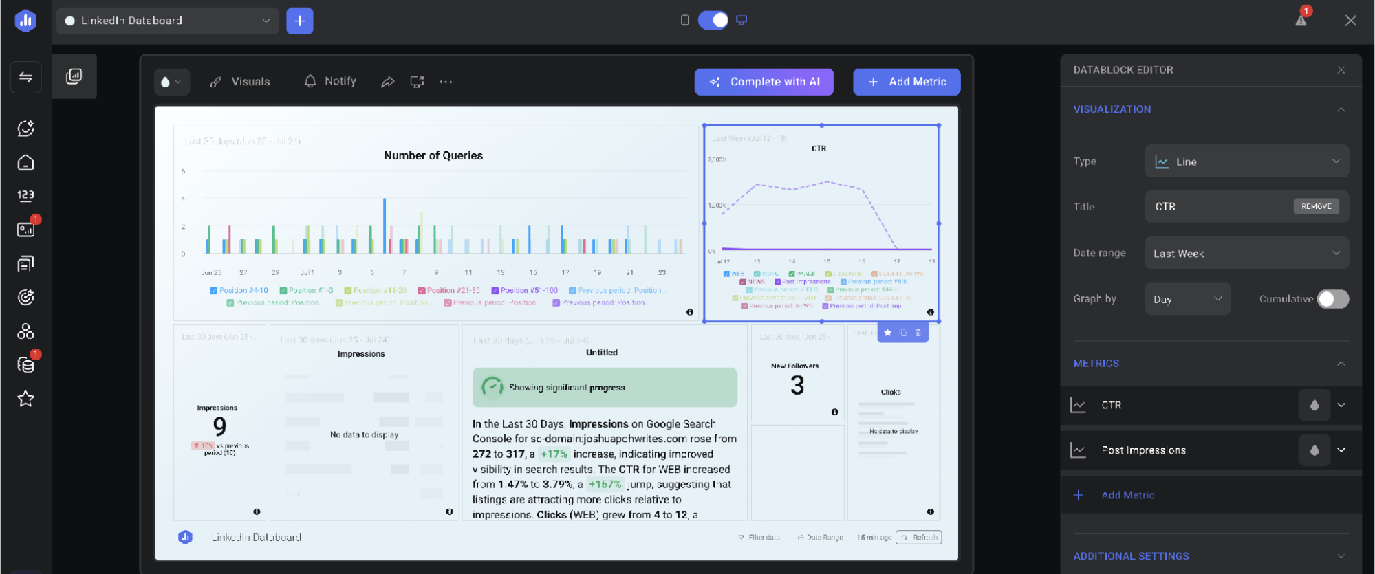
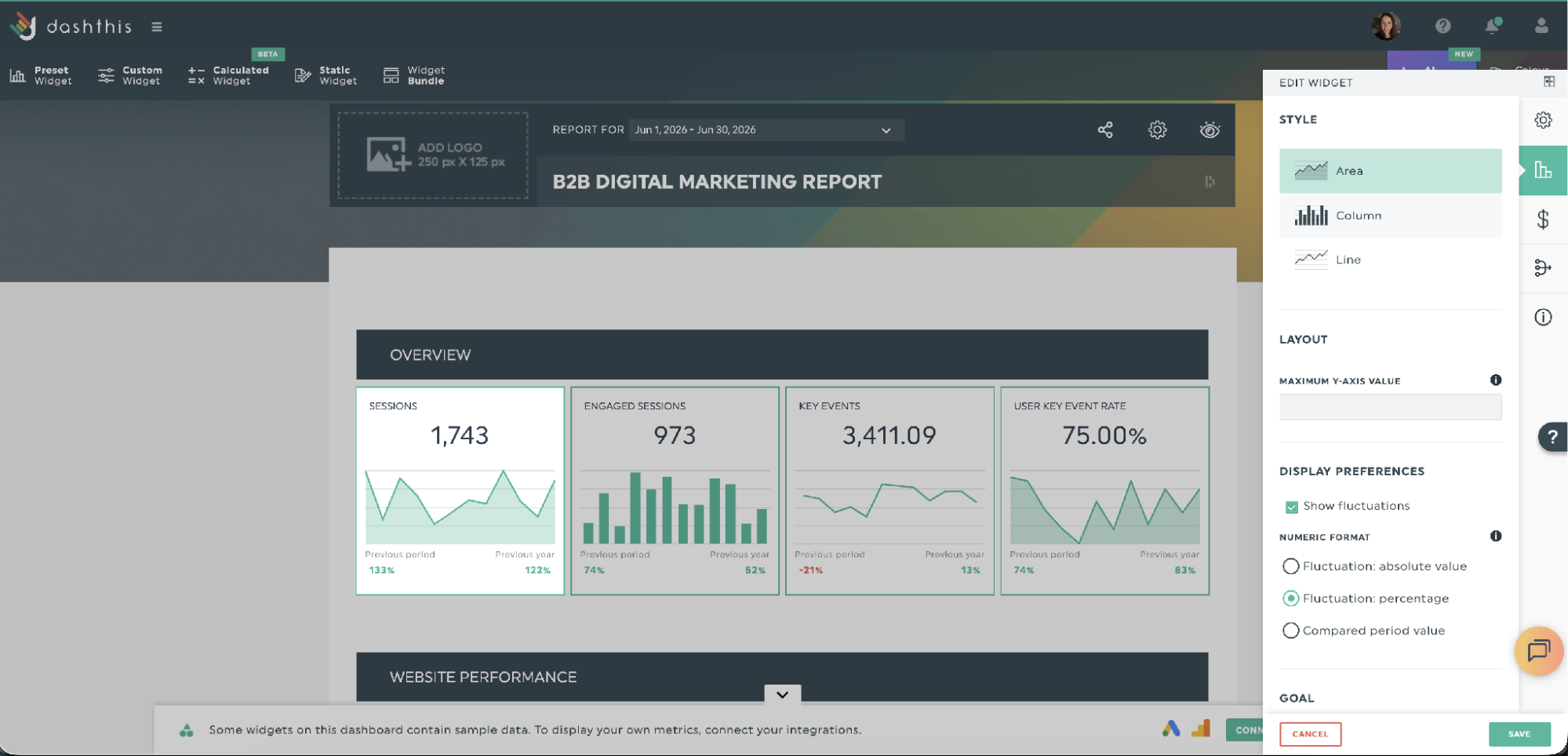
Those extra features tucked into the corners show up in the widget editor panel, with style, layout, and display options.
Building your first interactive dashboard
Databox offers you a few options to start building a databoard, its term for a customizable dashboard.
- Build from scratch using a step-by-step wizard
- Start from one of Databox's pre-built dashboard templates
- Click Create with AI and have Databox build a first draft for you. We tested the AI option on a website analytics report and had a working databoard in two clicks, though you still need to connect your own data sources before you'll see data pop up
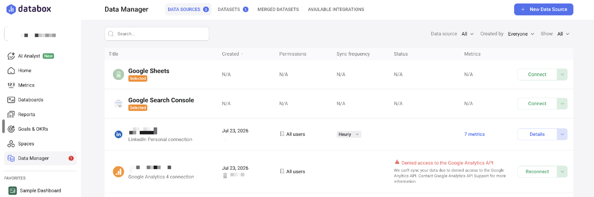
Databox splits your data into a few categories. Databoards display your data. Reports are what you send clients. Everything you've connected lives in the Data Manager, which doubles as the hub you'll pull metrics and widgets from when building a report.
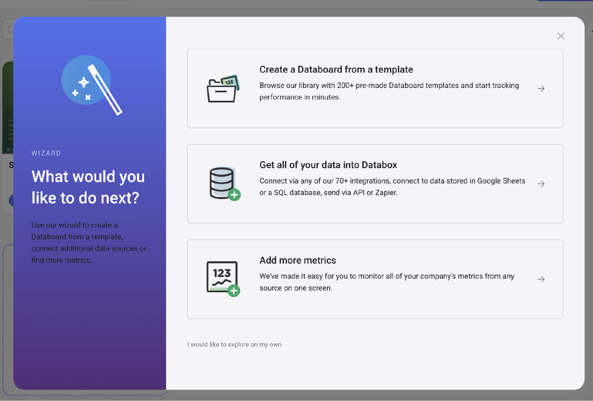
Below, the Data Manager shows where all your connected sources live, next to the wizard prompt for jumping into a template, connecting data, or adding metrics.
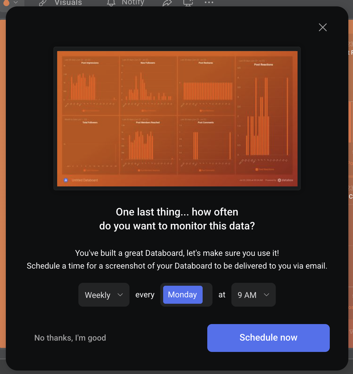
Once you've built a databoard, Databox nudges you to set up automated reports, a scheduled email snapshot that helps avoid databoards sitting unused once they're built.
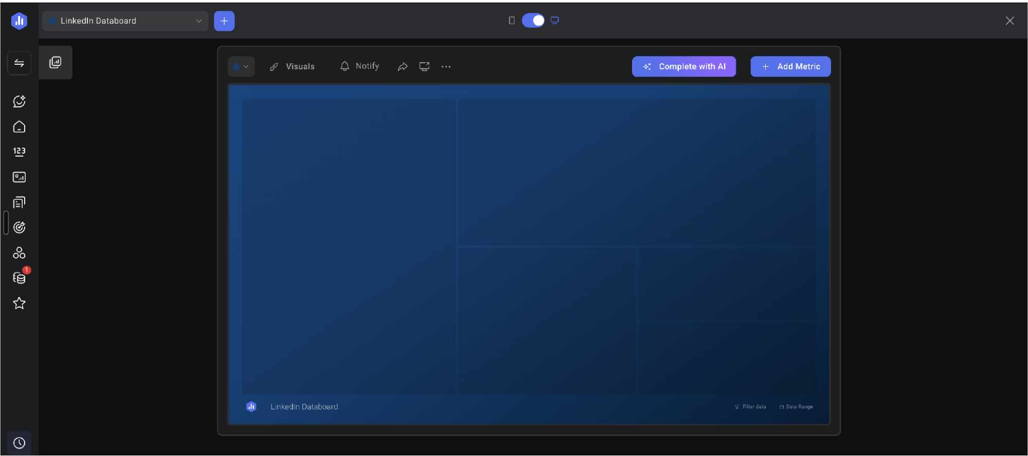
To see how the builder handles a real report, we connected a LinkedIn account and built a databoard from scratch.
From there, you've got two ways to fill in the databoard: add metrics from your connected data sources yourself, or use Complete with AI to fill it in automatically. There's a Populate with AI option to fill empty cells with recommended metrics if you need help.
When we tried it on our LinkedIn report, it populated the databoard with Clicks and Impressions, fine for a general overview, but less so if you already know exactly what your report needs to cover.
Widget editing and annotations in Databox
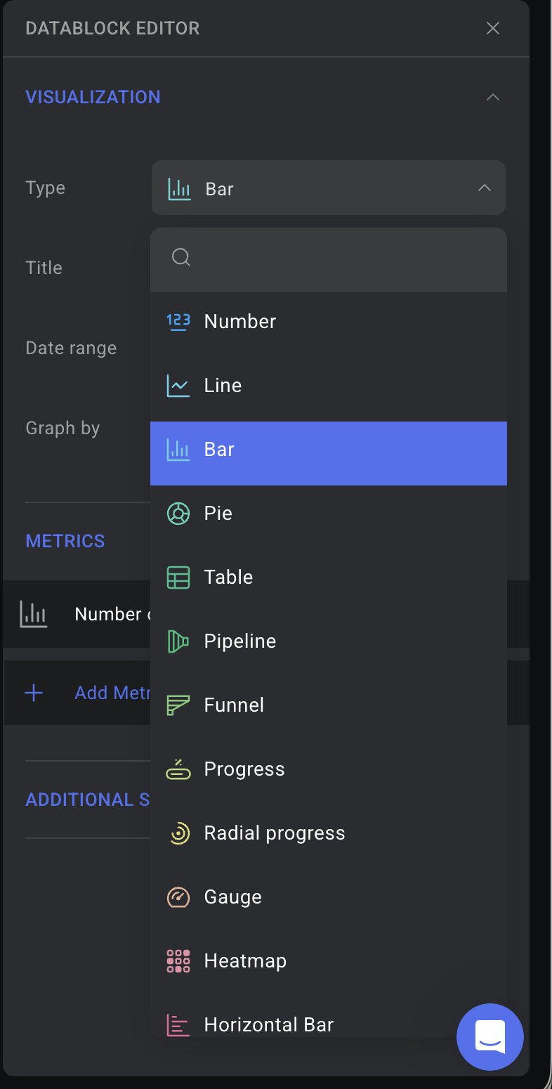
Widget editing also feels smooth. Grab a metric's edge and drag. The chart snaps to the grid and resizes with you. Changing how a metric is visualized works the same way: hover over a data block and you can switch the visualization type, change the metric, or sort the data. For line charts, bar charts or heat maps, you can use the editor to add annotations to specific points in the chart.
Hovering over a chart shows you how your current numbers compare to the previous reporting period at a glance, so you can spot a period-on-period change without opening the full report.
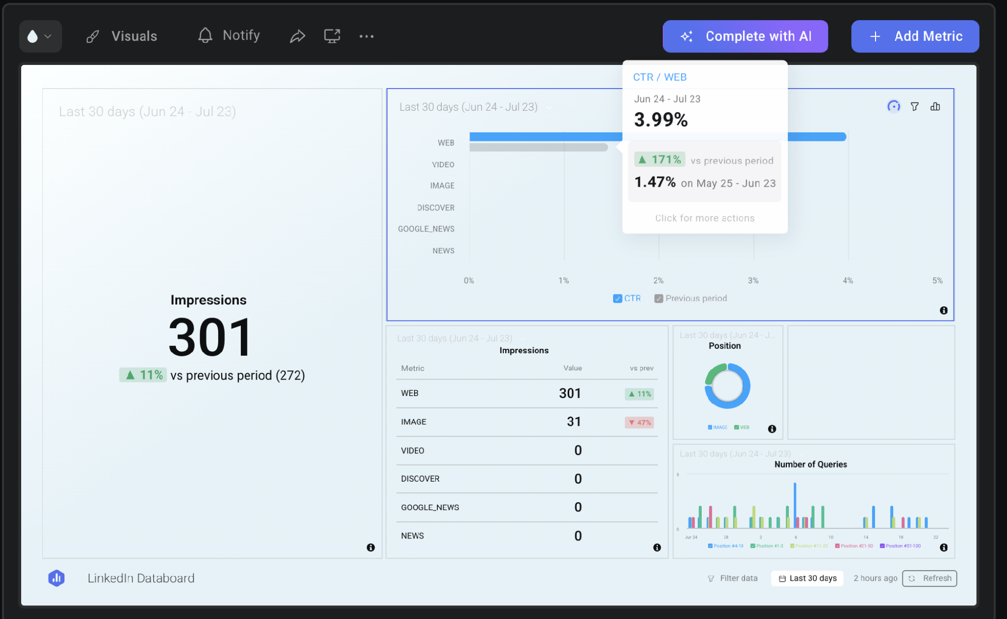
Pin priority metrics on your front page
You can pin metrics to the front page of your Databox account, worth doing for priority metrics like revenue or cost-related numbers.
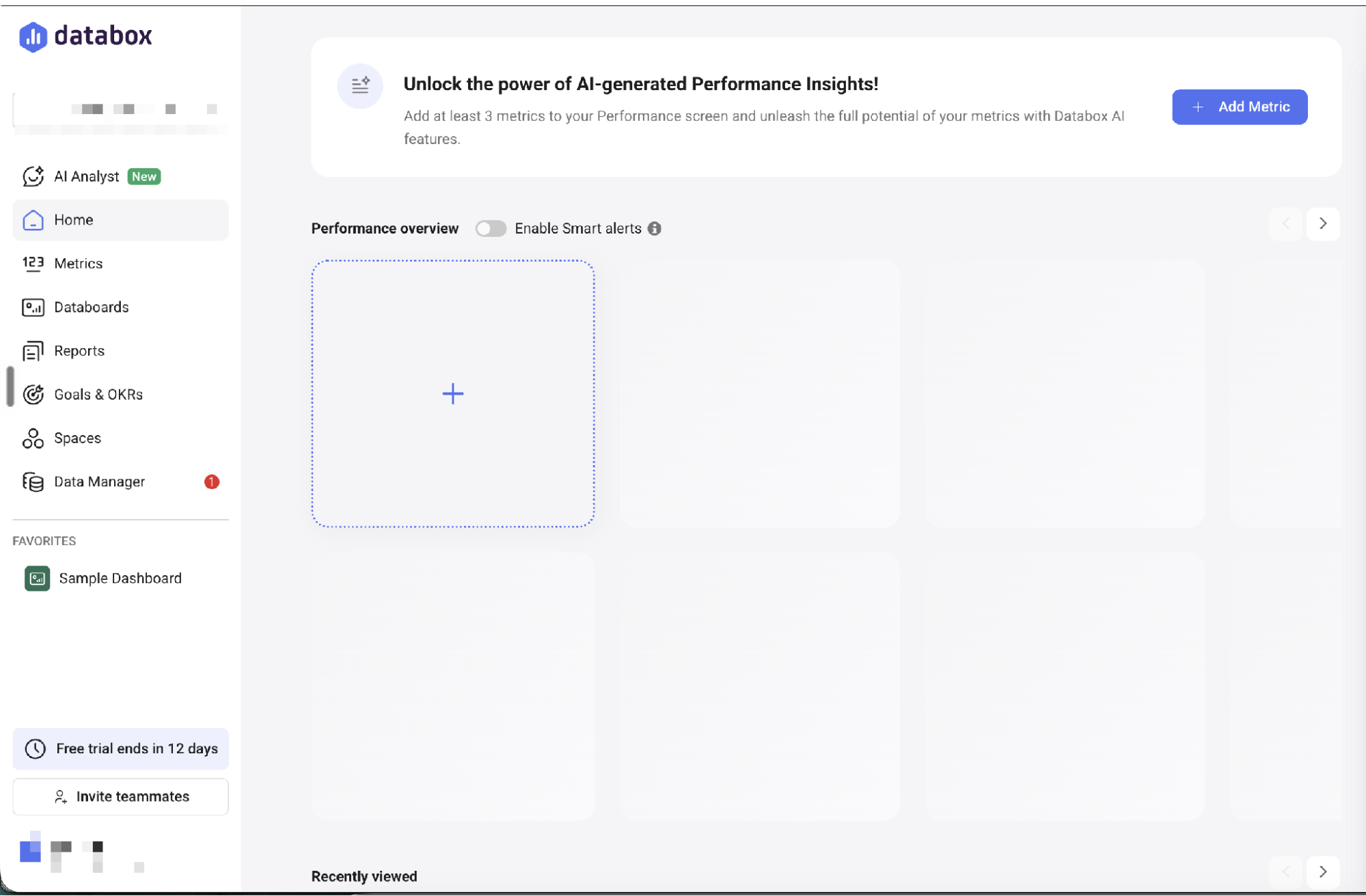
We did have a performance-specific niggle though. The databoard editor is straightforward to use, but a bit sluggish. There's a noticeable delay between clicking a widget and its editor responding. It doesn't render the platform unusable, but it is more noticeable the longer you spend building or editing databoards.
Databox-specific features to help with report building
Databox's Looped Databoards group multiple databoards together to tell a more comprehensive story with your data. Take a presentation on your email marketing performance. Instead of cramming everything onto one databoard, you could build three separate ones:
- an overview of your email platform performance as a whole
- a deliverability-focused view
- a breakdown of campaign-specific data
Loop them together and you get one shareable presentation where you can flip between databoards to focus on specific elements during your presentations, rather than sending three separate links or cluttering up your databoard with every single widget.
Databox offers custom and calculated metrics, letting you build filtered, segmented, or cross-source metrics like CAC, churn rate, or ROI, available on every plan. DashThis's Calculated Widgets, also included on every plan and currently in beta, cover similar ground: you can combine metrics from your integrations to build custom KPIs like blended ROAS across multiple digital advertising channels.
Here, blending Post Engagement Rate across Instagram and Messenger gives you one combined engagement number, exactly what you'd want when a client cares about overall social engagement rather than platform-by-platform detail.
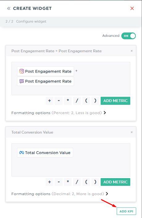
DashThis's widget builder lets you combine performance metrics from different platforms using basic operators.
Our verdict: Databox gives you a lot to work with, and building custom dashboards feels smooth once you're in. You've got multiple ways to build a report depending on how much help you want, and resizing widgets or changing visualization types is quick and accessible once you're in.
It takes some time to orient yourself in the platform. The interface is dense, so if you're new to report building, expect to spend a bit of time finding your footing, and the overall experience runs a touch sluggish throughout.
DashThis takes a more focused approach. We've kept our reporting builder leaner by design, so everything is more accessible for non-technical users to find and pick up, making it a better fit if you need a tool that just works for your marketing reporting.
3. Client communication features
A reporting tool should help clients understand what's happening in their campaigns and know what to do next. Here's how Databox handles sharing, presenting, and analyzing your reports.
Report sharing and presentation options
Like other reporting platforms, Databox offers the standard report sharing options:
- A shareable link recipients can open online
- PDF export for offline viewing, and scheduled email delivery
You can send or schedule a report to one or more Slack channels, for internal sharing or for clients who prefer to communicate there. Reports embed on an external page using an iframe, so live results can sit on your own site or an internal team wiki without anyone needing a Databox login.
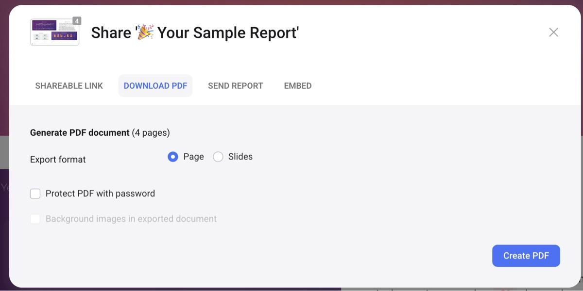
Presentation mode runs a report full screen for live client calls. You can also view your report's contents as presentation slides directly in Databox, useful if you build slide decks often since it skips converting reports from PDF into slides by hand. Charts and text resize automatically to fit. Give the slides a quick check after conversion, since auto-resize isn't always perfect.
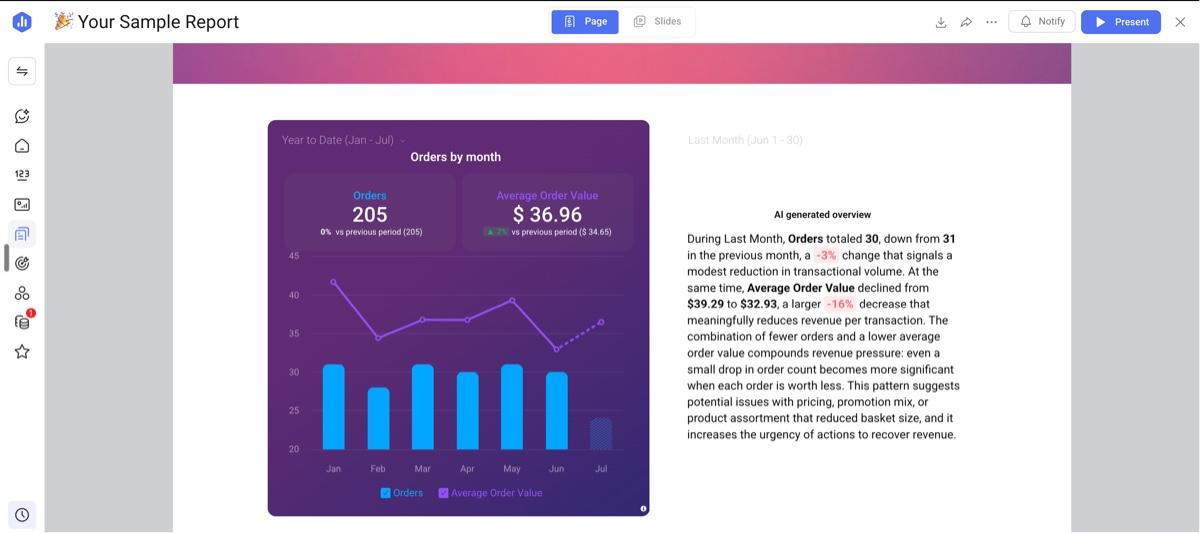
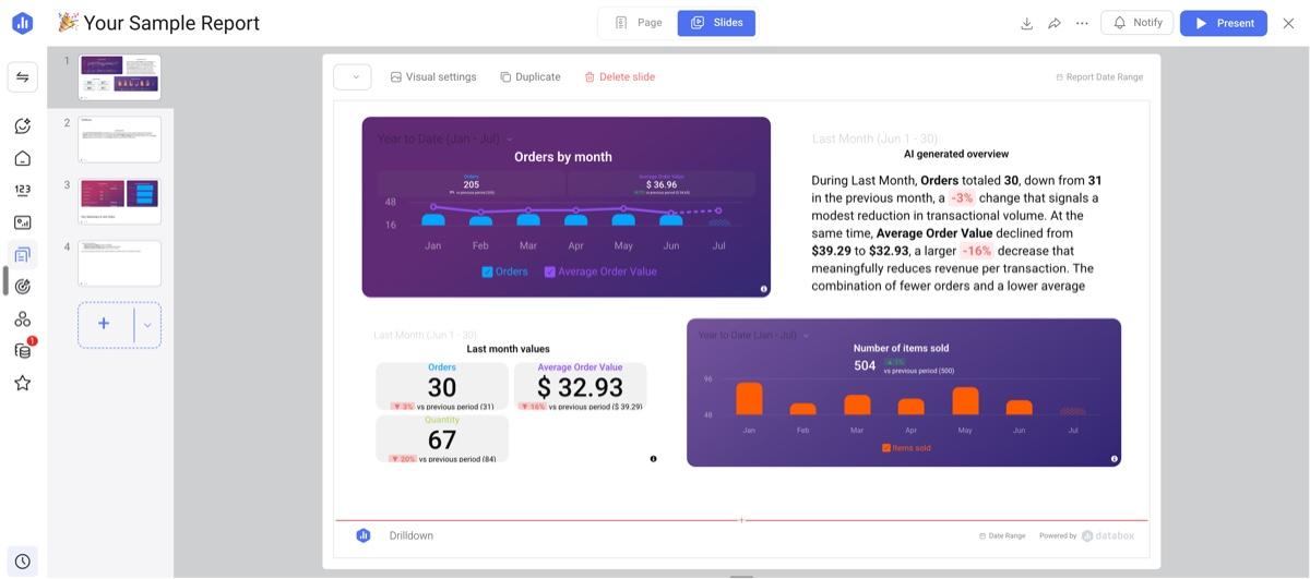
Reports being shown in report mode and slide mode
Databox's notifications feature can also keep your team ahead of client conversations before anyone opens a databoard.
Metric notifications deliver weekly updates as a single metric or as a scorecard combining up to five metrics in one alert. You've also got Smart Alerts, which flag unexpected changes in your data automatically, or manual alerts that trigger when a metric crosses a threshold you define, useful if you're running a PPC campaign and want to know the moment cost per conversion climbs too high.
DashThis doesn't currently offer automated threshold or anomaly alerts. Our AI Insights catch the same anomalies, cost spikes, and underperformance when prompted. That gap matters most for fast-moving PPC campaigns, where Databox's real-time alerts offer a real advantage to help you catch problems before they escalate, less so for standard monthly reporting that doesn't need minute-to-minute tracking.
White-label options and custom branding
The standard Databox branding is minimal. You'll only see a “powered by Databox” in the report footer, and you have the option to remove this branding on paid plans. For full white-labeling features, you'll need the white-labeling add-on on Starter, Pro, or Growth, which adds up to $250/month or $200/month on annual billing. It's included free on Agency Premium.
Databox's white-label add-on covers custom login domains, a branded email sender, full logo replacement across the web app, and a logo-branded mobile app login experience. Once a client logs in, they see your branding. While it's a pricey add-on, it's a comprehensive package for agencies that want brand consistency no matter where clients access their data.
In comparison, DashThis offers a leaner and more accessible set of white-labeled features. You get to remove DashThis branding, use a custom domain, and apply customized color templates, all included on the Professional plan and up so you can access white-labeling without a hefty cost.
Client account structure
If you use Databox's Agency Growth plan, you can give each client their own dedicated workspace for added data privacy and security. Per Databox's own documentation, each client account is its own workspace.
A boutique client and a client running several smaller businesses under one roof each get their own workspace, keeping their data separate, whether one person manages both accounts or two different teams handle them. You manage every client account from a single agency account, with access controls to decide which staff members can view which client.
In DashThis, your dashboards sit in one account, organized by dashboard rather than by client. For agencies serving clients with strict compliance or data security needs, Databox's Agency Growth plan and its client sub-accounts give you a real advantage, though it adds an extra step: switching accounts every time you move between clients.
For smaller agencies that prefer everything in one place, or don't need that separation, DashThis keeps your clients' data simple to manage day to day.
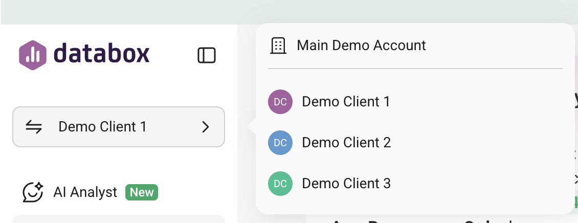
Example of the Agency Growth account structure
AI-powered features in Databox
Databox brands itself as an AI-powered platform, so we tested how well its AI features held up.
AI features are a focus at Databox, based on the number of AI features developed in the past year. Here's what's shipped in the past year, all in quick succession:
- Genie, its embedded AI analyst, launched in March 2026 into early access
- A Databox MCP server followed in June, letting you connect Databox to Claude, Cursor, ChatGPT, and other MCP-compatible tools so you can query your data without opening Databox at all. It's included on every paid plan.
- A Claude Skills marketplace for AI analytics workflows launched the same month.
Ask Genie to summarize a report and it'll surface the performance highlights, or turn it loose on raw data instead. In the Data Manager, point it at an uploaded dataset, like a CSV file, and it gives you an overview of what's inside before you build a report from it.
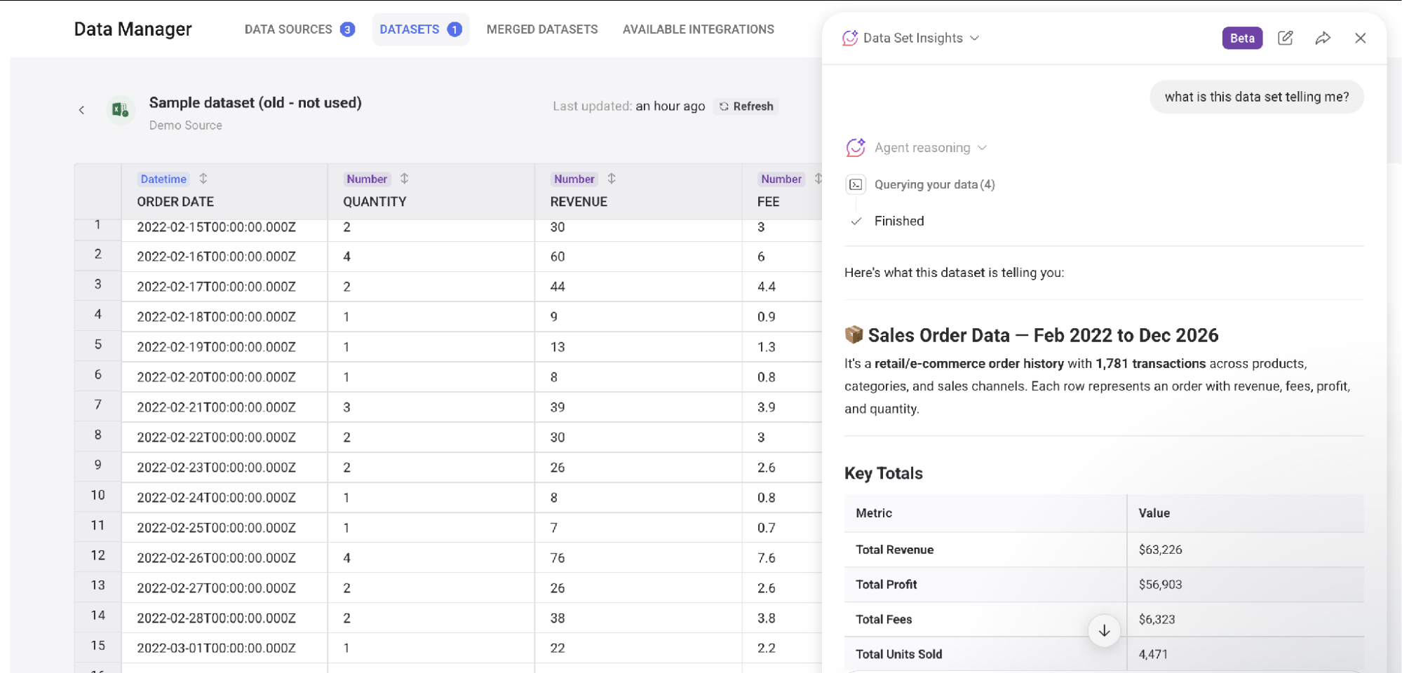
Chat with Genie directly about a dashboard and it runs a metric-by-metric trend analysis, flags three risks and opportunities, and suggests next steps you can act on. It proposes follow-up questions automatically too, so you're not stuck guessing what to ask next.
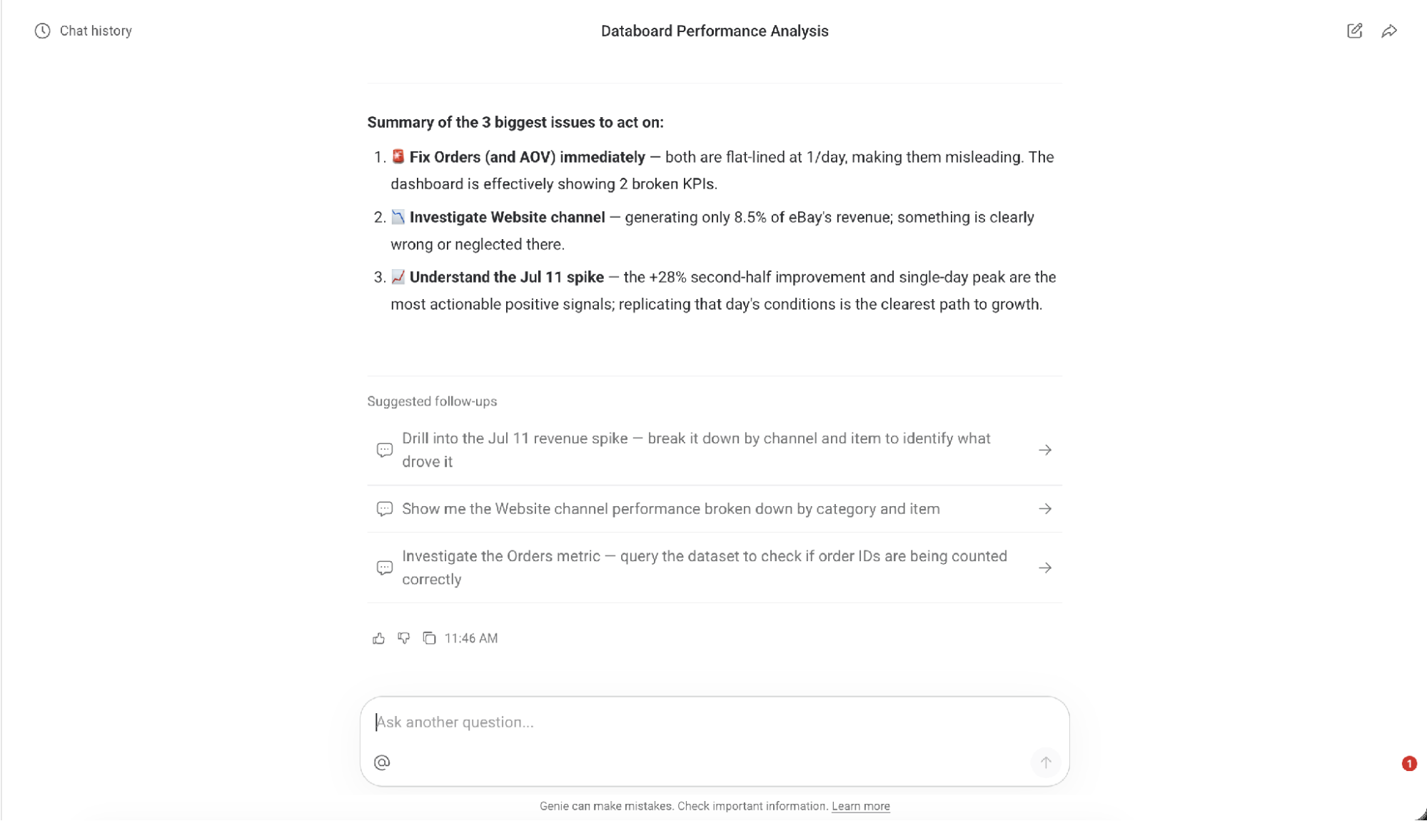
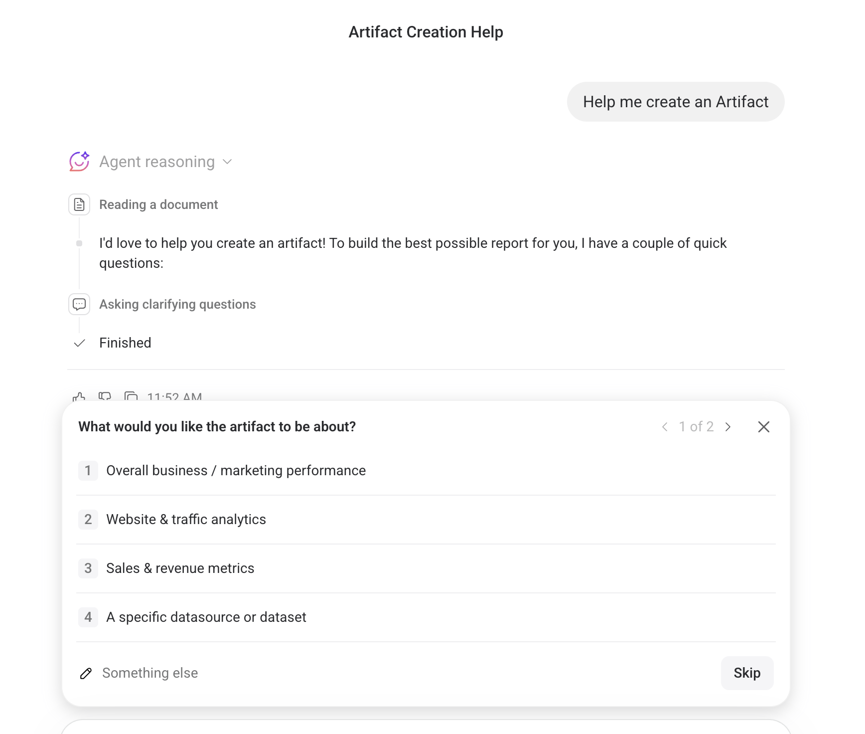
Genie builds Artifacts, which are live-rendered data visualization tools you create through a guided chat menu, right inside your dashboard. If the name sounds familiar, that's because it's the same term Claude uses for its own live-rendered outputs.
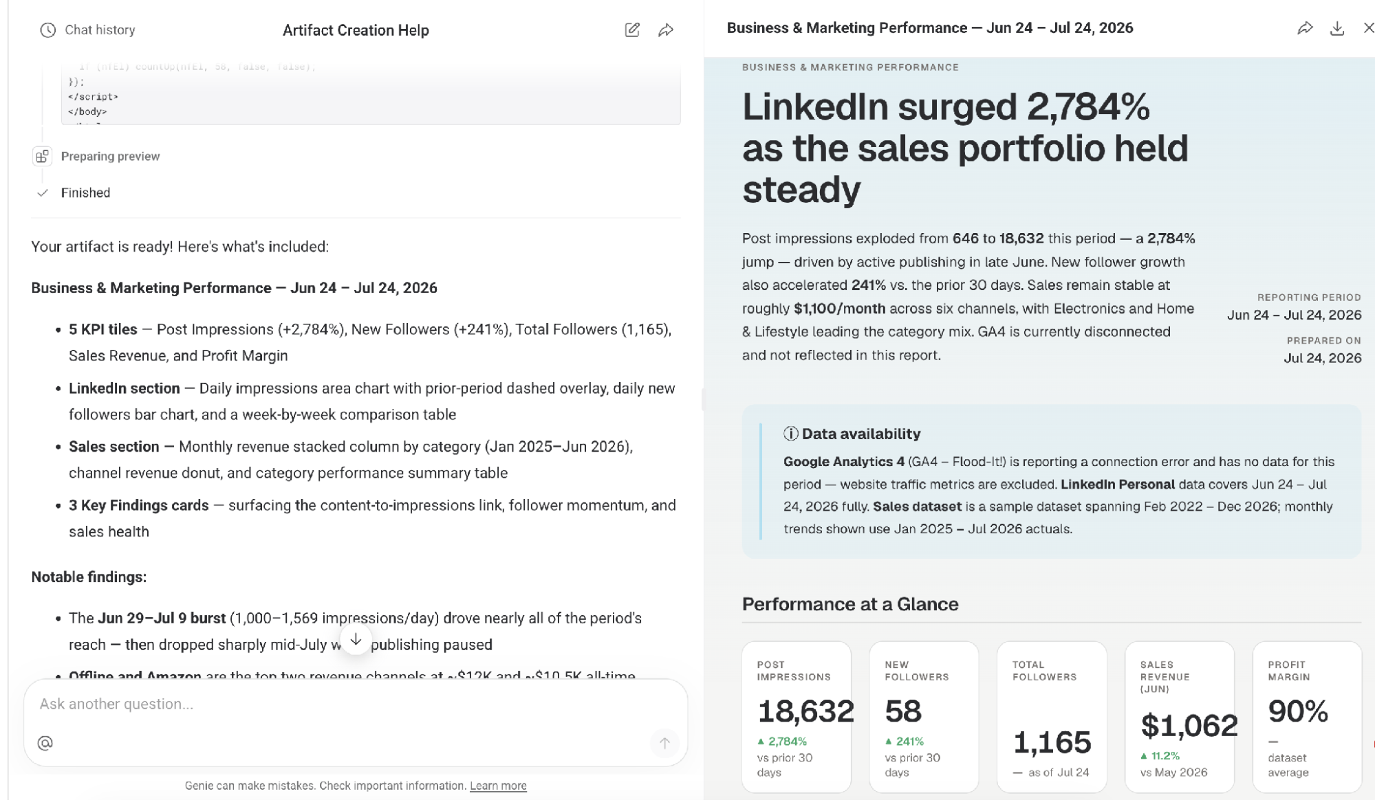
Ask Genie to generate a full report instead, and it builds one in AI format that you can download as a PDF or HTML file, a fast way to hand a client or teammate a visual snapshot without building a full report from scratch.
As of July 2026, Genie is in early access and free to use on any paid plan. Usage is capped at 50 chats per user per day and 25 messages per conversation, with limits resetting daily. This may change. Databox says it'll eventually move to a credit-based model, though it hasn't said when.
Our verdict: Genie holds up as an AI assistant. Building Artifacts directly from a databoard and connecting your databoard data to Claude or ChatGPT through MCP are both solid differentiators. DashThis doesn't offer either right now.
Instead, DashThis takes a narrower, steadier approach. You’ll get 10 AI-generated summaries a month on every plan, covering wins, issues, and opportunities in your data, with conversational analysis available as an add-on. For an AI analyst that builds visualizations, assists with reports, and digs into raw data, Genie has more range. If you want AI insights with a transparent, already-settled price, DashThis’s AI usage approach is easier to plan around.
4. Customer support quality
Databox's customer support channels
- Live chat and email support, responsive within minutes during US Eastern business hours
- A Help Center for self-service support
- A dedicated Customer Success Manager on the Growth plan and up
So, how is the support experience with Databox?
As G2 and Capterra reviews paint a mixed picture of Databox’s customer support experience, we wanted to see if this was still the case.
To test this, we reached out to Databox's support team during our account trial with several questions related to editing charts, connecting integrations, and using Databox features. When we asked about building our first databoard, our support agent looked at the integrations we'd already connected and offered to build it, or a Genie AI Artifact, for us directly, unprompted.
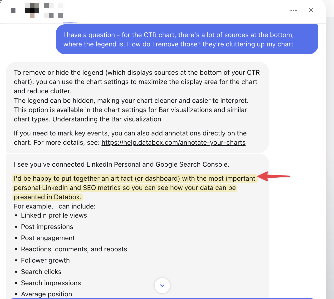
Most of what support surfaced pointed us toward Genie's AI features, but they also answered our direct questions and pointed us to relevant help articles when needed. Response speed was quick whenever our working hours overlapped with US Eastern time, matching Databox's own stated support hours. Databox says it doesn't offer a formal SLA, aiming to respond within minutes during business hours, though complex issues can take up to five business days to resolve. Outside business hours, expect a longer wait.
We also noticed the trial and sales experience ran on the pushier side. The support team asked us multiple times to get on a call with their product experts, with multiple email follow-ups from the sales team during the trial period. We found that a lot for a 14-day trial.
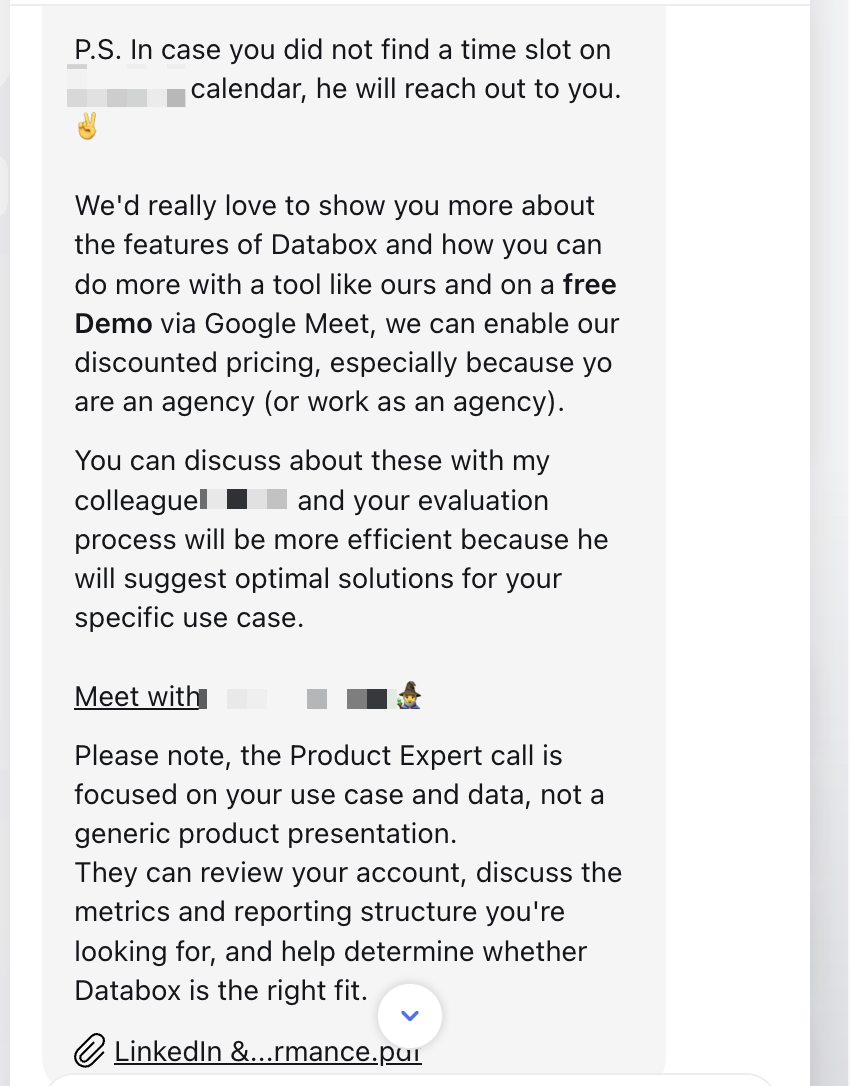
Our verdict: Databox's support is proactive and knowledgeable. Case in point: the databoard building example above. Response speed depends on your time zone, and its pushy sales approach may not work for everyone.
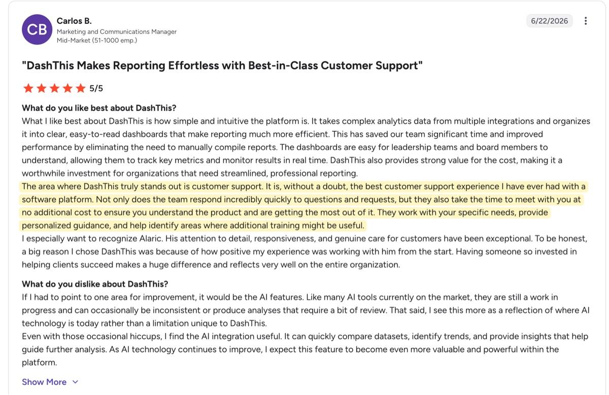
For DashThis, support meets you where you are. Our team works with you throughout your trial to help you get the most from the platform, and you'll only see a consultation call offered when you ask for one or show real engagement with your account. Our customers consistently point to the support team itself as a strength: Carlos B., a Marketing and Communications Manager, called it "the best customer support experience I have ever had with a software platform" on G2.
5. Pricing and scalability
Databox does a lot, but whether it's worth the cost depends on your budget and revenue model. We assessed the Agency plans, the track most relevant for marketing agencies, and found Databox tends to push customers toward the Growth plan as its recommended default.
Every Databox plan caps you at three included data sources, except Agency Premium at 50. Take one client running PPC campaigns: connect Google Analytics 4, Google Ads, and Meta Ads, and you've already hit the limit, on a single client. Add a second client and you're paying overages before you've built your second databoard.
DashThis's subscription tiers include all features, including AI features, 30+ integrations at a flat rate. The amount you'll pay stays flat as long as you stay within the number of dashboards and data sources included in that DashThis plan.
What you'll pay at different usage rates for Databox
Here's how the two compare as your client roster grows.