The Beginner’s Guide to Writing a Data Analysis Report That Gets Read And Drives Decisions

In the 1980s, data meant a thick contact list of names and addresses on paper that companies used for cold calls or direct mailers.
Sounds simple enough. But then the Internet and big data sets arrived, and that simplicity vanished. Fast-forward to today, and we now have access to CRMs, customer behavior data, AI insights and many types of marketing data under the sun to use for informed decisions.
Well, only if you can turn all that raw data into actionable insights.
And with the right tools, you don’t need to be a data scientist or have an entire data analyst team to do it. A data analysis report can help you make sense of all that data. But simply dumping data exports into a dashboard creates cluttered, unusable data analytics reports. To create reports clients actually use for decision-making, you need structure and audience focus.
We’ll walk you through the process. This guide explains how to write clear, easy-to-understand data analysis reports with a simple structure and step-by-step process.
Table of contents
- What is a data analysis report?
- Step 1: Define your report’s purpose and audience
- Step 2: Collect and organize your data
- Step 3: Pick the right metrics and KPIs
- Step 4: Analyze and interpret your data
- Step 5: Use the right visuals to support your point
- Step 6: Add context and insights to your dashboard
- Step 7: Write your executive summary and share the report
- Examples of structured data analysis reports
- Ready to create your own data analysis report with DashThis?
What is a data analysis report?
A data analysis report is a business intelligence document that turns raw performance data into clear findings you can act on. With a good data analytics report, you can spot trends and track progress, then make confident decisions backed by real data.
After reviewing an analytical report, your client should know what's working, what's not, what to do next, and why. For example, the dashboard below shows how DashThis presents Facebook metrics in a clear, scannable layout for a social media report. It helps clients quickly understand channel performance and compare it with other networks for a more detailed view.
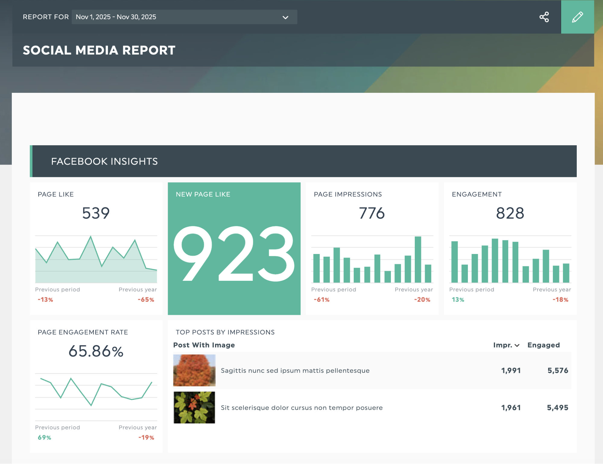
Get this social media report template with your own data!
What should be included in a data analysis report?
Let's break down the elements that make a data analysis report work:
| Component | Purpose |
|---|---|
| Executive summary | Gives executives a brief summary and direct links to the main sections. |
| Clear goal | Set the report's goal and choose the metrics and structure to use |
| Contextual information | Adds comparisons with past periods and targets to highlight performance trends |
| Key insights | Turns data into clear, practical answers to drive data-driven decisions |
| Data visualization tools | Makes data easier to interpret and more memorable |
| Practical next steps | Lay out concrete next steps: what to start, what to stop, and what to continue based on this data. |
OK, now that you know what to include, what are the steps for writing a data analysis report? Here's our step-by-step guide to make sure your reports include all the critical parts and help your clients make decisions.
Step 1: Define your report’s purpose and audience
This provides the foundation for the rest of your sets up your report, making the rest of this guide much easier to follow.
Before you start on the other steps, make sure you can answer three questions:
- Who will be reviewing your data analysis report?
- What specific insights or answers do they need?
- What should they do after they review it?
Let’s say you’ve got an upcoming presentation with your client’s head of marketing to review your social media strategy. They find the number of social media platforms overwhelming and want to know which channels to focus their content strategy and marketing budget on.
Later, you learn that your head of customer engagement wants to join the meeting and is interested in how social media can drive customer engagement.
So, you’ll prepare a report that compares each channel’s metrics side by side, focusing on key performance indicators such as overall engagement, how well each channel drives social media traffic to the website, and paid ad ROI, while keeping engagement metrics to address your customer engagement head's concerns.
Identify each person’s main concerns and address them in your report writing. Define the types of data you will track.
To make things more straightforward, you can turn it into a little table, like:
| Job title | Key concerns | KPIs to track |
|---|---|---|
| Head of Marketing | Which social media channels should we invest our budget and resources in? | Engagement rate by platform, ROI per channel, conversion rate by platform |
| Head of Customer Engagement | Which social channels are most effective at engaging our customers? | Response rate, sentiment analysis, engagement rate |
Tailor your report to the level of detail each job title expects. Broadly, executives focus on ROI, revenue, and overall business impact. Managers and specialists look for execution details, such as individual performance metrics.
Step 2: Collect and organize your data
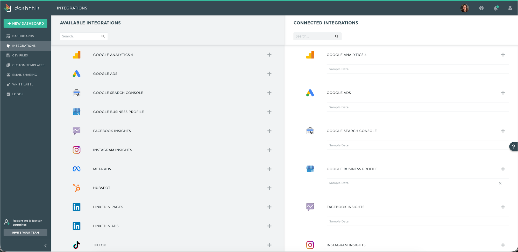
You can import your data manually by exporting from each platform and checking that everything matches. But that process eats hours you could spend on strategy. Use a reporting tool like DashThis, with 34+ integrations, to pull data from your marketing tools straight into your analysis report.
Connect your digital marketing tools once, approve access, and your data flows into ready-to-present dashboards. Spend less time wrangling exports and more time shaping the story you want to tell.
What if your data comes from a proprietary CRM or a tool without a native integration? You can upload it using our CSV uploader.
Step 3: Pick the right metrics and KPIs
Once you know your goal, pick metrics that track actual progress.
Which metrics matter most?
Be careful not to chase numbers that look important but don't show real progress toward your goals; these are vanity metrics. To steer clear of them, check each metric by asking yourself two questions:
- What specific business outcome or business decision are you trying to achieve or make?
- How does this metric show progress toward that outcome?
If you’re coming up blank or unclear on these questions, chances are you’re dealing with a vanity metric.
Here are three common reporting scenarios you may come across:
| Business goal | Vanity metrics | Meaningful KPI example |
|---|---|---|
| Increase conversions from 2.5% to 4% by Q2 2026 | Page views and average time on site | Conversion rate by stage, cart drop-off rate, revenue per visitor |
| Reduce customer acquisition cost by 35% by Q4 2026 | Ad impressions, total clicks, follower count | Return on ad spend (ROAS), cost per acquisition (CPA), customer lifetime value to CAC ratio |
| Rank in top 3 for 25 keywords by Q3 2026 | Total indexed pages and keyword counts | Number of target keywords ranking in top 3, organic click-through rate (CTR), organic conversion rate |
Let’s tie it all together. We’ll add new columns to our earlier table to separate vanity metrics from the KPIs that matter.
| Stakeholder | Key concern | Vanity metrics | Example meaningful KPIs |
|---|---|---|---|
| Head of Marketing | Where should we put our social media budget and resources? | Total followers, post impressions, likes | Cost per acquisition (CPA) and ROAS by platform, conversion rate from social traffic |
| Head of Customer Engagement | How can we use social media to build stronger customer relationships? | Total comments, share count, follower growth | Customer retention rate of social engaged users, positive brand mentions and sentiment trend |
The right metrics answer your stakeholders' specific questions and show real progress toward their goals. If a metric can't do either of those things, it doesn't belong in your report.
Step 4: Analyze and interpret your data
When you analyze data, you're doing three things:
- Finding out what happened
- Understanding why it happened,
- Deciding what to do next.
This applies to good and negative results. If it’s a positive result, analyze why it happened so you can replicate or scale it for future business growth. If they’re negative, dig into the cause and address it quickly.
Let's say you're an SEO agency seeing a sharp rise in organic traffic and keyword rankings for your client's site this quarter. That’s awesome! Let's break down the analysis step by step.
What happened?
First, communicate what happened using simple, clear terms. For example:
“Over the past 30 days, organic traffic rose from 8,000 to 16,000 monthly visitors, and 12 keywords moved into the top three positions.”
Why did this change?
Start by examining trends across metrics and flagging any anomalies. Then ask yourself whether outside factors might be influencing the results
For an SEO result, begin by checking whether any SEO activity occurred just before the metric moved, such as:
- Did you publish new content or update existing pages
- Improve your site’s performance?
- Did your backlink profile change significantly?
Then look for external factors that could shape the result, such as Google algorithm updates, seasonal search patterns, and changes in competitor rankings. In this case:
- Published a buyer's guide 8 weeks ago. It now ranks for 15+ purchase-focused keywords.
- Google’s latest algorithm update favored sites with strong expertise, experience, authority, and trust; our recent author bio changes helped boost those signals.
- Cut landing page load time from 4.2s to 1.8s on key pages, boosting engagement by 45% and reducing bounce by 30%.
AI can help with your analysis by spotting patterns in your historical data that you might miss. DashThis's AI might show that faster page speed is linked to lower bounce rates and higher rankings, or that content updates steadily lift related keyword positions, helping you confirm what's working sooner.
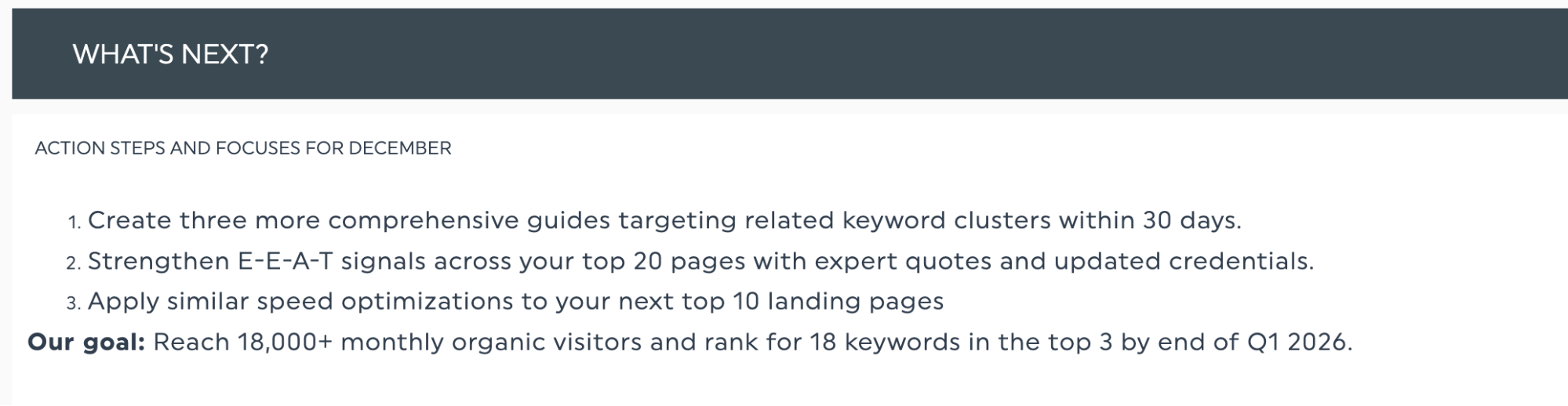
What will we do?
This is where you turn insights into action. Based on the data, outline specific next steps and set measurable goals.
For our SEO example, here's what that might look like:
Actions to build on this momentum:
- Create three detailed guides focused on related keyword groups within the next 30 days.
- Boost E-E-A-T on your top 20 pages by adding expert quotes and up-to-date author credentials.
- Apply the same speed improvements to your following 10 landing pages.
Goal: Reach 18,000+ monthly organic visitors and rank for 18 keywords in the top 3 by end of Q1 2026.
This three-step data storytelling structure turns raw data into a clear story that makes your point clear to your stakeholders.
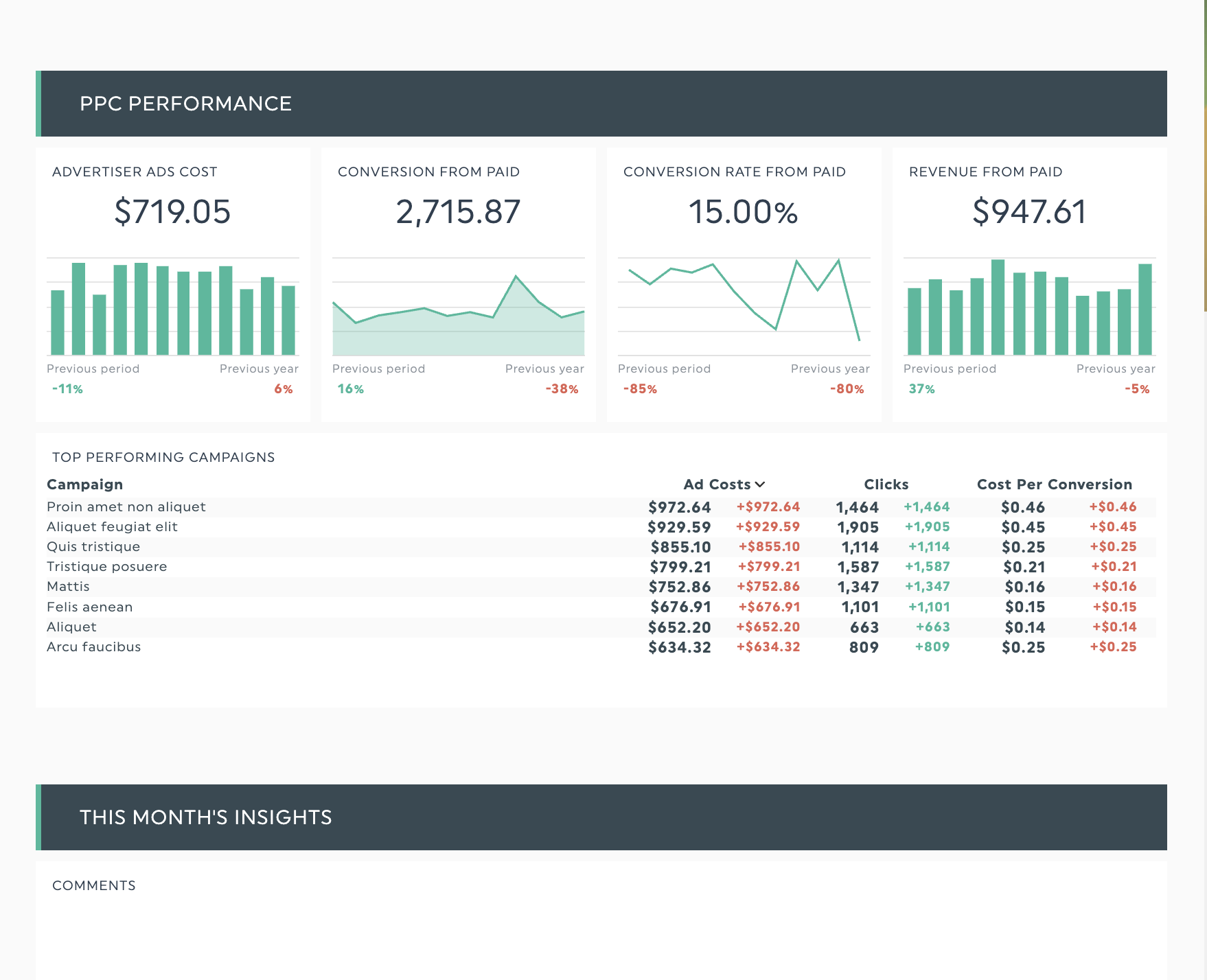
Step 5: Use the right visuals to support your point
Telling a story with data means directing readers to what matters most. Charts, such as bar graphs and pie charts, serve as signposts. Small touches, such as colour coding highlight the key parts of the story.
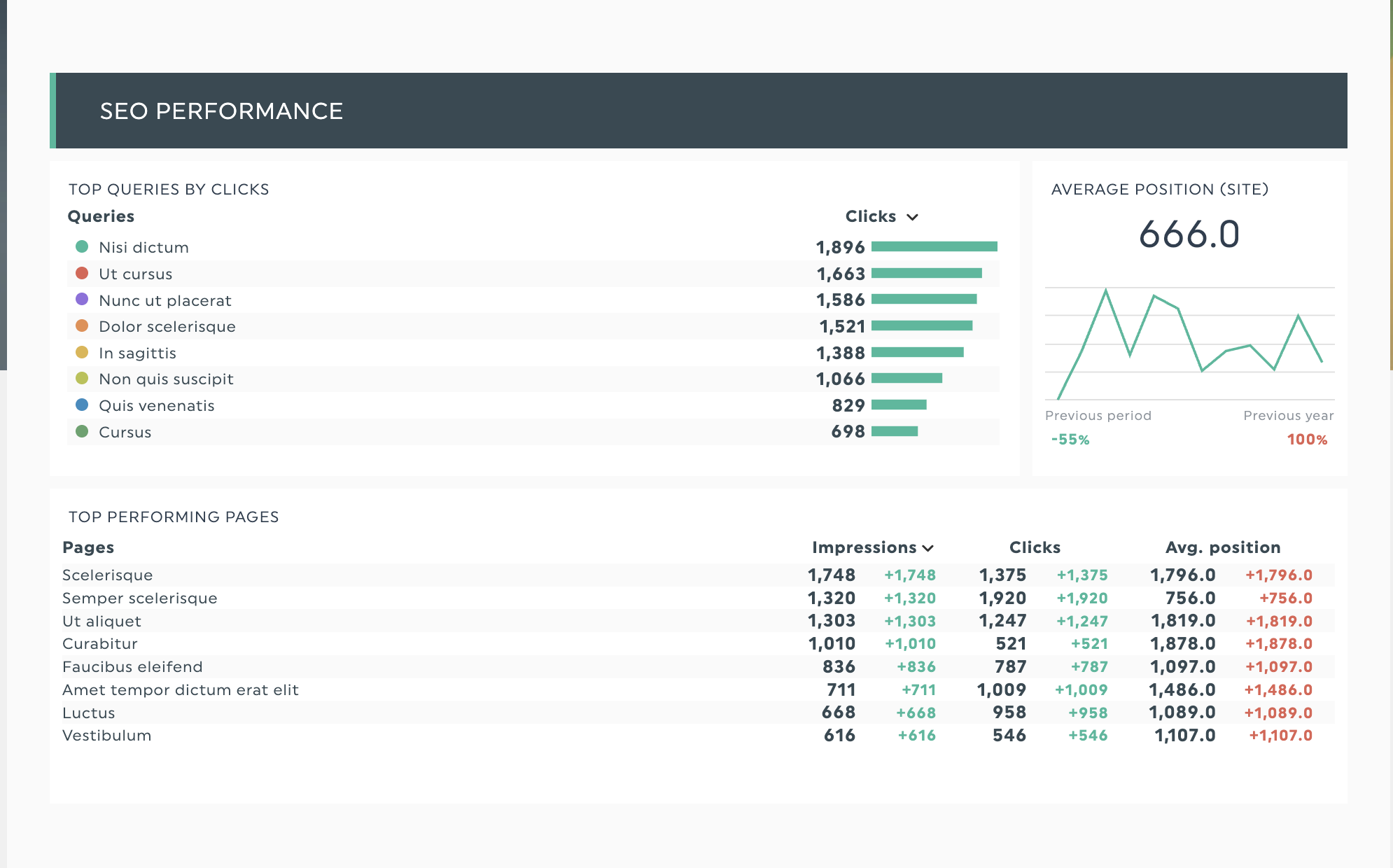
SEO data presentations often include numerous numbers and multiple metrics. Suppose you want to spotlight your best landing pages as prime candidates for page-speed work. Our SEO report template can show month-over-month movement with a small table of average position and clicks.
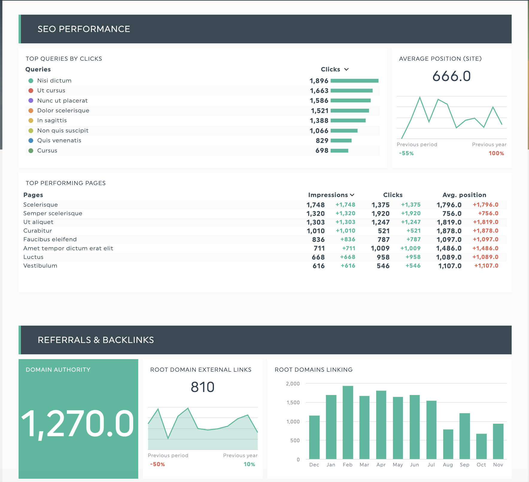
Get this SEO report template with your own data!
Need a more in-depth explanation on how to use visuals in your reporting? Learn more about effective data visualization techniques in our guide.
Step 6: Add context and insights to your dashboard
You’ve got your analysis and visuals, so how do you put this all together to communicate your findings in the actual data analysis report? Now, you need to help the readers of your report understand what you saw in your analysis and explain it clearly.
Back in Step 4, we analyzed the SEO data using three key questions: what happened, why it happened, and what to do next. Now, let's map each answer to where it belongs in your report.
| Analysis question | Add to | Useful DashThis feature |
|---|---|---|
| “What happened?” | Next to the relevant metric/chart | Comment on widget |
| “Why did this happen?” | Below section or a note on a widget | Standalone comment box or comment on widget |
| “What will we do?” | Executive summary or end of section | Text widget |
Add a comment to a widget to summarize data or clarify a specific data point to help readers quickly grasp the information.
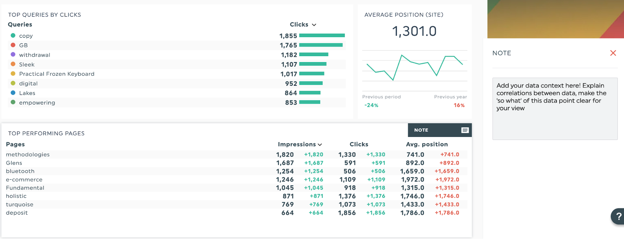
For broader strategic planning or explanations like outlining next steps or setting goals for the next period, use a text widget. This gives you space to lay out action items without cluttering individual metrics.
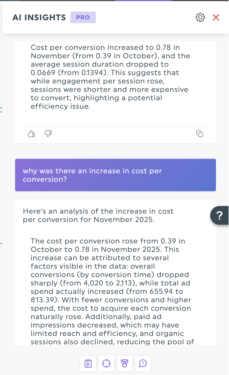
Get more from your data with AI insights
While comments and text widgets let you add your expert interpretation, DashThis's AI insights can speed up the process. For instance, the Summary lens quickly surfaces key marketing takeaways for your reporting period, so you can focus.
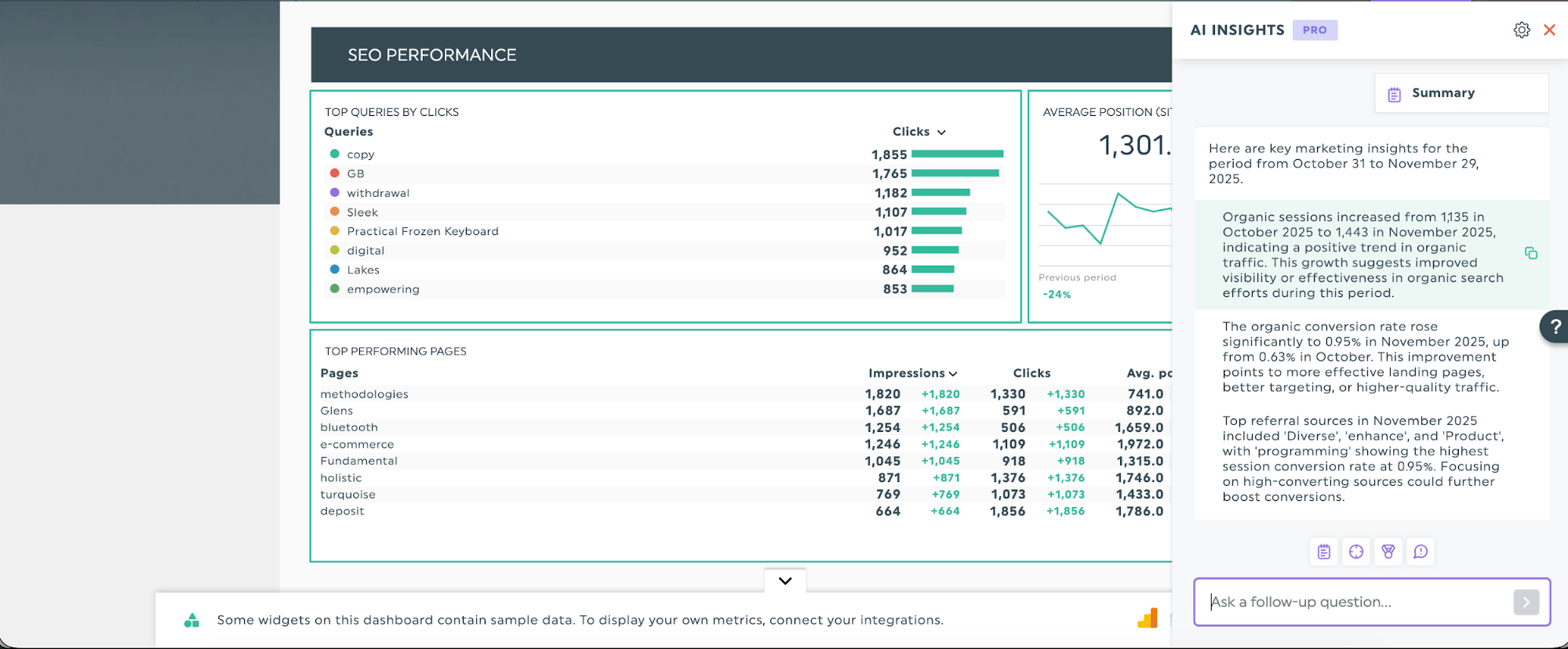
When those high-level insights raise new questions, AI Insights Pro lets you chat with the AI to explore details. If the summary shows an increase in cost per conversion, you can prompt the AI to analyze the trend further.
Step 7: Write your executive summary and share the report
Yes, the executive summary is the first thing people read, but we recommend working on it last.
This way, you’re already aware of what’s covered in the data analysis report and can be sure you haven’t missed anything. An executive summary should contain:
- Problem
- Key findings
- Recommended next steps and rationale
Keep your audience in mind as you write. Your executive summary should give readers exactly what they need: the key facts and next steps, without diving into details they'll find later in the full report. Think of it as a preview that helps them decide where to focus their attention.

When you’re ready, share your completed report via a scheduled email update or a shareable link. This is a good place to include the executive summary, so readers can get the jist of the report before reading the details.
Examples of structured data analysis reports
DashThis offers 50+ prebuilt templates that automatically structure marketing reports and data analyses, so you can focus on delivering insights rather than formatting. We’ve included suggestions on which data points to highlight and call out for these templates.
Digital marketing report
Get this digital marketing report with your own data!
Digital marketing campaigns often span multiple channels, which means you need to track, compare, and analyze metrics across different platforms. Use this report template to bring them together, including metrics from SEO, email, Google Analytics, and other sources.
Ideal for multi-channel marketing campaigns or marketing strategy reviews that require simultaneous analysis across multiple channels.
SEO report
Get this SEO report template with your own data!
SEO requires sustained effort over months or quarters, so your reports should show steady gains and demonstrate that your strategy is on track. Make it easy for your team and clients to track SEO metrics such as click-through rate, referral traffic, domain authority, and backlinks.
Local business report
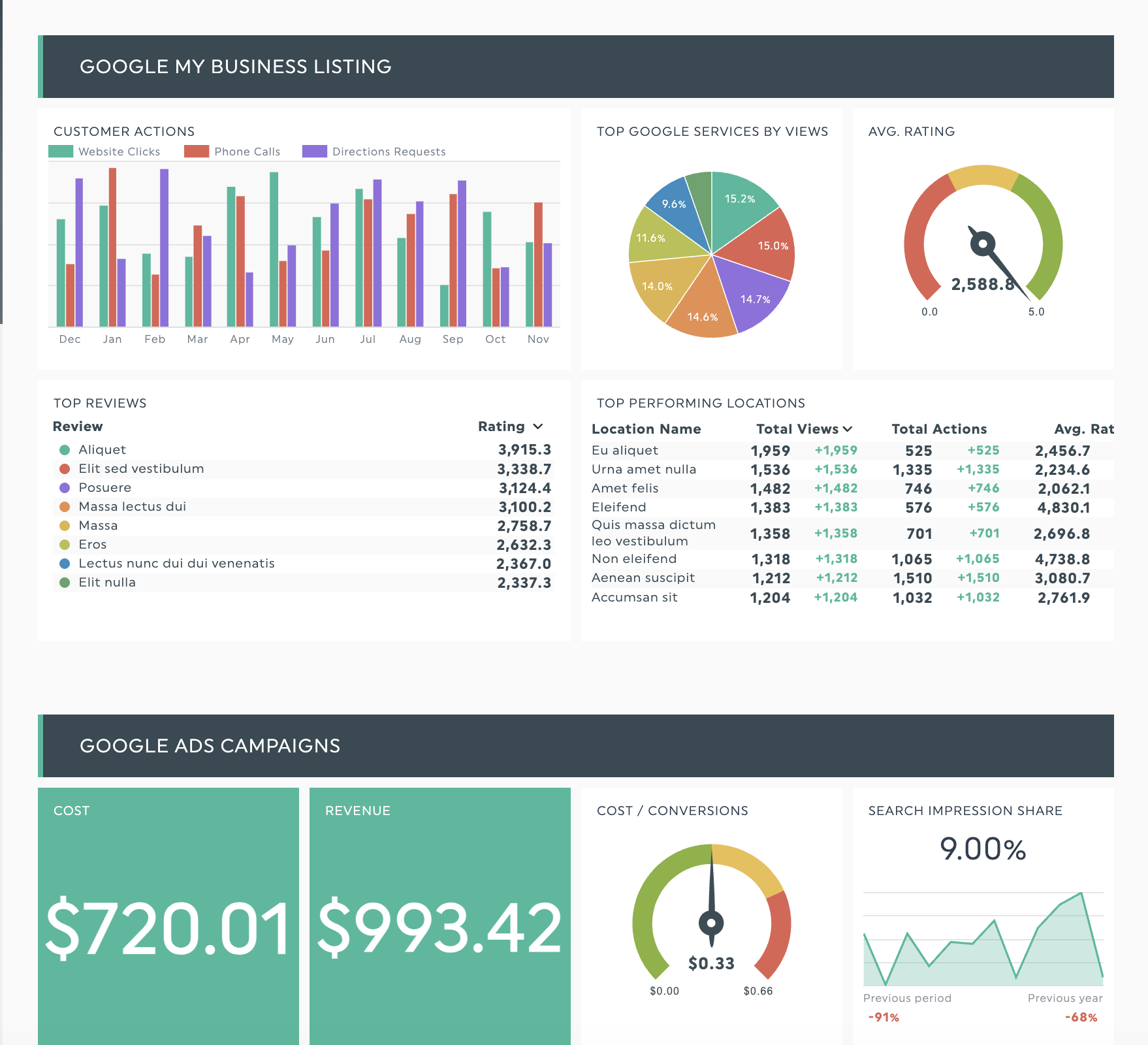
Get this local business report template with your own data!
Working with a small business owner? Like any business leader, they're concerned about marketing ROI, but with tighter budgets and often limited marketing expertise, there's less room for error. A Salesforce report finds that 61% of SMB leaders say affording business costs is challenging.
Given these constraints, clearly link your campaign to the revenue it generates and explain the numbers in plain terms. Expect questions such as “What return will this campaign deliver?”
This template connects online metrics to real-world results by tracking Google Business Profile views, local search rankings, and directions requests alongside your digital campaign performance. Ideal for agencies managing local businesses who need to prove and optimize ROI from both digital marketing and local search visibility.
Ready to create your own data analysis report with DashThis?
Writing a data analysis report doesn’t have to be complicated. Define your audience, choose the right metrics, and use our three questions to let your data tell a clear, relevant story for your readers. Use this step-by-step approach to turn raw data into clear, practical takeaways for your clients.
DashThis handles the busywork so you can spend more time on strategy. Plug in your data sources and pick a report template to get started. Then focus on what the numbers mean instead of building spreadsheets. You could reclaim over 20 hours per month—exactly what Jelly Marketing saved by switching from manual Excel spreadsheets to automated DashThis reports.
Start your free 14-day trial and streamline your data analysis reports today.

Discover AI-driven Insights with DashThis
Read More

Don’t miss out!
Follow us on social media to stay tuned!
Automate your reports!
Bring all your marketing data into one automated report.
Try dashthis for free