How to Create a Google Sheets Dashboard (Free Templates)

The monthly marketing campaign is finally over and you’re now ready to present your agency’s hard-won results to stakeholders.
There’s just one problem.
The report looks overwhelming, even with its charts and pivot tables. Can your client, a C-suite business executive with little marketing experience, understand it?
In this guide, we look at an alternative way of turning complex information into digestible graphics—so digestible, in fact, that anyone can grasp it within minutes.
We’ll also share our free Google Sheets dashboard template for you to get started immediately.
- What is a Report with Google Sheets?
- How to Create a Google Sheets Dashboard with DashThis
- Best Practices for Creating a Google Sheets Dashboard
- Google Sheet Dashboard Templates
- Automate Your Reporting
What is a Report with Google Sheets?
A report with Google spreadsheet displays critical information visually (e.g., key metrics turned into a Gantt chart and pivot table).
You usually sync these reports from sources like Google Forms or import data from a CSV file or an API connector (e.g., Facebook Ads).
In some cases, marketers will upload the spreadsheets in a reporting tool like DashThis to better visualize complex information, distill actionable insights, and automate reporting from start to finish.
How to Create a Google Sheets Dashboard with DashThis
It takes a few clicks to create a beautiful and functional dashboard on DashThis.
Here’s a quick step-by-step walkthrough to connect Google Sheets with our automated marketing reporting tool:
- Check that your spreadsheet meets the requirements here (e.g., DashThis only supports Google Sheets, not Microsoft Excel)
- Connect your Google Sheet source to DashThis
- Select Integrations Manager
- Click Add next to Google Sheets
- Choose your account
- Grant permission to allow DashThis to gather data from Google Sheets
- Pick the spreadsheet and source(s) you want to connect
- Click Custom Widgets
- Pick your Graph Types
Enter the metrics and dimensions accordingly. You will end up with a Google Sheets dashboard like this.
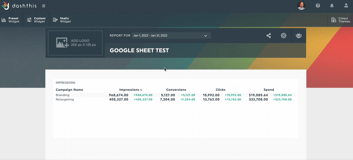
Notice the clean and straightforward layout. Anyone—even clients with zero marketing expertise—can quickly gauge the performance of each metric.
Insights and limitations
Even the most user-friendly software tool stumps new users from time to time.
To make the most out of your Google Sheets reporting on DashThis, note the following:
- Add a line in your sheet and set the metric value to 0 if a source no longer contains data from a past period, but you still see it from said period in the widgets.
- DashThis uses the name, format, and position in the spreadsheet of each column. Any changes made to these parameters will impact your widgets and reports (tip: if you encounter an error in your widget, follow the instructions in the error message or contact support for assistance).
- Widgets are displayed as N/A for numerical values with empty cells.
- DashThis pre-defines the default order for each metric as descending (i.e., values will be ordered from highest to lowest in a list or a multi-column list widget).
- Our reporting tool stores your historical data after importing. To remove it, insert a 0 for the periods you want to delete. This will reset it.
- DashThis pre-defines the default aggregation format as a sum for all numbers and currency formats (i.e., if multiple values exist for the same dashboard period, we will sum them up in your widget). Only percentage formats will be aggregated as an average.
With these insights at the back of your mind, you can whip up an engaging report in the blink of an eye.
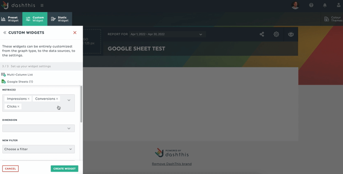
[DashThis editor] Select metrics in dropdown menu via Custom Widgets
Of course, our tool also comes with a few limitations, such as:
- Limiting 52 columns, 5,000 rows, and 40 tabs from a spreadsheet file in importing
- Updating for new data in spreadsheet hourly
- Importing only original data (e.g., you can’t import pivot table or gantt chart)
There are several workarounds to some of these limitations. For example, consider creating another sheet with the remaining data if your spreadsheet exceeds the columns, rows, and tabs limit.
Drop a message to our support team if you need a hand. We’ll do our best to resolve the issue. 😊
Best Practices for Creating a Google Sheets Dashboard
Great reports convey critical information at a few glances.
Whether you send them to a marketing specialist or a client with zero marketing expertise, they should be free of endless rows of data that take hours to dissect.
These three best practices help you create a digestible Google Sheet dashboard for all stakeholders.
Keep it short and concise
It takes effort to perform data analysis on raw data fresh out of the marketing oven.
Clients rarely have time or interest to decipher every single metric. These managers or C-suite leaders usually look for metrics that impact revenue and ROI the most.
In the Google Sheets dashboards, ensure you prioritize metrics that drive a business outcome.
For example, if you’re monitoring the number of monthly leads in a Facebook retargeting campaign, you’ll want to focus more on metrics like top converting campaigns and cost-per-conversion, not number of likes (since like count rarely correlates with engagement and conversions).
Use data visualization by using different graph styles, widgets and formats
Data visualization is the process of turning data into visually beautiful graphs and charts, so that you can make sense of your marketing (or sales) dataset quickly.
It hits the sweet spot between comprehensive and digestible.
Say you want to show a client their overall social media performance. Rather than displaying multiple channels next to each other, merge them into a single widget, like this.
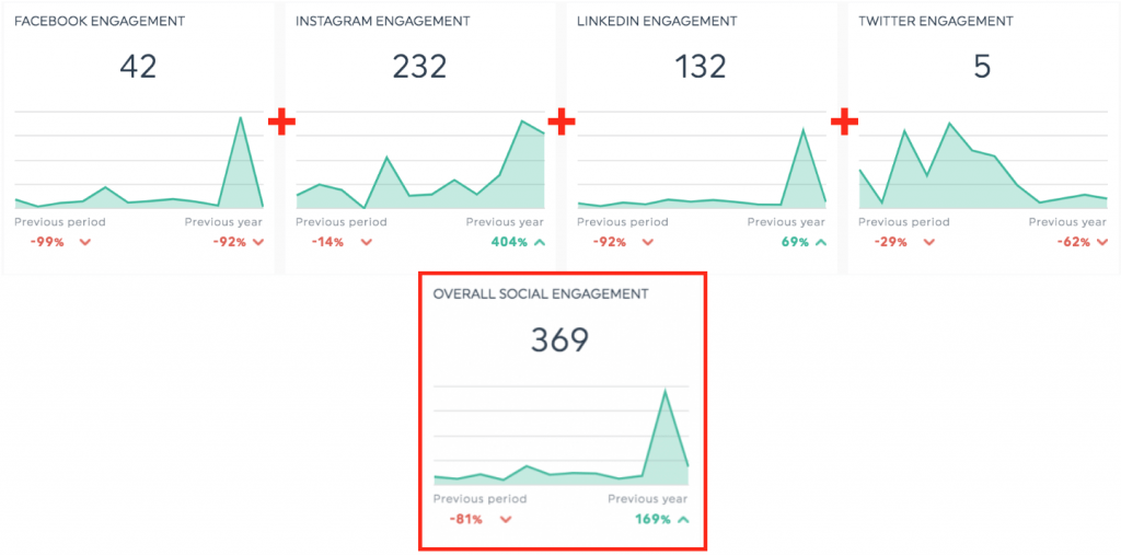
It helps the client understand how each channel contributes to the overall engagement (tip: to do this, click Edit Widget > Merge Widgets).
Make it shareable
On top of creating a comprehensive and digestible marketing dashboard, it’s also vital to make it as accessible as possible.
Consider using a reporting tool like DashThis to speed up your reporting.
You can share the dashboards via a shareable link, export them as a PDF, or schedule an automatic email dispatch.
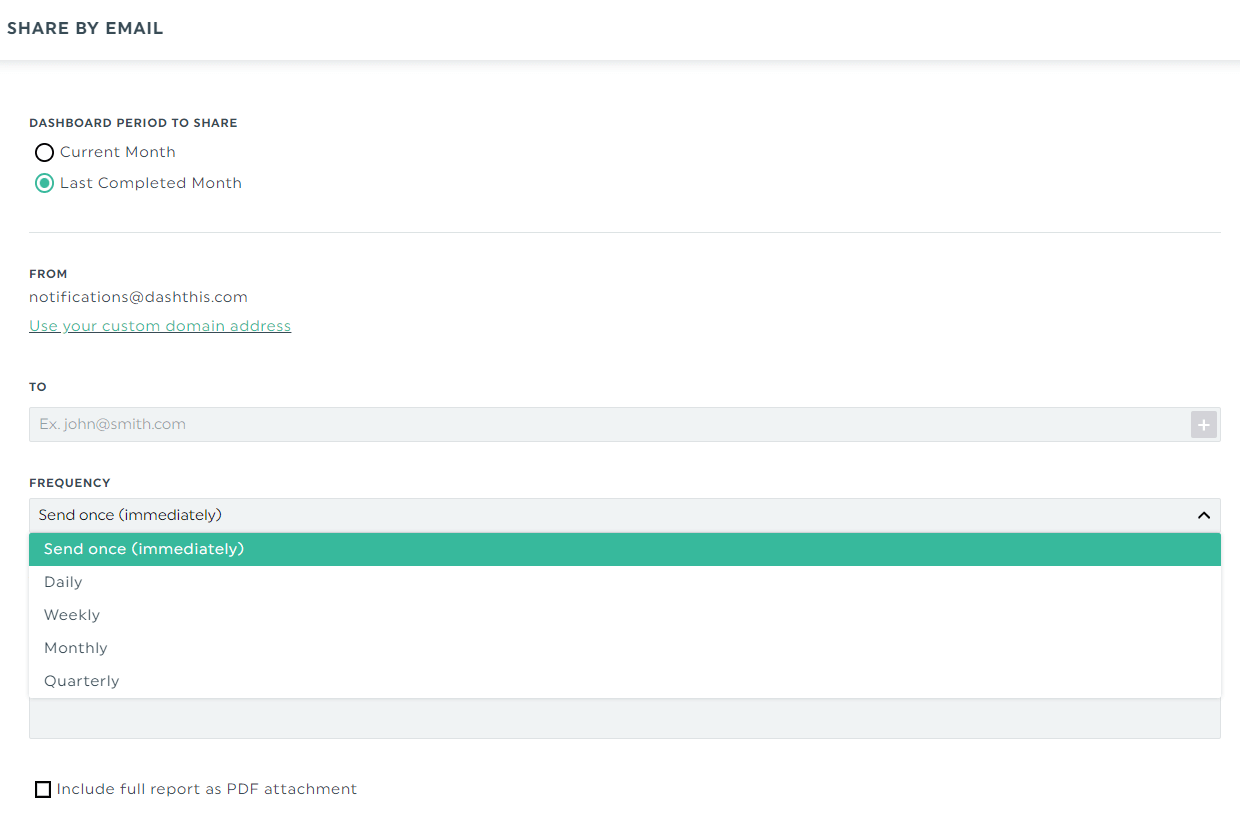
Click Sharing Options> Share by Email.
Select the dashboard period, recipient’s email address, and frequency (e.g., once, weekly, monthly) and click Save when you’re done. You can also auto-generate the full report as a PDF attachment if your clients prefer to keep it on file.
With automatic email dispatch, you can streamline the reporting workflow and gain back hours of your time.
Plus, clients can easily view the reports in the selected data range in real time and access their dashboards whenever they want.
Google Sheet Dashboard Templates
Customizable templates save effort.
Whether you’re tracking SEO performance, monitoring sales activity via HubSpot CRM, or combining several data source platforms into a single report, admit it; templates are time-saving assets.
You can take two free Google Sheets dashboard templates (from our template gallery!) for a spin.
Create custom sales reports with our sales report template
Grab this sales report with your own data!
Sales reports identify bottlenecks in the sales pipeline.
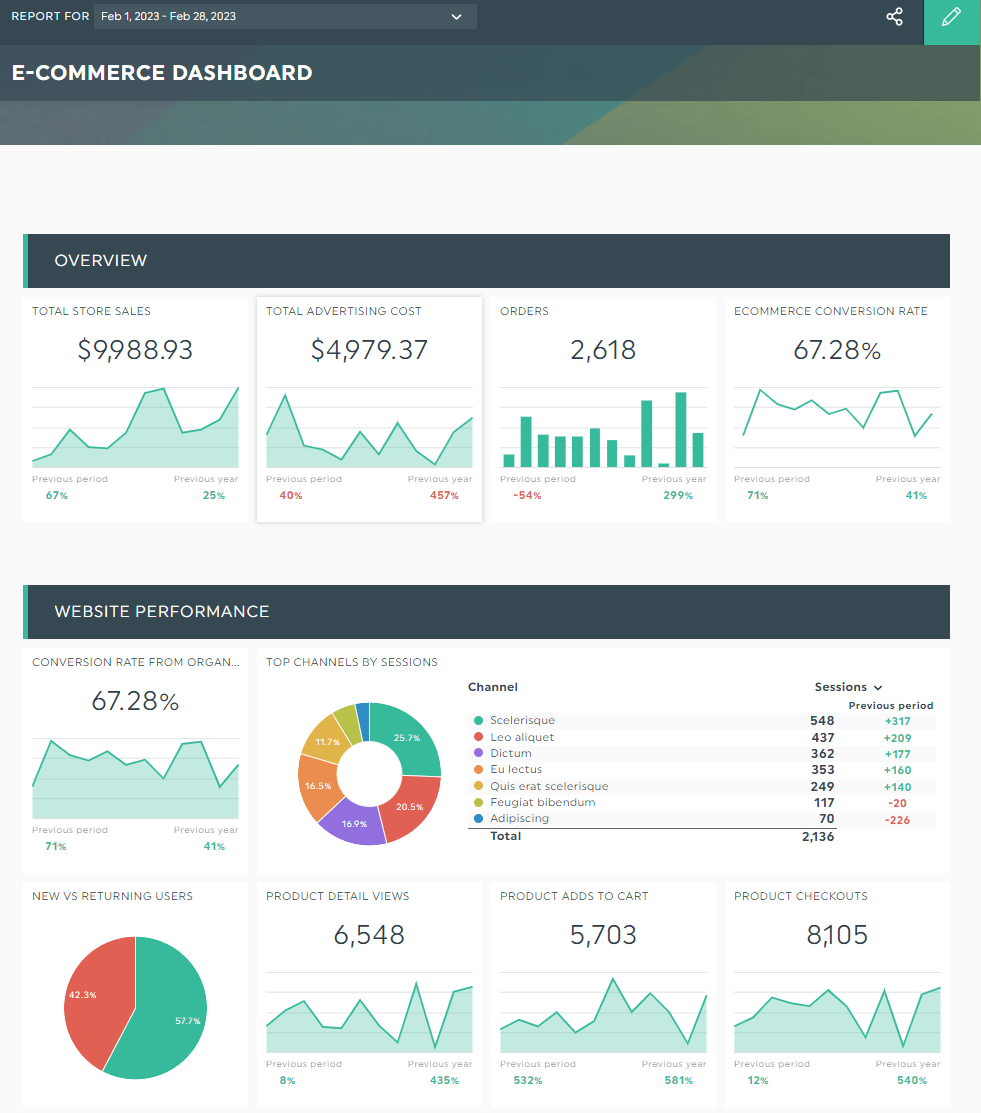
This e-commerce sales dashboard shows how organic traffic and paid ads impact store sales.
It measures metrics like product views, checkouts, and the ratio of new and returning users (see pie chart on left), giving stakeholders a cohesive look at the overall e-commerce sales strategy.
Build a KPI report template for marketers
Grab this digital marketing analytics dashboard with your own data!
Customers are scattered across multiple channels.
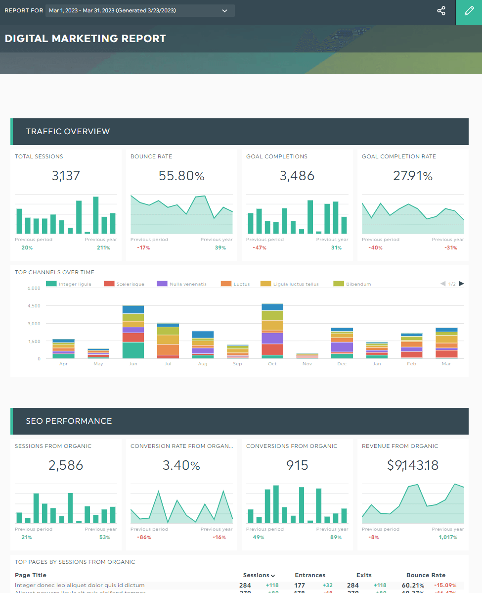
This digital marketing report marries paid and organic website traffic into one dashboard. Integrating Google Analytics and Google Ads, it measures the digital touchpoints that hurt or heighten the customer journey.
Automate Your Reporting
Google Sheets is the quickest way to communicate marketing performance to a client.
Unfortunately, only so many pivot tables and Gantt charts can do.
DashThis is an automated marketing reporting tool that helps everyone better visualize complex information, distill actionable insights, and automate reporting from start to finish.
Grab your free 15-day trial of DashThis to give it a whirl today.

Start creating your Google sheet dashboard today
Read More

Don’t miss out!
Follow us on social media to stay tuned!
Automate your reports!
Bring all your marketing data into one automated report.
Try dashthis for free