Product Update: February 2018

Last month was February, the month of looove, and since we love you so much, dear users, we’ve created a new support hub and simplified your navigation through the menus, all the while adding new metrics and dimensions to your integrations to make your whole reporting more intuitive.
If I’m honest, the results are downright AWESOME! Read on!
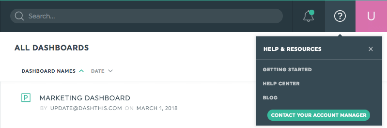
A support hub at your fingertip
Need help with something? We’ve got your back!
The top-right corner Help Center icon has been replaced by a support menu, where you can find the answers to any questions in the blink of an eye (or the click of a mouse): our Help Center, our blog, our Getting Started guide, and of course, a direct link to contact your stellar account manager.
Better menus, effortless navigation
Several menus have been updated to make your in-app navigation smoother, keeping DashThis a tool that’s becoming easier to use by the day (or almost). In a nutshell:
- All of the top-right corner dropdown menus look slicker and take much less space, which adds a general breaaathable feeling to your dashboard manager.
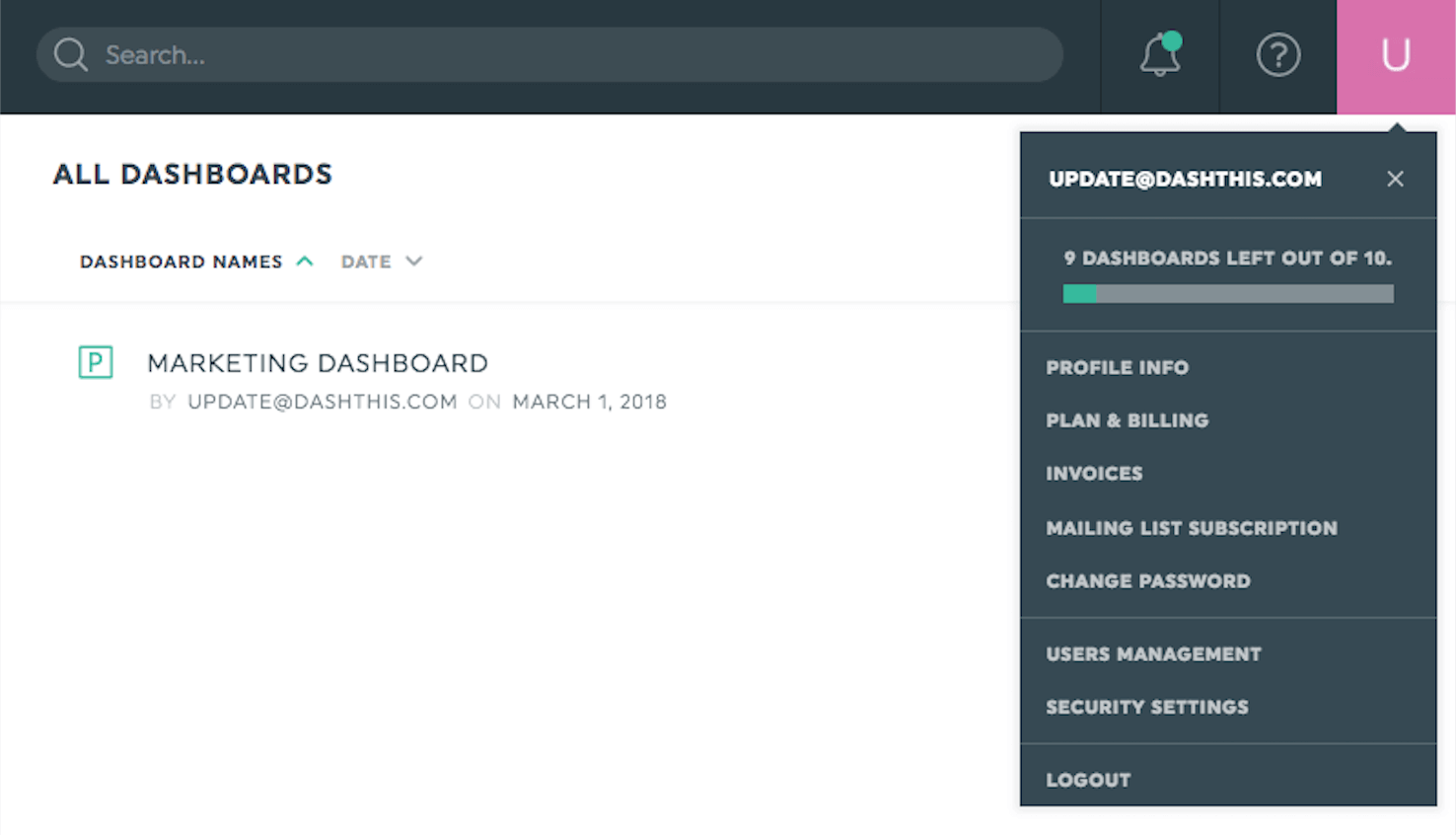
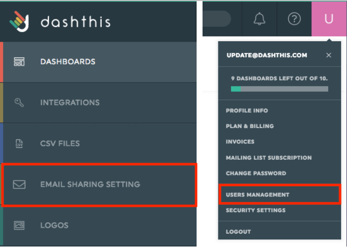
- Looking at your use of DashThis has allowed our dev team to draw conclusions about what you were looking for in every menu, and so the appropriate changes have been made among the admin and user menus. You can now find your Email Sharing Settings in the admin menu, and your “Users” section (now called “Users Management”) in your user menu.
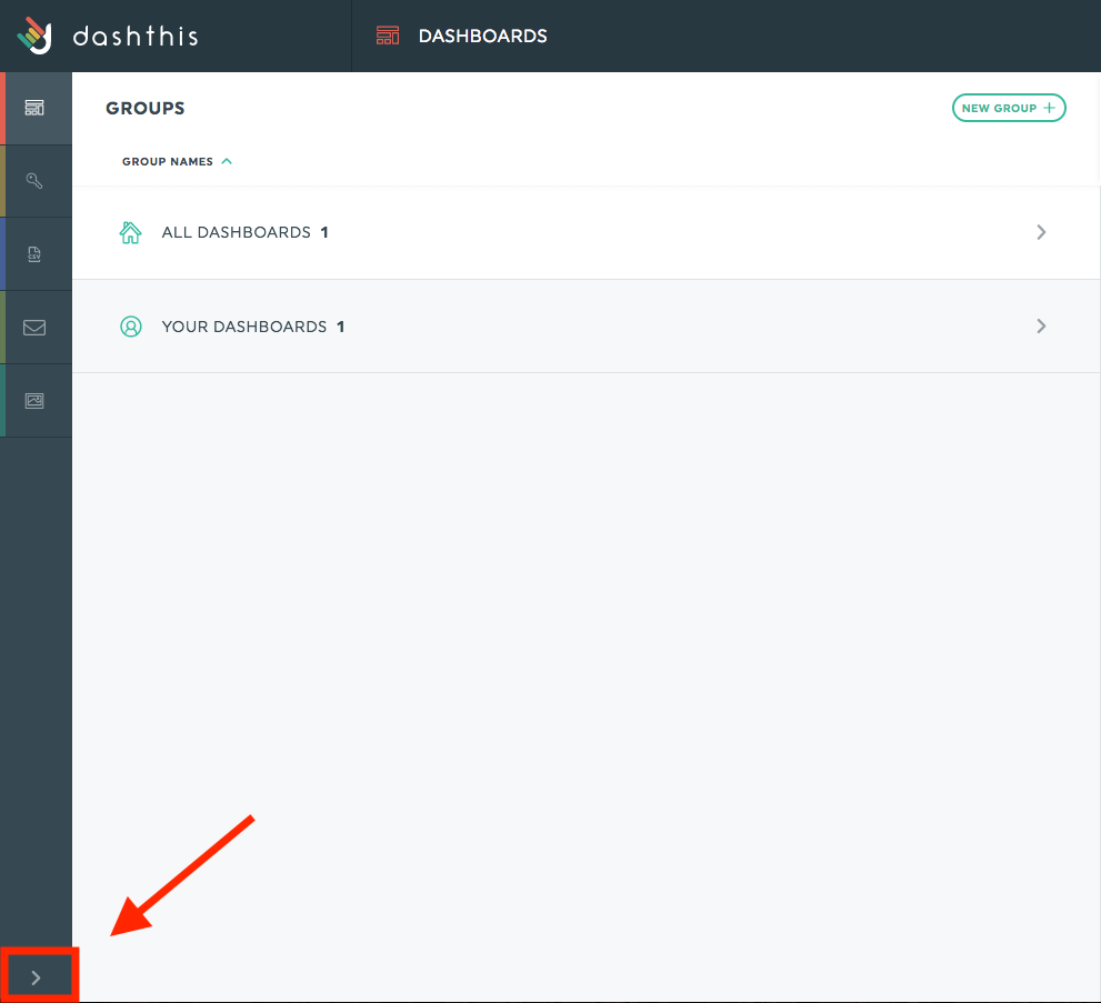
- We heard you, dear marketers; we realized the left admin menu popping open when your mouse was just hovering was frustrating to many of you, so this issue has been fixed. The panel will now only open when you actually want it to.
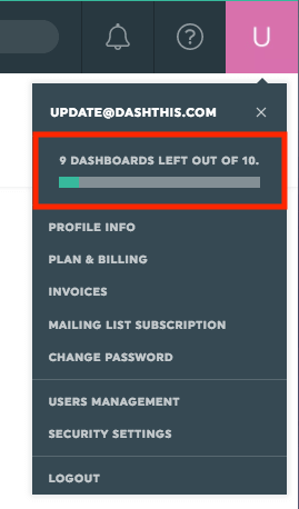
- The number of dashboards you have left with your plan now appears at the top of your user menu so you’ll never be short a dashboard when you need it.
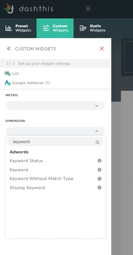
Clearer “Keyword” dimensions
Your choice of AdWords’ “Keyword” dimensions have been narrowed to make your selection more intuitive. As you’ll notice, there are now only two “Keyword” related dimensions: “Keyword” and “Keyword without match type”, which should decrease the risk of confusion among lookalike categories.
Other quick fixes
- The “Metro” dimension has been added to your Google Analytics Integration, making it easy-peasy to segment your audience into metropolitan areas.
- In your Facebook Ads integration, you can now find “Landing Page Views” as a unique metric, and the “Cost per Landing Page View” metric has also been added.
These upgrades are bound to make your whole reporting experience smoother, all the while preparing the ground for even MORE great updates next month. Stay tuned!
Happy reporting!

Ready to automate your reporting?
Read More

Don’t miss out!
Follow us on social media to stay tuned!
Automate your reports!
Bring all your marketing data into one automated report.
Try dashthis for free