What Are Performance Metrics? A Complete Guide for Marketers

Have you ever wondered if that campaign you spent hours working on is actually delivering results? Or maybe your monthly campaign reporting session is approaching, and you need to present its results to other departments in a way that makes sense to them.
What are performance metrics? They're the measurable values that track how well your business activities achieve their goals—giving you the solid data to answer these questions. These metrics show what's working, what isn't, and where to focus your efforts for maximum impact on your organization's success.
But we can’t cram all the metrics in your platform into a report and call it a day. With so many metrics out there, and with half of executives feeling overwhelmed by the volume of data and dashboards they receive daily (per a TheyDo survey of decision makers in the US and Europe), you need to know which ones to highlight in your report and how to explain their significance to your clients.
Whether you're new to tracking performance metrics or want an practical way to pick the ones that match your client's goals, this guide is here to help. You'll learn to spot key metrics and make sense of what they show, then turn those numbers into practical dashboards that support real decisions.
Table of contents
Table of contents
- What are performance metrics?
- How to identify the right marketing KPIs for your reports
- A step-by-step guide: How to build your first performance metric dashboard
- Ready to turn performance metrics into actionable client insights?
What are performance metrics?
Performance metrics are quantifiable measures tracked over a specific timeframe that show whether a business process is meeting its objectives and where improvements are needed.
Common types of performance metrics at a glance in different business functions include:
| Category | KPI examples |
|---|---|
| Marketing performance | Traffic by marketing channel, conversions, engagement rate |
| Sales performance | Total revenue and profit growth, add to cart, customer win rates |
| Customer health | Customer satisfaction scores, retention rates, life cycle value |
| Cost & efficiency | CPA, CPC, revenue attribution, return on investment (ROI) |
| Employee productivity and satisfaction | Turnover rate, absenteeism rate, goal completion rate, overall employee engagement |
In marketing, you’ll track your campaign’s contribution towards revenue, lead generation or brand awareness, as well as specific productivity metrics to measure campaign efficiency. So, you’ll answer questions such as:
- Are our marketing channels generating enough qualified leads to keep the sales pipeline full?
- Are organic or paid advertising bringing in more engaged leads?
- Which marketing channel and campaign converts the most customers at the most effective costs?
As marketers, your clients and stakeholders will watch how your work ties to the overall business strategy. That can mean lifting sales or increasing revenue. It may require knowing which levers to pull when the data shifts and what to recommend to your client next to help them in their decision-making.
Understanding your client’s point of view matters. Marketing leaders say their top challenge is showing measurable impact on financial outcomes, according to The CMO Survey in 2025.
Difference between performance metrics, KPIs and vanity metrics
These three terms are often mentioned in the same breath when discussing business performance metrics, but what’s the difference? Let’s use a table to explain the difference.
| Metric type | Measures | How it informs strategic decisions | Key question it answers |
|---|---|---|---|
| Key performance indicator (KPI) | Progress toward a clear business goal | Useful for setting priorities and assigning resources. | Are we on track for this goal? |
| Performance metric | Overall performance of a channel or marketing activity | Helps you spot trends and problems but needs context to guide action. | What is happening? |
| Vanity metric | Numbers that look important but aren’t relevant to the overall goal | Not useful and may distract from key metrics. | Does this only make us feel good and aren’t relevant to our goal? |
This depends on your campaign’s objectives. If your goal is to turn more free-trial users into paying customers in Q3, here’s how to choose the right measures and avoid vanity metrics.
KPI: conversion rate from trial to paid
Performance metrics: trial signups and activation rate, plus support tickets per user
Vanity metrics: total signups without activation, homepage visits.
Spotting vanity metrics is hard, and if you’ve felt that way, you’re not alone. Tying marketing results to real business outcomes is a major challenge for 85% of B2B marketers, according to a WPromote survey of hundreds of B2B marketers.
Use the “So What” test to identify vanity metrics
You can use the “So What” test to decide whether a metric is meaningful or just a vanity metric to drop.
Coined by author and analytics expert Avinash Kaushik in 2010, this simple test simply involves you asking each metric you’re thinking of including ‘so what’ three times. Each answer should lead to the next question. If, by the third “So what?”, you still don’t have a clear next step, drop that metric from your report.
Here's how it works.
Let’s say you’ve found in your latest monthly report that your organic website traffic has increased 50% this month. Apply the test, and you’ll see:
- So what? "More people are visiting our site
- So what? "This could mean our content marketing is working"
- So what? "We should analyze which content drove traffic and create more like it."
In this case, it’s worth tracking organic website traffic when you can link it to a clear action: analyze your top-performing content and reverse engineer what made it work.
Beyond manual checks, automated tools can surface the metrics that matter by flagging unusual patterns and correlations that would take hours to find by hand. For example, DashThis's AI Insights scans your data and highlights metrics with notable changes or trends, allowing you to spend your analysis time where it counts.
How to identify the right marketing KPIs for your reports
If executives are drowning in data, we need to be clear about what belongs in our reports. To do this, tie performance metrics to concrete business goals and the questions your stakeholders care about so the report stays useful instead of adding to their overload.
To help you identify your marketing KPIs, you’ll need to address two questions
- What business objectives matter most to your stakeholders
- How do they measure success?
This means understanding how people across your organization see the same goal. Different groups have different concerns and needs.
For example, a metric your client’s CMO cares about may differ from what the head of sales wants, even if both are working toward the same goal. You can close that gap by planning from multiple angles and choosing metrics that match each group’s needs.
Start by identifying your main business goal, and link it to the reviewer’s specific concerns so your report speaks their language.
Here’s how it might look for a few different business goals.
Generate sales-qualified leads
Get this e-commerce sales report with your own data
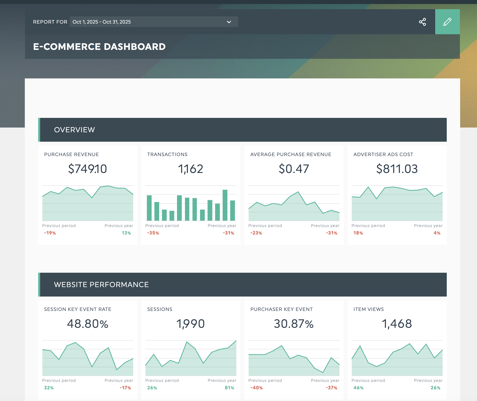
Your client hired you to grow revenue, which means keeping the sales pipeline stocked with high-quality leads. These metrics help you gauge whether you're attracting prospects who are engaged and match your brand's ideal customer profile, giving sales strong opportunities to pursue.
| Stakeholder | Primary concerns | Key metrics |
|---|---|---|
| Marketing | How marketing drives the sales pipeline and reduces costs | Marketing-qualified leads (MQLs) MQL to SQL conversion rate Cost per SQL Marketing's revenue influence |
| Sales | Is marketing delivering quality leads that sales can close? | Sales acceptance rate Lead quality score Time to first meeting SQL to opportunity conversion rate |
| Executives | What's our return on marketing investment? | Cost per acquisition (CPA) Profit margins Customer acquisition cost (CAC) CAC payback period Revenue contribution by acquisition channel |
Improve brand awareness
People don't make purchasing decisions immediately, especially if they aren't familiar with your brand. Trust is as much of a purchase consideration as quality and price, according to Edelman research. When your brand awareness campaigns are working, these metrics offer tangible proof.
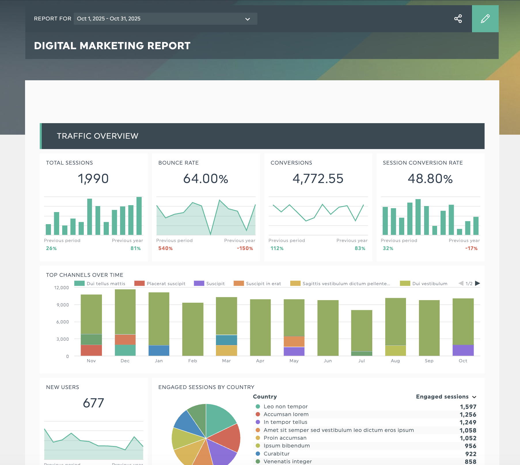
Get this digital marketing dashboard with your own data!
| Role | Primary concern | Key metrics |
|---|---|---|
| Marketing and brand | Are we increasing visibility and reaching the right people in our target market? | Branded search volume Brand visibility within the industry Social media reach and impressions Earned media mentions |
| Go-to-market and growth team | Are we building awareness among our most important customer groups? | Share of voice in high-value segments Share of ad views among the audience we want to reach Engagement rate by audience segment |
| Executives | How does spending on awareness help a company grow? | Branded search volume growth rate Engagement rate on awareness content |
Measure marketing ROI by channel
These metrics show which channels generate the highest marketing ROI, so you can allocate budget wisely and clearly report each channel’s financial impact.
| Role | Primary concern | Key metrics |
|---|---|---|
| Marketing | Which channels deserve more budget and where should we reduce spending? | Revenue attributed to each channel Return on ad spend (ROAS) Cost per acquisition by channel Channel-specific conversion rates |
| Finance | What's our marketing ROI and overall operational efficiency? | Overall and channel-specific marketing ROI and profitability Customer lifetime value (CLV) by acquisition source Customer acquisition cost CAC payback period |
| Campaign managers | How is my specific channel performing against targets? | Click-through rate Engagement rate by source Conversion rate Cost efficiency metrics |
4 steps to apply this framework to your marketing KPI selections
- Pin down your main goal and how your marketing campaign supports it.
- List who will review this report and map out their key concerns and needs
- Apply the "So What" test to each potential metric
- Select 3-5 metrics that address each stakeholder's perspective on the same objectives
Tip: Need help identifying the right KPIs? DashThis offers 50+ ready-made marketing report templates with preset KPIs and a clear structure, making report building easier.
A step-by-step guide: How to build your first performance metric dashboard
You’ve got your data and KPIs; how do you present them in a way that makes sense for your clients? Many teams rely on dashboards for a reason. A 2025 peer-reviewed study across retail, financial services, and manufacturing found that interactive dashboards accelerated decision-making by up to 35 times, while real-time BI visuals enhanced day-to-day operations by approximately 28 times.
Where should you start when building a dashboard to track and show your performance metrics?
First, sign up for your 14-day DashThis trial, then follow these steps.
Step 1: Identify what decisions this dashboard must support
Before building a dashboard, map out what decisions this dashboard needs to support. Are you reviewing your SEO campaigns weekly? Reporting your monthly PPC ad spend, or planning quarterly budgets? Your chosen KPIs should reflect those goals.
If you’re just getting started, you can build a dashboard in free tools like Google Data Studio or Excel. They’re free to use, but you’ll need to know pivot tables and be comfortable with the software. Manual data entry is common in these tools, so preparing and updating the data will take more time.
If you want to streamline manual report building, whether you work with multiple clients and projects or simply want to spend less time on reporting and project management, DashThis offers over 50 templates for various industries and use cases. They help you capture key metrics and provide a solid starting point for your dashboard.
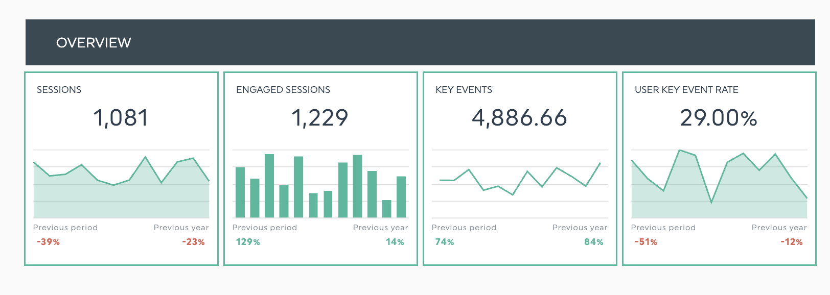
When building your dashboard, start by grouping related metrics together. For instance, your traffic acquisition section might include organic traffic, paid traffic, and referral traffic side by side for easy comparison. Tools like DashThis make this easier with pre-built templates. But the key is logical organization regardless of your platform.
Step 2: Connect your data sources
Today’s customers rarely use a single channel to make a purchase. Google reports that 52% of online shoppers use multiple channels during their shopping process. As people move between online and in-store steps, your marketing should show up in more places so you remain visible where they look.
The same applies to B2B software buyers, who research their purchasing decisions independently across multiple channels, including AI-based tools. On average, it takes a B2B buyer an average of ten interactions across all steps of their buying journey before making a decision, according to McKinsey’s 2024 B2B Pulse Survey.
On the data reporting front, you need to know which channels are working and contributing to this journey, and which ones aren’t. However, multiple channels introduce additional complexity to your data analysis. Each platform has its own dashboard, its own metrics, and sometimes different terms to describe the same metric. As a simple example, what Google Ads labels as Conversions, might be called 'Key Events' in GA4, which can be confusing to analyze if you’re not careful.
You can import these data points by hand, but it’s a poor use of time. You export the data, import it into your dashboard, then fix the formatting. The process eats hours and pulls you away from the work that actually helps your clients.
Instead, here’s a better way. Look for reporting platforms that connect with your digital marketing tools.
For example, DashThis integrates with 34+ marketing tools like GA4, TikTok, Mailchimp, and Instagram Ads. Connect them to DashThis once permissions are granted, and we’ll automatically import your data into your dashboards. Fewer manual uploads mean more time for real analysis.
Step 3: Apply data visualization principles to make your dashboard more effective
You’ve got your data on one dashboard. Now you need to match each KPI to visuals that quickly show what it means and why it matters to the people reviewing the dashboard.
When clients can quickly find the key points and see how they relate to their business and role, they’re more likely to take your reports seriously
Here are examples of visuals to help you flesh out your reports and highlight key details.
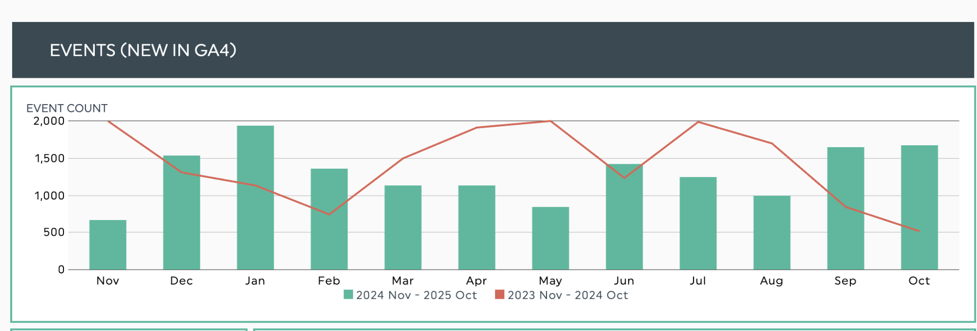
Trend charts can include bar and line charts to compare multiple metrics over time.
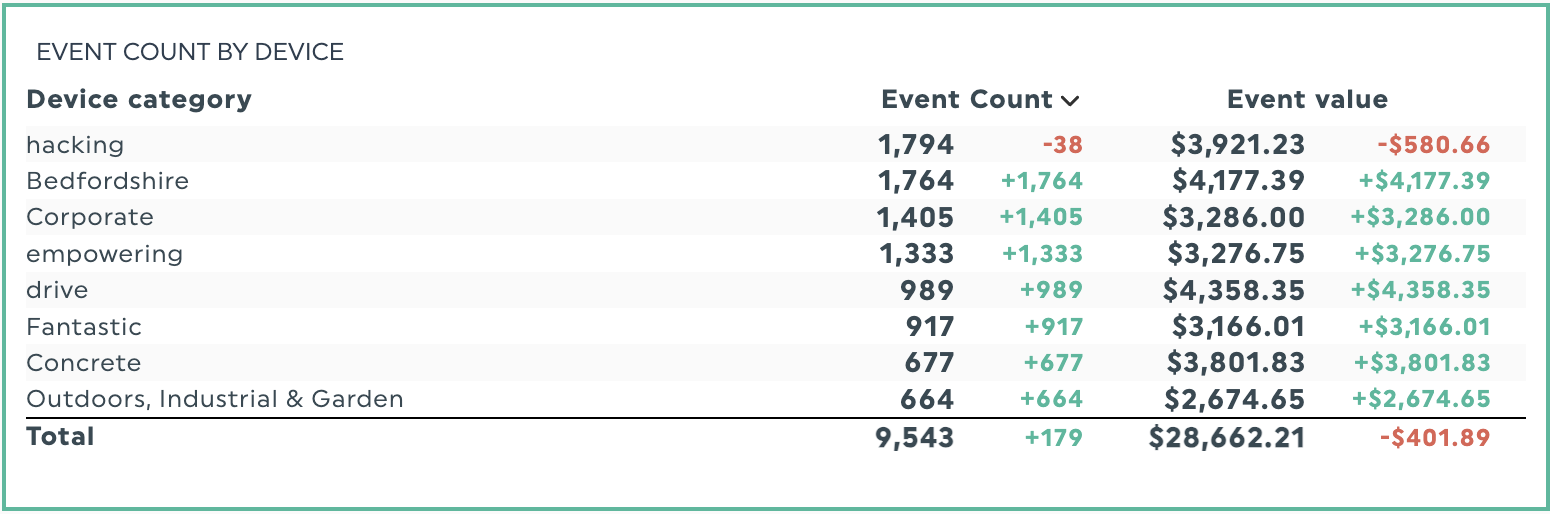
Comparison tables help you compare data across categories such as device type, campaign, or marketing channel. Color coding highlights metrics that need attention and shows how they changed since the last reporting period.
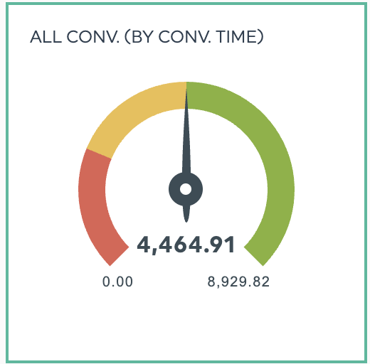
Gauge widgets show progress towards specific goals. Colour ranges let stakeholders see how a metric or campaign is performing at a glance.
Need a more in-depth explanation? Learn more about effective data visualization techniques in our guide.
Now that you've built a clear, audience-focused dashboard, you're ready to analyze your data and turn what you find into practical next steps.
Step 4: Interpret your data and turn findings into concrete recommendations
Once your data is in the dashboard, analyze it to extract findings that matter to your stakeholders and will inform their decisions.
Data analysis and interpretation mean:
- Compare each metric with prior reporting periods
- Identify relationships between different data points
- Distinguish meaningful patterns from background noise
- Draft actionable follow-up steps you can recommend to your client
You can analyze your data by hand or use AI tools to spot patterns and summarize results. Automated outputs can reveal connections you might otherwise miss and serve as a springboard for deeper analysis.
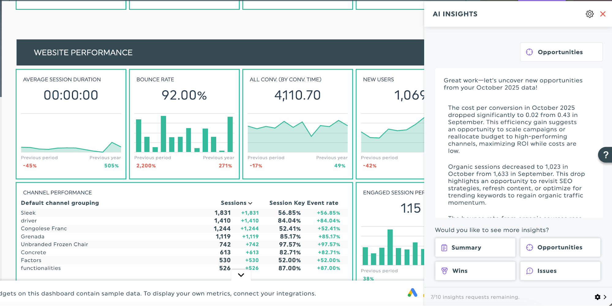
For example, DashThis’s AI insights helps you view your dashboard data from multiple angles to strengthen your analysis and support your recommendations.
- Summary insights: Get automatic highlights of what's trending in your marketing data
- Opportunities: Find ways to improve your campaigns with AI predictions
- Wins: Spot your best-performing campaigns and channels
- Issues: Catch problems early before they hurt performance
Rather than sifting through data by hand, DashThis highlights opportunities on its own, like spotting top landing pages or calling out drops in organic sessions. Use these AI findings as your starting point to quickly see what's working and what needs attention.
For example, let’s say your goal is to improve the overall efficiency of your marketing ad spend, using cost per conversion as a KPI of success. Using DashThis’s Opportunity lens, it might flag that there’s a significant drop in cost per conversion this month, and lay out steps you can take to further improve ROI.
Step 5: Make sharing and collaboration easy
Once you’ve finished your analysis, make your dashboard easy for clients or team members to access. For starters, you can email the Excel file as an attachment or share a Google Sheets link.
If you work with multiple clients and juggle several projects at once, here’s what to do next for a more efficient workflow.
- Set up automatic updates so stakeholders get regular information without having to ask. Send weekly reports to campaign managers and monthly summaries to executives.
- Give team members live dashboard access to see up-to-date data between reports. A shareable link lets people check current performance whenever they have questions, without waiting for the next scheduled report.
- Use built-in collaboration tools to discuss findings right in your dashboard. If your sales director has questions about lead quality, they can comment on the relevant widget instead of starting a new, lengthy email thread.
Tip: If you work with multiple clients, keep each brand consistent by using white-labelled reports in presentations. Put your agency’s logo and colors on every dashboard for a polished look.
When done intentionally, reporting solutions can help streamline client communications and build trust. Jelly Marketing, a full-service digital marketing agency, overhauled client reporting with DashThis. Automating dashboards and using branded reports saved the team more than 20 hours each week. During client calls, account managers share live dashboards so everyone looks at the same real-time data, which keeps optimization talks focused and useful. Read the full case study to learn how they did it.
The right dashboard platform should cover these needs so you can focus on analysis, not data management. A marketing reporting focused tool like DashThis offers them all, built for marketing teams and busy agency owners.
Ready to turn performance metrics into actionable client insights?
Understanding performance metrics is just the start. Dashboards deliver value when you choose meaningful KPIs and review the data regularly. Share findings in ways that speak to each stakeholder’s priorities so they can make confident decisions during your performance reviews.
If you're juggling multiple clients, switching between platforms to pull data, or spending hours manually creating reports to measure performance each month, there's a better way. DashThis streamlines your performance metric reporting so you can spend less time wrestling with spreadsheets and more time doing what you do best: analyzing results and optimizing your marketing initiatives.
Reporting doesn't have to take over your week. Start a free 14-day trial and see how DashThis helps you turn marketing results into clear, time-saving performance management reports.

Measure your performance metrics in Dashthis now!
Read More

Don’t miss out!
Follow us on social media to stay tuned!
Automate your reports!
Bring all your marketing data into one automated report.
Try dashthis for free