Discrete vs Continuous Data: Key Differences and Examples for Marketers

As you work with marketing data, you'll encounter different types of quantitative data, including discrete and continuous data. Proper visualization of these data types enhances your report's credibility and helps clients make better decisions.
This guide explains the difference between discrete and continuous datasets and why knowing these differences isn’t just for students studying statistics, they’re relevant if you handle any form of client-facing data. Learn which data visualization methods work best for each numerical data type, and see how DashThis can help present your marketing data effectively.
Table of contents
- What is discrete data?
- What is continuous data?
- Discrete vs continuous data – key differences for marketers
- How to combine both discrete and continuous data in your marketing reports
- Automate your marketing reporting and data visualization with DashThis
What is discrete data?
Discrete variables consist of whole numbers (integers) without fractions or decimal values. In marketing, these are typically non-negative integers since you can't have negative clicks or negative sales. You can count these values, typically describing them with the phrase “the number of.”
Think of common examples of discrete data, like counting the number of students in a classroom or determining shoe sizes. When it comes to marketing, discrete data shows up everywhere in your campaigns and reports, like:
- T-shirts sold
- Emails sent this month
- Impressions or people reached with an Instagram reel
- Ad clicks by Meta ad campaign
- Total engaged sessions in May
Best chart types for discrete data
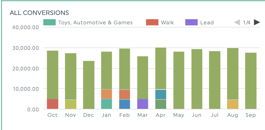
Different types of charts work well for specific data analysis needs. For discrete data, bar graphs, pie charts, and stacked columns are your go-to options since they show you the big picture numbers while letting you see exactly what makes up those totals.
Bar charts are particularly useful for direct comparisons. They help you compare individual metrics side-by-side across different campaigns or audience segments, like when analyzing engaged sessions across landing pages.
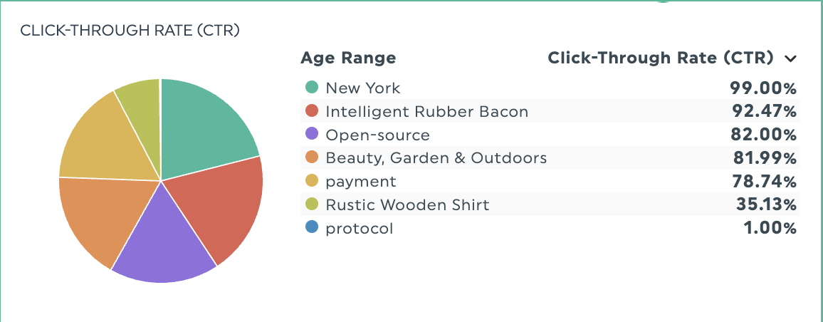
Alternatively, pie charts work well for breaking down aggregate metrics into categories. They’re useful for segmenting email lists into distinct audience groups or analyzing click-through rates across age ranges.
But what if you want the capabilities of a pie chart, combined with seeing how these percentages change over time?
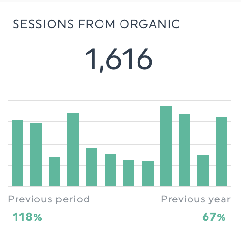
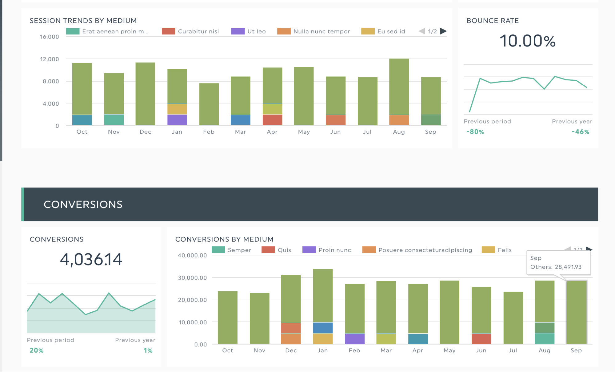
Here, a stacked column chart breaks down totals into components and tracks changes across time periods. This format effectively displays SEO metrics like organic traffic percentage or total conversions from organic sources across months. The clear comparison between time periods can help you show the impact of your SEO results and strengthen your case during a client campaign review.
Tip: DashThis picks the best visualization styles through preset widget options, simplifying how you display data.
While bar chart types work well for discrete data, you might be wondering: what about line graphs? Aren't they versatile enough for any type of data?
Well, here’s the issue. Using a line chart misrepresents discrete data by connecting separate points with lines. For example, when tracking email opens on a line graph, the connecting lines suggest fractional values like 2.5 or 3.7 opens exist between different values. But email opens only occur in complete units - you can’t have partial opens like 2.5, only whole numbers like 2, 3, or 4 email opens.
What is continuous data?
Continuous data represents precise measurements that can take on any specific value within a range, including decimals and fractions. This means there are an infinite number of values between any two points. For example, your conversion rate could be 2.5%, 2.51%, 2.512%, or any decimal value in between - unlike discrete data where you're limited to whole numbers.
In short, if you can ask 'How much?' or 'How long?' instead of 'How many?', it's likely continuous data.
Examples of continuous data in digital marketing include:
- Revenue metrics like customer lifetime value and average order value
- Campaign performance metrics like cost per click, conversion rate or clickthrough rate.
- Time-based engagement metrics like average session duration, time on page, and bounce rate
How to visualize continuous data variables
The best visualization tools for continuous data include line graphs and gauge charts. Here's when to use each.
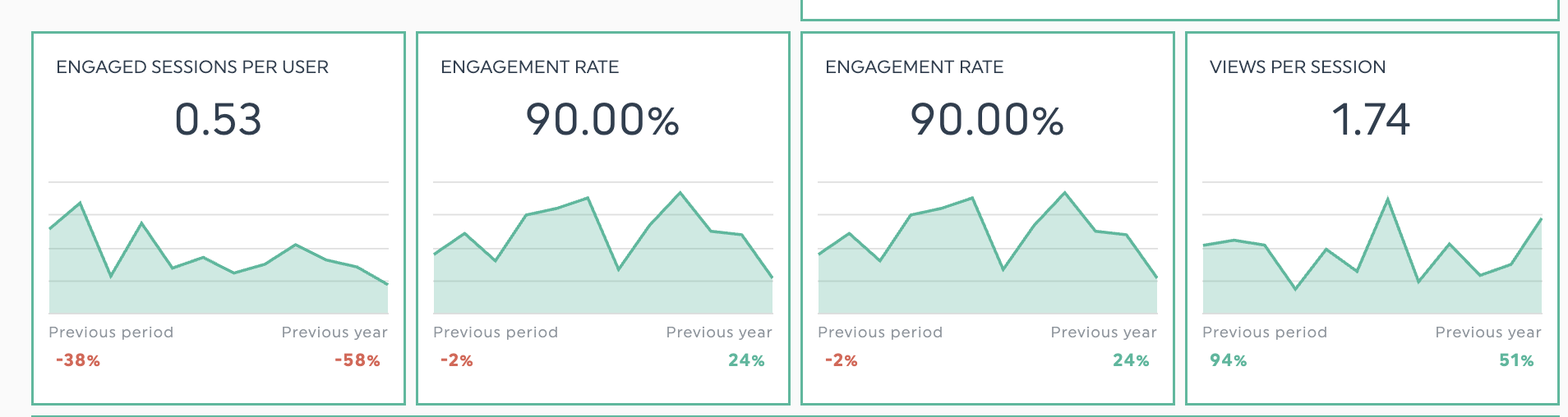
Line graphs effectively display changes in continuous data variables within their given range over time, like conversion rates or average order value. They also allow you to track multiple related metrics over time, like connections between page load times and average order value, helping you spot patterns that could improve your checkout process for e-commerce, or whether there’s any differences in metrics over time.
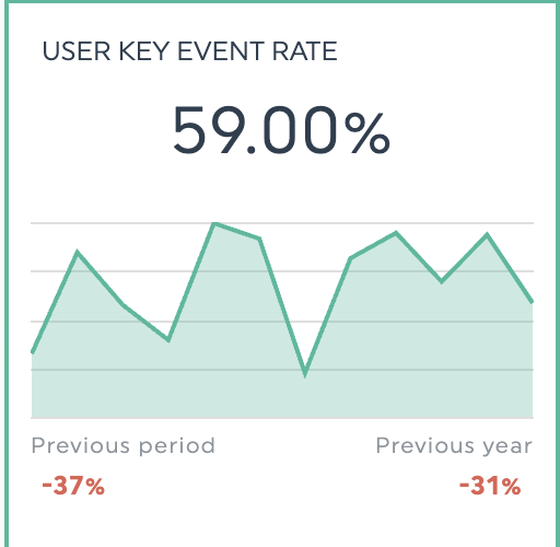
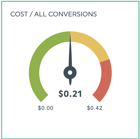
For goal-focused types of variables that require close monitoring, gauge widgets help track your progress. They work well to show how close you are to hitting key targets - whether you’re tracking cost-per-conversion or revenue goals. These widgets also help provide color-coded visual context - you’ll immediately know if you’re on track with your goals or not.
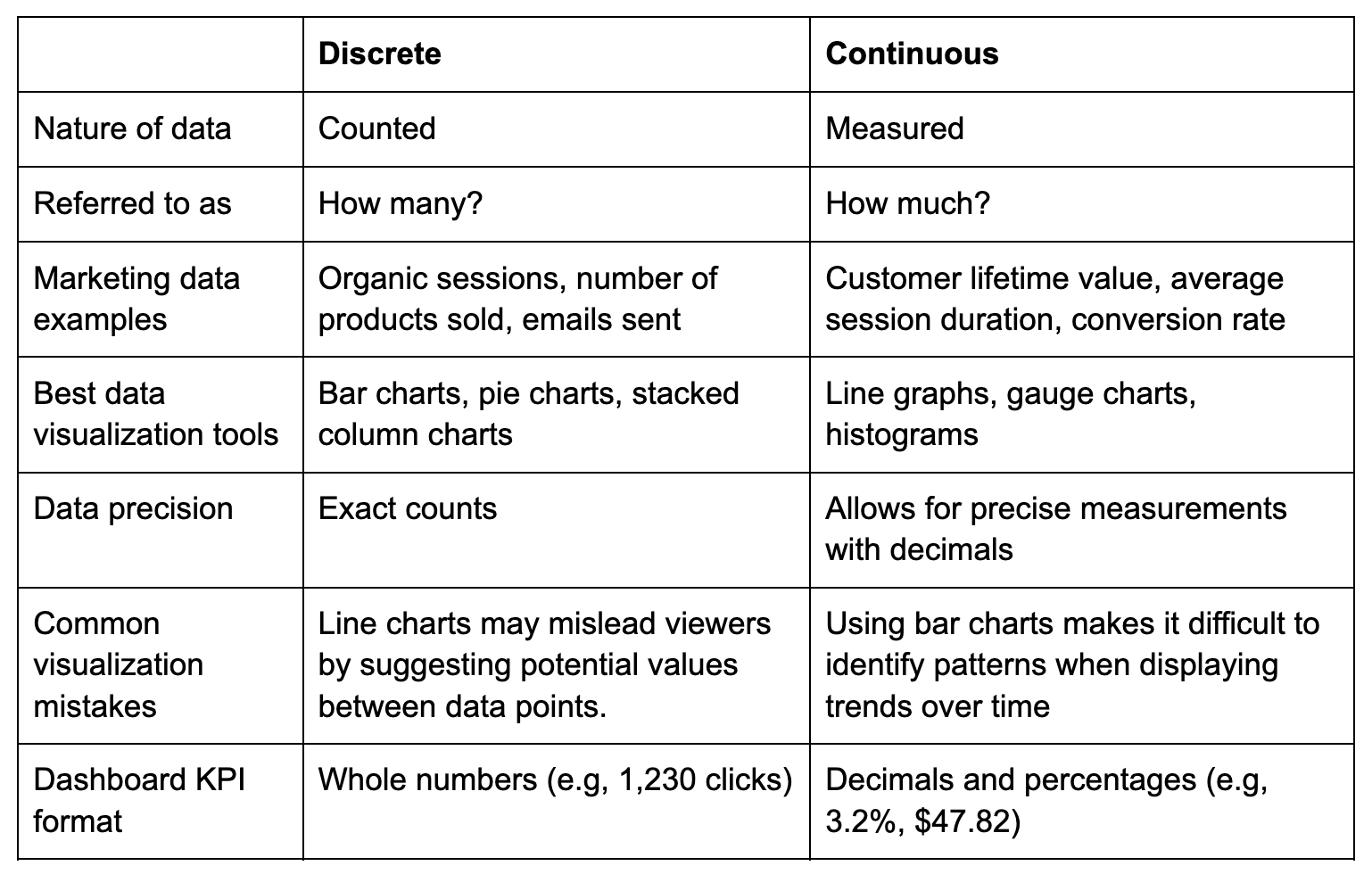
Discrete vs continuous data – key differences for marketers
Choosing the right visualization for your data type prevents client confusion and builds trust in your analytical expertise. Use this summary table to quickly identify the difference between these types of data.
How to combine both discrete and continuous data in your marketing reports
Marketing campaigns don’t fit neatly in boxes. The most effective strategies mix both data types. Here are some real-world examples that show how to blend discrete and continuous variables in your reporting.
Email campaign performance
Email marketing reports show both raw numbers (list size, opens, clicks) and percentages (open rate, bounce rate). To assess whether your subject lines need A/B testing, plot your open rate and click-through rate (CTR) on a line graph to spot patterns in how subscribers interact with your emails.
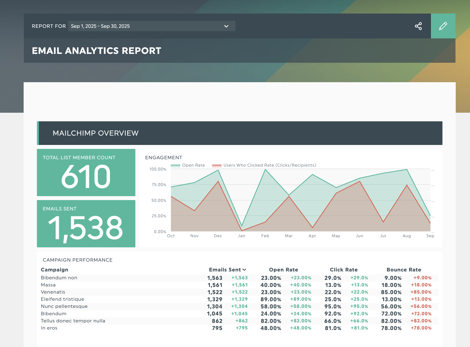
Get this email campaign report template with your own data!
E-commerce performance
E-commerce reports combine discrete values like transaction counts with continuous data such as key event rates and average order values. By analyzing these numbers together, you can refine your client’s checkout process and identify top products to promote during seasonal sales.
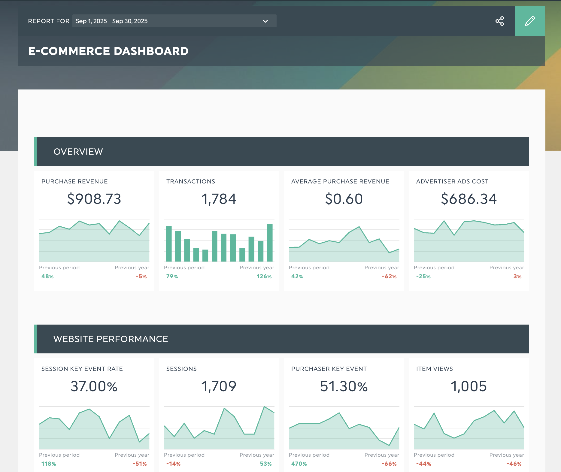
Get this e-commerce dashboard with your own data!
Google Analytics 4 website analytics report
GA4 metrics track both individual events and ongoing visitor behavior. Looking at specific numbers like sessions and conversions alongside metrics like bounce and engagement rates gives you a clear picture of how your website performs.
How about reviewing your cross-channel acquisition campaigns across monthly time intervals? When you pair 10,000 referral sessions alongside a 2.3% conversion rate, you’ll understand both the volume and quality of your traffic. These numbers can guide your next move - whether to focus on growing visitor numbers or fine-tuning your conversion process.
Get this GA4 report template with your own data!
Automate your marketing reporting and data visualization with DashThis
When your marketing metrics directly impact client performance, understanding data classifications creates clearer, more effective client reports. Hence, spending time to ensure your data analysis foundations isn’t wasted time. You’re making sure your reports are accurate, and your campaign results as credible as possible.
Apply these reporting principles to create reports that look polished and help clients grasp their marketing results. DashThis comes with preset charts and widgets to visualize your marketing metrics, letting you spend more time analyzing data rather than selecting charts. Experience DashThis with a 14-day trial today.

Discover AI-driven Insights with DashThis
Read More

Don’t miss out!
Follow us on social media to stay tuned!
Automate your reports!
Bring all your marketing data into one automated report.
Try dashthis for free