How to Make The Best Web Analytics Presentation for Your Bosses

So you've got to make a web analytics presentation for your bosses (no pressure!). For many digital marketing professionals or junior analysts, this can feel like a daunting task. How do you display and communicate the information? Which information do you include or leave out? How do you make it interesting?
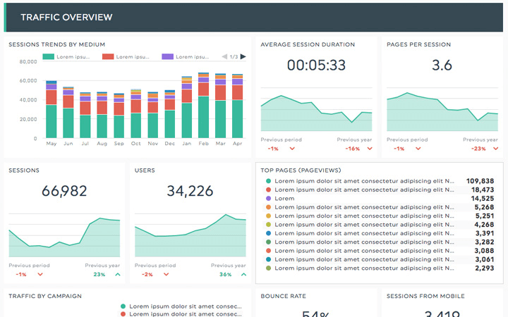
First things first, make sure you've got the best possible tool to create your report. By using a web reporting automated tool like DashThis, you won't have to create your report from scratch every month and will have a good-looking, clear report to show off.
Get this template with your own analytics data
You can create SEO reports, or a Google Analytics report with all your Google Analytics accounts, any other search engine data, and any other online marketing platforms, such as a social media report in no time. You even got preset report templates to get you started right away.
Now that you're all set, here is the 6-step process I’ve used to deliver more effective presentations, shape my company’s marketing strategy, and earn the confidence of my bosses.
- Step 1 - Discover the primary business concerns
- Step 2 - Find all the angles
- Step 3 - Remove the non-essential
- Step 4 - Prepare for derailment
- Step 5 - Shape it into a story
- Step 6 - Provide one key takeaway
- Pro Tip - KPI Dashboarding for the win
Step 1 - Discover the primary business concerns
If you are tasked with giving your bosses a "Google Analytics overview presentation", or something of the sort, you are going to be stumped...big time. There are just way too many Google Analytics reports and relevant information to attempt to communicate it concisely.
Your job is not to be a prophet that reads minds, interprets data, and translates valuable insight for all to revere. Your job is to find and present relevant data that will address their primary business concerns and help them make better business decisions.
So before you start, you first need to understand what the primary business concerns of your bosses are. Ask your bosses this two-part question and tailor your content to make it relevant to them:
-
"What's one question you wish you could get answered about our website?"
-
and "what's one thing you hope to learn from our website visitors?"
For example, let's say your bosses tell you that they want to find out:
-
Which markets the company is gaining organic e-commerce traction in?
-
And, which blog content is actually driving business?
These questions will give your presentation focus and make it relevant to their primary business concerns. If you don't have direct access to the bosses you are presenting to, reach out to someone who works closely with them and who understands their concerns.
Step 2 - Find all the angles
Once you've gotten context regarding the primary business concerns of your bosses, it's time to find the reports which will best address those concerns and provide insight.
At this stage, you're not formulating your final Google Analytics presentation slides or practicing your delivery, you're simply acting like a detective to find all the possible reports which will answer their questions. Go for volume here, and try to explore as many angles as possible.
Sticking with our examples above, let's look at how we can answer those questions:
1. Which markets is the company gaining organic e-commerce traction in?
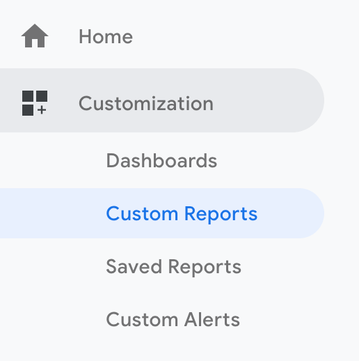
Let’s go to our Custom Reports tab for this one:
...and look at organic e-commerce behaviour by city. You can also look at region or country depending on the scope of your business.
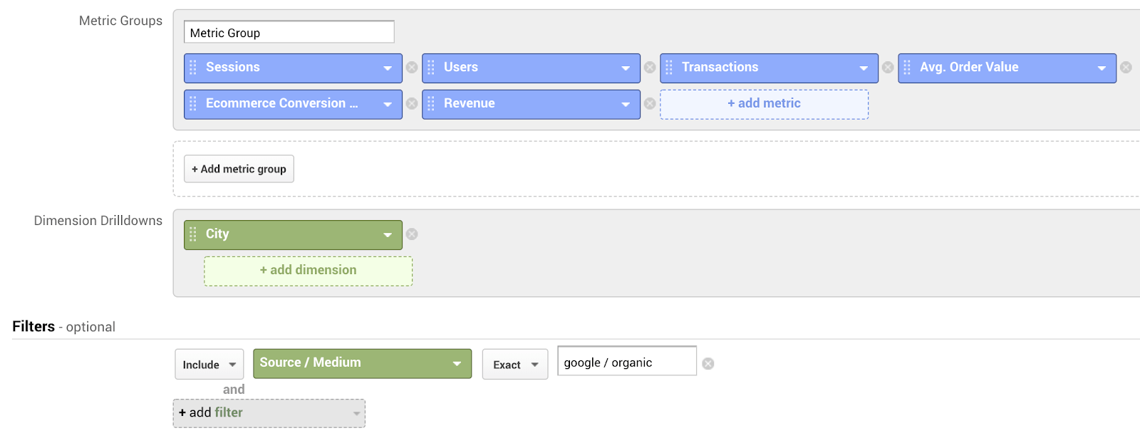
Here’s what this Custom Report shows us: (Data taken from the Google Merchandise Store Demo Account).
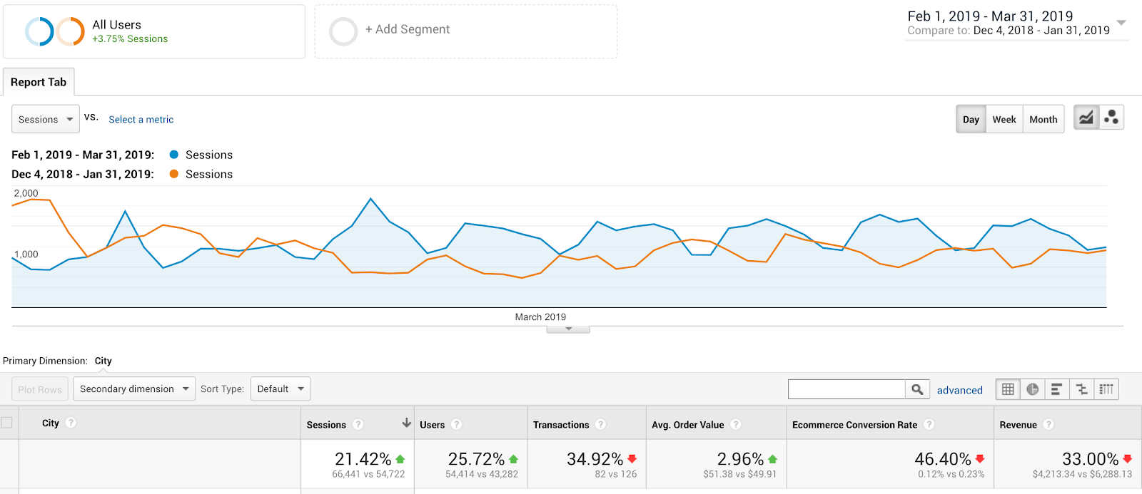
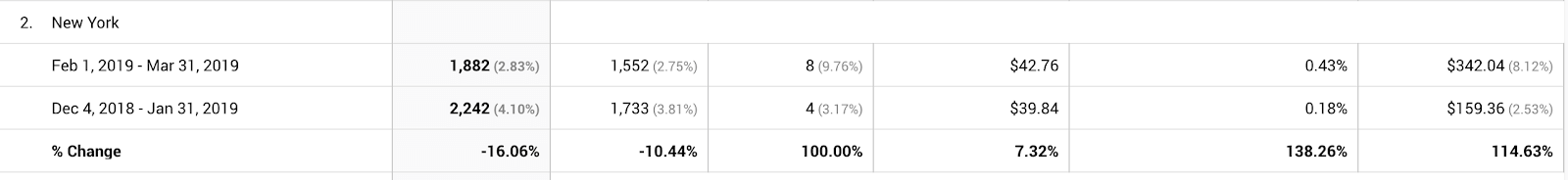
It looks like New York had an increase in Avg. Order Value, E-commerce Conversion Rate, and Revenue, even with a drop in Sessions and Users. This might suggest to your bosses that a focused paid search, display campaign, new retail store, or partnership in those areas could be successful. (The numbers in the example above are too small to be statistically significant, but this is just for demonstration purposes). Ok, time to explore the second question...
2. Which blog content is actually driving business?
We’ll go back to our Custom Reports for this one:
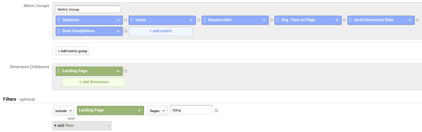
In this custom report example, we're looking at which blog Landing Pages (website entry pages) led to a Goal Conversion. I recommend only including goals that have a dollar value associated with them (vs. behaviour metrics), but for the purposes of the example, this report would show us our top Landing Pages in the blog section of our website which led to a Goal Conversion.
Note: I also included Bounce Rate, Pageviews, and Avg. Time on Page to give us more context regarding the behaviour on each page, but don’t let this distract you from answering your bosses’ primary business concerns.
Now, let’s look at things from a different angle…
We now know which blog Landing Pages are leading to Goal Conversions, but what about the blog Pageviews that happen after someone has already landed on our site?
We can use the Page Value metric here to give us the information we need.
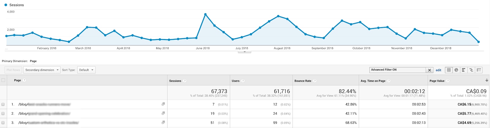
Page Value will show us which content is the most valuable in relation to our goals, regardless of whether it was a Landing Page or not.
Remember, we're trying to uncover multiple angles here to give us the clearest overall picture before we even touch our Google Analytics presentation ppt (or a Google Analytics Reporting Tool if you’re like me). This report gives us a second way to analyze the data so we can be more confident that what we are presenting is accurate and relevant.
Note: You must have monetary values assigned to your Goals in order for the Page Value metric to populate.
These are just 2 basic examples of different ways that you can slice and dice information to make your Google Analytics presentation relevant to your bosses. You can see that once we have a focus, it's easy to get to work finding the types of reports that will communicate the data effectively.
If you're new to Google Analytics and have no idea how to create these reports, a quick Google and Youtube search will give you multiple examples, walkthroughs, and ideas to try out. Or visit Analytics Academy for free training and courses.
Step 3 - Remove the non-essential
Once you've spent time brainstorming all the different types of reports and angles to represent the data, it's time to find the core narrative. What information is core to answering your bosses’ primary business concerns and what isn't?
It's easy to want to show your boss a million things to prove how smart and amazing you are, but resist the urge! You will only create a lack of focus in your presentation. A question you can ask yourself here is:
-
“Does adding this information help answer my bosses’ primary business concerns or does it take things in a slightly different direction?”
An example of this might be noticing that certain blog posts have a higher Bounce Rate on mobile vs. desktop. This is still important because it suggests that you need to consider optimizing your blog or site to be more mobile-friendly, but it is a departure from the original question and will send the conversation spiralling off into another direction.
If it doesn't add direct value to the core narrative, remove it. You can always save it for a future conversation.
Step 4 - Prepare for derailment
There is nothing more devastating to the focus of your presentation that an odd statistical anomaly throwing the conversation completely off course. People (and bosses especially) tend to place more importance on the things they are familiar with, regardless of whether or not it’s relevant to your presentation.
Make sure you prepare yourself ahead of time by identifying all of the potential anomalies that your bosses might comment on. Then seek out real-world evidence of what caused them and why.
If one of your bosses interrupts you mid-sentence and says “So why did our Bounce Rate jump so high on Sept 17th??” (and they love to do this by the way), make sure you have a quick and punchy answer to address their unwarranted concern and then swiftly get back to your original narrative.
Step 5 - Shape it into a story
Once you've got your core narrative, it's time to shape it into a story. There's a simple framework called A-B-T which I suggest to all presenters of potentially boring information. It goes like this:
A-B-T = And-But-Therefore. Remember it!
Most analytically-minded types aren't the most naturally versed in theatre and entertainment. Their presentations tend to be a series of "we noticed this, and then we noticed this, and then we found this...". This sounds very scientific and all, but it is an "and, and, and" method of communicating and it's actually similar to the way little children tell stories.
Example: "I went to Billy's, and then we made a fort, and then we had ice cream, and then...".
Using "And, But, Therefore" structures your information into a three-act narrative (thesis, antithesis, synthesis) that will help your audience follow along. For example:
"We discovered that the referring site driving the most revenue is Company X, and traffic from them has increased 10% year-over-year, but interestingly enough, our Goal Conversion Rate from Referrer Y has almost tripled with a 192% increase in month-over-month revenue! Therefore we're really optimistic about pursuing new content partnerships with company Y."
Wow! What a difference!
This method of communicating is significantly more interesting and memorable. It highlights lessons learned and forces you to think about cause and effect relationships. In fact, I would recommend formatting every single presentation you ever do in this format.
Try to think of your entire presentation as an arc in this way: A series of observations (thesis), one unexpected key finding or challenge (antithesis), one key take away (synthesis). Then, break down the sub-sections into mini-A-B-T structures to provide narrative throughout.
Step 6 - Provide one key takeaway
If you follow the A-B-T structure above, your presentation should really have ONE key takeaway that directly answers the primary business concerns that your bosses had.
You will likely spot many relevant insights and actions that need to be shared and applied to answer the primary business concerns, but give the most weight to that single takeaway. Your bosses have a million things on their plates and can't keep track of more than one key insight following that presentation.
Pro Tip - KPI Dashboarding for the win
Speaking as a business decision-maker myself, having accurate metrics and data for measuring my team's efforts is one of the most important operations in my business.
It's why I suggest going beyond your basic Google Analytics presentation slides and making your bosses a Key Performance Indicators (KPI) Dashboard that can serve as a central part of your Business Intelligence strategy. DashThis is an excellent tool for doing this!
Once you've created a live dashboard to track all your most important high-level KPIs, you use it to indicate to you when certain KPIs are off and then, like a detective, create specific presentations that dig deeper to highlight the key findings that led to those KPIs underperforming.
Conclusion
Follow these 6 steps and you’ll have a web analytics presentation that will knock the socks off your bosses and earn you a reputation as being the ‘go-to’ person for all important business decisions:
-
Discover the primary business concerns
-
Find all the angles
-
Remove the non-essential
-
Prepare for derailment
-
Shape it into a story
-
Provide one key insight
Bonus: Use KPI Dashboarding for greater business intelligence
Delivering great presentations is a complex skill learned over time. Continue to apply and refine the ideas shared here and eventually, with practice, you’ll be a web analytics presentation savant.
Then your bosses will be sure to get your expert opinion before all of their important business decisions. Not a bad position to be in… Good luck!
Want to create the perfect digital marketing presentation dashboard including data from your analytics tools AND social media platforms?

Create your own web analytics presentation in seconds!
Read More

Don’t miss out!
Follow us on social media to stay tuned!
Automate your reports!
Bring all your marketing data into one automated report.
Try dashthis for free