A Step-by-Step Guide to Effectively Measure Marketing KPIs with DashThis

"Hold on - how does any of this tie to our Q4 revenue targets?"
Your client smiles politely, but you sense their frustration. Their executives are staring blankly at your presentation. Some are checking their phones. That's when it hits you. You've crammed in all the key performance indicators (KPIs) you thought were important to show your marketing efforts, rather than thinking about what they want to know.
If you've spent hours preparing for a client review, only to have it fall flat, you know how disappointing it is for everyone involved.
The problem isn't your data skills. It's how you frame the analysis of your marketing campaigns. Learning to structure data-driven insights and in a way that makes stakeholders care is a learnable skill.
This guide shows you how to effectively measure marketing KPIs, analyze results, and automate reporting with DashThis, so you can optimize and streamline your reporting process to avoid these painful situations.
Table of contents
Table of contents
- What does it mean to ‘effectively measure’ marketing KPIs?
- Step 1: Clarify your report’s goal
- Step 2: Select the right KPIs
- Step 3: Gather your marketing data
- Step 4: Visualize data and KPIs clearly
- Step 5: Make sense of your data, and act on what you learn
- Step 6: Communicate your findings to stakeholders
- Use DashThis to measure marketing KPIs for your agency effectively
What does it mean to ‘effectively measure’ marketing KPIs?
This means explaining how key marketing metrics affect your client's business, rather than merely reporting them.
How does this look in practice? Let’s say you’ve got a tracked marketing KPI you want to analyze and explain to your client. Here’s what you’ll do.
- Set the context: review industry benchmarks and past campaign results to judge whether a tracked metric meets expectations or needs improvement.
- Understand why something happened: tie a marketing action or campaign to why a metric went up or down.
- Look for patterns, correlations, and trends in the data: check whether a metric is rising or falling, investigate why it’s flat, and review related metrics to provide context and explanations.
From there, explain what the numbers mean for upcoming work. For example, show how you’d walk someone through a recent change in click-through rate in a Google Ads campaign, and what a clear, measurable explanation looks like.
Tracking: Our CTR is 3%, up by 2% this month.
Clear, measurable explanation: Our CTR is 3%, up 2% this month. The industry benchmark is 2.5% and our Q4 average was 2.8%, so we're now above target.
But don’t stop there. Give more context and explain what you’ll do next: For example:
After we launched problem-focused ads last week, CTR climbed to 4.2%, up from 1.8% on the feature-led set. Conversions held at 4.5%. That means more relevant clicks and a 30% lower cost per acquisition (CPA) — the amount we spend to get each new customer. Next, we'll run these ads in more markets and pause the feature ads. We'll test problem-focused messaging in Google Ads.
That way, you answer the ‘so what?’ and the report recipient knows why the data matters to them.
Building this level of analysis means linking data points and spotting patterns across metrics. DashThis's AI reporting tool does the heavy lifting by surfacing meaningful changes and relationships, then highlighting opportunities or issues to investigate, all inside your dashboards.
Follow this step-by-step guide to measure your marketing KPIs and share clear, well-organized reports for all clients in DashThis.
Step 1: Clarify your report’s goal
A marketing report is only useful if you set a specific goal. Without clear objectives, you can't determine marketing success or know which metrics actually matter.
Use these two goal-setting frameworks to define your measurement goals and choose the right metrics.
Two frameworks to set clear goals
Framework 1: SMART Goals
SMART goals make objectives clearer and set a specific period to work toward them. A vague aim like “maintain email list health” becomes the following when framed with SMART criteria:
Reduce email bounce rate from 3% to under 2% and improve list engagement rate from 15% to 20% by the end of Q2 2026
For a deeper look at SMART goals, see our metric analysis guide.
Framework 2: Objective and Key Results (OKRs)
Like SMART goals, OKRs help you focus on the right work. You define an objective and list 3–5 concrete, measurable actions to reach it.
So, a business priority around driving sales by focusing on and increasing marketing investment looks like:
Objective: Support our sales team by consistently generating new leads and sales-qualified leads (SQLs)
Key result #1: Acquire 1,000 marketing-qualified leads this quarter
Key result #2: Increase marketing-qualified to sales-qualified lead conversion from 30% to 40%
Key result #3: Increase the total number of new customer acquisitions from 150 to 200 per quarter
Key result #4: Reduce cost per MQL from $150 to $100 by focusing on more efficient channels
For a more detailed look at OKR reporting, check out our guide
When to use SMART goals or OKRs for your objectives
SMART goals excel when you want clarity on your overall aim. OKRs tie concrete actions to a target tracked by several metrics.
Choose SMART goals if:
- You're optimizing a single metric or channel.
- You need guidelines to craft functional goals
Choose OKRs if:
- You need to show how different marketing activities collectively drive one outcome
- You want to tie tactical metrics to strategic business results in your report
Step 2: Select the right KPIs
With your objective set, choose measurements that track the key activities and link them to concrete business outcomes.
One pitfall you need to be aware of here is selecting vanity metrics. These metrics look great on paper but don’t reveal how you’re performing towards a goal or guide your next moves.
How can you tell which KPIs actually matter and which are just vanity metrics?
Unsure whether a metric is a vanity metric? Review the metrics you’re considering and ask two questions.
- What outcome are you working toward?
- How will you measure whether you've reached it?
These questions force you to connect every metric to a tangible business result. If you can't draw that connection, you're likely looking at a vanity metric.
Paul DeMott, Chief Technology Officer at Helium SEO, encounters this issue regularly. He says:
The greatest error is to be confused between activity and impact. Marketers are keeping track of measures like impressions, clicks, or social media followers that make it seem like they are working hard, yet have no direct relationship with business performance. I have attended conferences where different teams were celebrating an increase in traffic with no growth in revenue. It is not that KPIs should be tied to what the business really values i.e. revenue, customer acquisition cost or lifetime value.
But how do you know if a metric drives business results? J.R. Faris, CEO of Accountalent, has developed a practical test through working with thousands of startups. His rule: “If a metric can't influence the next step of the customer's journey within seven days, remove it.”
The test acts as a quick filter. If you can't explain how a metric will change what you do this week, it's a vanity metric.
Example meaningful KPIs by business goals
This table shows examples of meaningful metrics:
| SMART business goal | Vanity metric | Meaningful KPI examples |
|---|---|---|
| Improve our organic lead generation efforts to generate 100 qualified leads in Q1 2026 | Website traffic, organic traffic, cost-per-click (CPC) | Conversion rate, number of leads, cost per lead (CPL) |
| Build brand awareness to reach 500,000 new unique users and increase branded search volume from 15,000 to 25,000 searches per month by Q2 2026 | Impressions, social media engagement rate | Reach, share of voice, branded search volume |
| Increase customer retention rate from 25% to 35% and reduce customer churn from 8% to 5% by Q3 2026 | New signups, cost per lead, open rate | Repeat purchase rate, churn, customer lifetime value (CLV), customer acquisition cost (CAC) |
Step 3: Gather your marketing data
Your customers don't convert after one interaction. They see your ad, Google reviews, visit your site, and maybe sign up for your email list before buying. An Intuit report found that small businesses typically advertise across three to four marketing channels in 2025, which reflects how people shop or evaluate service providers.
Tracking KPIs manually becomes a headache fast. Even a few minutes spent exporting and formatting data add up, especially when you’re covering multiple platforms. Multiply that by the number of clients who need monthly reports, and the task can swallow hours you could use to test new creatives or fine-tune targeting instead of fiddling with data.
This is precisely what DashThis helps busy agencies and marketing teams save time by automating this tedious work. We connect to 34+ data sources, including Google Analytics 4, Meta Ads, TikTok, and LinkedIn. Just sign up for your 14-day free trial, connect your accounts, and we'll handle the rest. No more copy-pasting between spreadsheets.
Step 4: Visualize data and KPIs clearly
Let’s do a quick test.
What format will help executives reviewing dozens of reports at a quarterly strategy meeting grasp your conversion trends the fastest?
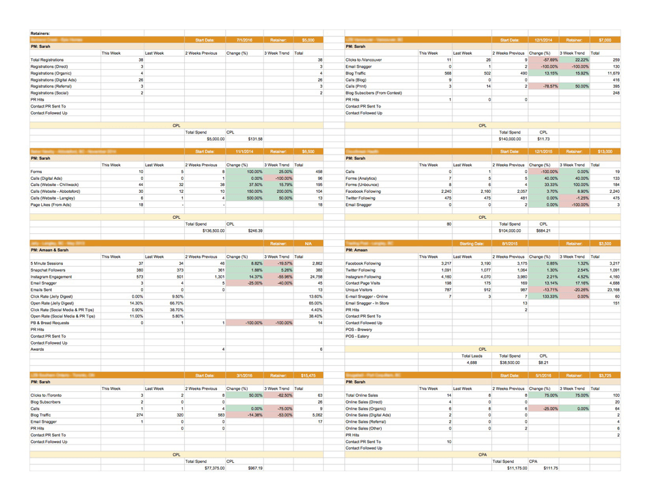
This bunch of Excel spreadsheets.
Or this marketing dashboard?
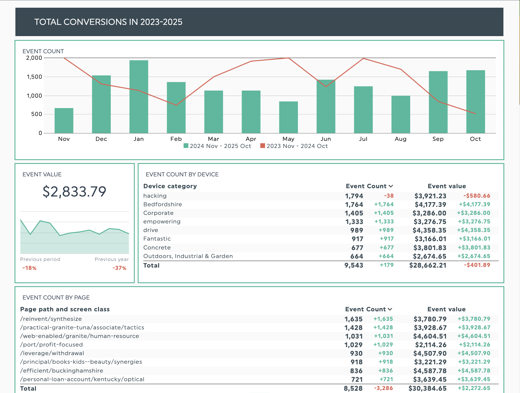
Get this Google Analytics 4 dashboard with your own data
Organized visuals will win out. In a spreadsheet, the data is there, but your audience needs to do the work to hunt for patterns and make the data understandable to them.
A dashboard uses visuals and layout to guide your audience to patterns, and you can add specific annotations to explain them.
Data visualization highlights what matters and makes information easier to understand.
- Visuals like bar charts and line graphs help focus your readers’ attention.
- Cues such as colour coding highlight the most important parts of your data.
- Text headers help break charts into types of data or emphasize critical points.
Let's say you need to compare your total conversions over the entire year to identify any trends or patterns. A simple bar chart and line graph can show how trends vary over the two years, so you can quickly zero in on peak and lull periods for further discussion.
Marketing agency Search Station saw this when they switched from Google Sheets and Looker Studio to DashThis for campaign reporting. DashThis's collection of 50+ pre-built report templates and KPI dashboards helped the team create clear, easy-to-read reports in half the time, which made the agency look more professional to clients. Replacing spreadsheets with visual dashboards further reduced their reporting workload.
Want reports your clients can grasp at a glance? Check out our guide to effective data visualization strategies.
Step 5: Make sense of your data, and act on what you learn
When you analyze data, you determine what happened, understand why it happened, and decide what to do next.
You’re noticing a drop in conversion rate across your top-performing landing pages this quarter. Here is how to answer each of these questions.
What happened?
State what happened in the most direct way possible. For example:
Conversion rate dropped from 4.2% to 2.8% (33% decline) across top landing pages in the past 30 days.
Why did this change?
Start by asking whether any marketing activity occurred just before the metric moved. Did you alter the campaign, like the creative or the targeting, or change the budget? Then look for external factors that might be shaping the result—for example, seasonality or a competitor's push—and keep an eye on platform or algorithm updates.
After a closer look, your answers might look like this:
- We launched broader keyword targeting two weeks ago, which drove 40% more clicks but attracted less qualified traffic.
- Competitor promotion running alongside our ads may be pulling away potential customers
What will we do?
This step connects your analysis to concrete actions and defines your desired action. Outline how you’ll address the drop in conversion rate and determine a specific goal metric.
So, specific actions to address our conversion rate decline could be:
- Pause broad-match keywords and reallocate 60% of the budget to high-intent terms now.
- Prepare a counteroffer for when the competitor promotion ends
- Target: 3.8%+ conversion rate within 3 weeks
To explain these drops and spikes, you first need to identify which metrics are connected, which means manually comparing data points across different platforms and time periods.
AI can support your analysis by spotting patterns you might miss. Think of it as a second set of eyes that surfaces connections while you focus on the rest. DashThis’s AI reporting tool may show that a drop in conversions tracks with reduced ad spend, helping you spot patterns faster or simply double-check your analysis.
Step 6: Communicate your findings to stakeholders
Excellent analysis becomes even more powerful when stakeholders can easily understand and act on it.
Here are a few tips to help ensure your reports land with your audience.
Match your communication style to your target audience
Different stakeholders need different levels of detail, and you need to emphasize different aspects in your report. So, for example:
- C-suite executives: Focus on business impact and return on investment (ROI).
- Search engine optimization (SEO) marketing managers: Include tactical details on search engine results, such as backlinks, changes in keyword rankings, and shifts in referral traffic.
- Finance teams: Focus on profitability metrics like return on ad spend (ROAS), number of paying customers, and effective budgeting, with a strong cost-control mindset.
Use storytelling frameworks to make your findings stick
Beyond the step-by-step walkthrough we covered earlier, framing the work as a story can make the data easier for clients and stakeholders to grasp, especially those without a technical background.
Try Luca Dal Zotto’s "bridge analogy" method to link KPI trends to business goals. He uses it to show cause and effect with precise numbers, which his stakeholders value.
To explain KPI trends to non-data stakeholders, I use what I call the "bridge analogy." I tell them, "Imagine we're building a bridge from our current revenue to our revenue goal. Each KPI is a support beam. If one beam weakens by 15%, the entire bridge is at risk." Then I show them one simple chart, usually a revenue trend with the 2-3 KPIs that most impact it overlaid.
Luca Dal Zotto, co-founder of Rent A Mac
To use this framework in your reporting, pick the primary outcome your audience cares about, then tie 2–3 KPIs to that goal. If you’re showing how email marketing drives revenue, your KPIs could include:
- Conversion rate from email
- Average order value (AOV) from email traffic
- Email click-through rate
Keep stakeholders aligned with automated updates
Digital marketing moves fast, and sometimes you can’t wait for your scheduled monthly meeting to share a critical change.
Skip manual reporting and let automation handle it. DashThis updates reports in real time so everyone stays in the loop. Set weekly or biweekly dashboard refreshes to help teams spot trends early and adjust before minor issues become major problems.
Use DashThis to measure marketing KPIs for your agency effectively
Effective KPI measurement links what you do to what happens. You add context by explaining the numbers and looking for patterns. Use the findings to make choices that lead to concrete results.
But you don't have to do this alone. DashThis pulls data from your marketing analytics tools, turns it into clear visuals, and uses AI to spot patterns you might miss. Reports reach your stakeholders faster, giving you more time to dig into what matters, analyze results and plan your client’s marketing strategy.
Start your free 14-day trial and automate your KPI measurement and reporting, so you can spend more time acting on insights and less time hunting for them.

Discover AI-driven Insights with DashThis
Read More

Don’t miss out!
Follow us on social media to stay tuned!
Automate your reports!
Bring all your marketing data into one automated report.
Try dashthis for free