How to Create a Powerful Dashboard Design (+ Best Practices)

You don’t need to be a professional graphic designer or data scientist to create a powerful dashboard.
In this article, find out what makes a great dashboard design, what best practices to use, and how to create a report in the blink of an eye.
- What is a Dashboard?
- What Makes a Great Dashboard?
- Dashboard Design Best Practices
- How to Create a Perfect Dashboard + Dashboard Example
- Dashboard Designing Made Simple
What is a Dashboard?
A dashboard is a visual report that conveys your data points at a glance, helping to accelerate decision-making by a mile in your business.
Note the social media report below that displays multiple key performance indicators (KPIs) in a cohesive structure.
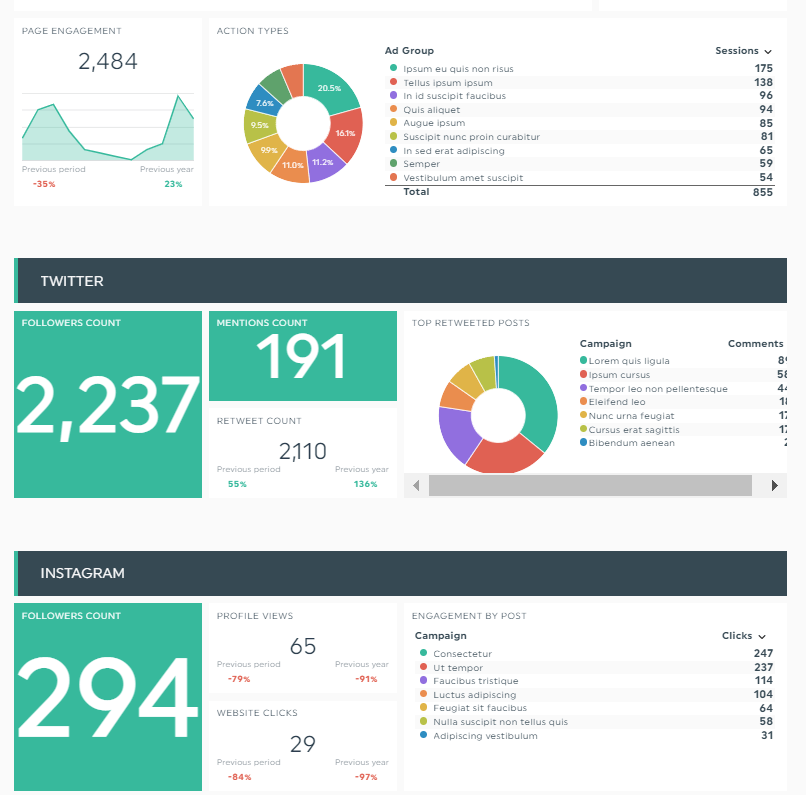
Grab this dashboard design with your own data!
With each section broken down into specific social media platforms, stakeholders can quickly decide which channels brought them the biggest ROI.
What Makes a Great Dashboard?
Effective dashboards communicate insights from data without sacrificing aesthetics.
The details of your report will depend on the type of dashboard you’re creating. But in general, your reporting tool should allow you to accomplish the following:
- Customize easily: Dashboard reporting tools offer customizable templates to speed up the design process. Instead of creating every single report from scratch, pick a template, customize it to fit your needs, and save it for future use.
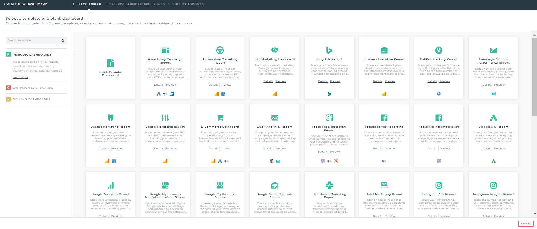
DashThis offers 30+ templates spanning across use cases (e.g., Google My Business multi-locations) and industries (e.g., automotive)
- Communicate information clearly: Good dashboard designs boast excellent UI design and UX design. They’re also interactive. You should be able to select a time frame and analyze the results accordingly.
- Add multiple design elements: Choosing the right element is critical. For instance, you wouldn’t use bubble charts for comparison or pie charts for distribution. An effective dashboard design with the correct graphs and chart types helps you spot patterns in a jiffy and understand it better.
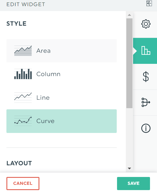
Easily switch styles for your metrics via DashThis
- Tell a story: Well designed dashboards are more than just beautiful graphics. They communicate how each data relates to each other and fits in the big picture.
- Explain goals and key KPIs: This is the good stuff on your dashboard. Make sure you drill down all key KPIs and demonstrate their progress towards your goals.
Dashboard Design Best Practices
It’s tricky creating an actionable dashboard UI when you have zero graphic designing skills. Fortunately, these dashboard design principles get you started on the right foot.
1. Focus on data visualization
Analyzing data shouldn’t take up a lot of your time. Opt for a data visualization dashboard that allows you to extract actionable insights with zero fuss.
2. Adapt the dashboard to the end user’s goals
Data means nothing if there’s no goal in sight.
Review what the client told you during the first discovery call (or in subsequent meetings, where you regroup and refine the marketing strategy) to dig deep into their goals.
For instance, a revenue goal will require a business executive dashboard that highlights marketing spend and cost-per-transaction.
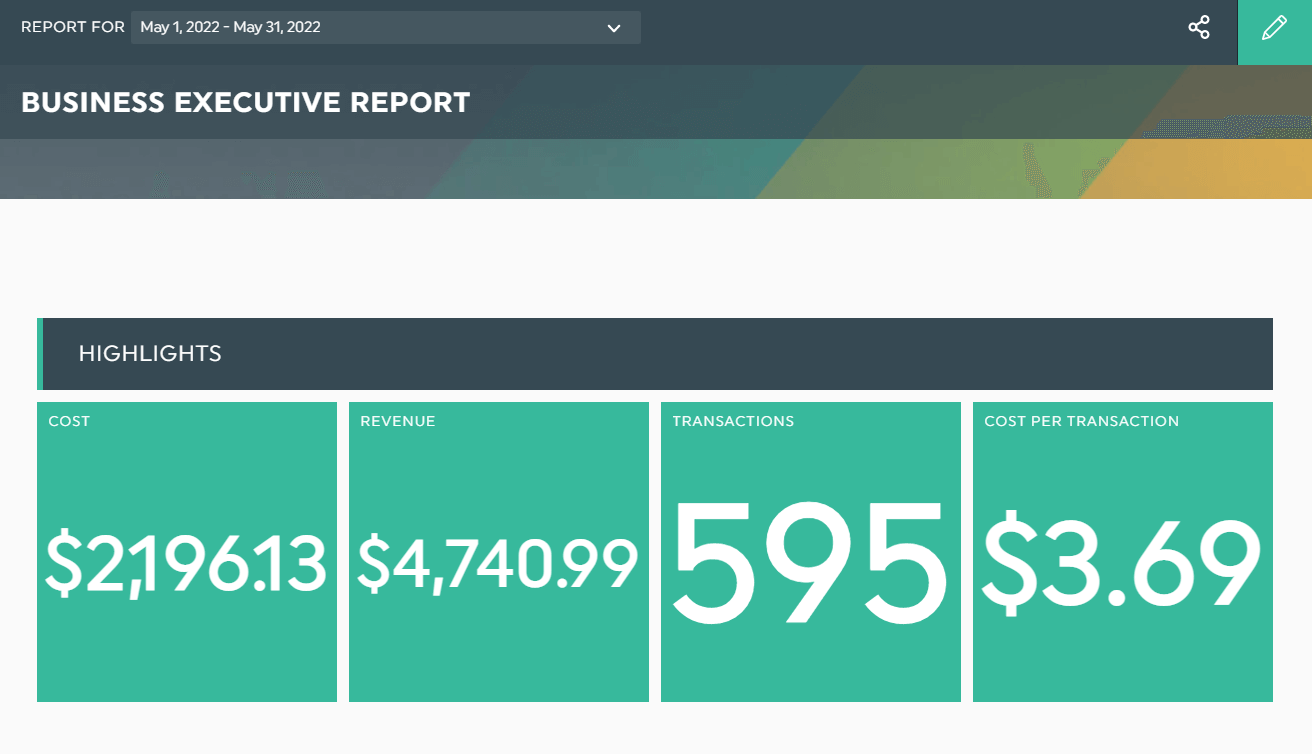
Grab this business executive dashboard design with your own data!
What’s the big picture here? What’s their success criteria? What would make them feel like they got a return on their investment?
The answers to these questions shape the dashboard’s angle.
3. Choose the right type of dashboard
Different goals, different dashboards.
Check your goals and the type of data available to make sure you're on the right track. Here are the three most common dashboard examples you can’t go wrong with.
(i) Analytical dashboard
An analytical dashboard analyzes trends and patterns from large volumes of data sets (e.g., three-month content marketing strategy for a mobile app company, ecommerce sales over a six-month period).
Note the SEO and backlinks report below that compares conversions over a year. It helps you identify your best-performing themes.
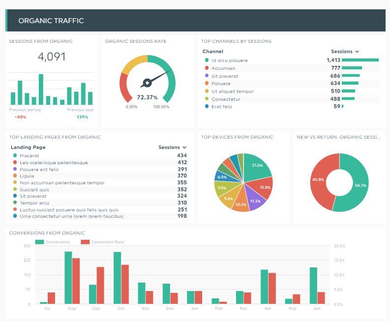
Grab this SEO dashboard design with your own data!
(ii) Operational dashboard
An operational dashboard monitors business processes daily (e.g., workflow documentation for marketing operations team, revenue operations team’s performance in a product-led growth company).
(iii) Strategic dashboard
A strategic dashboard displays a monthly or quarterly overview of a business strategy (e.g., decrease annual churn rate for a web app, improve demand generation for a web design agency).
4. Only include what’s important
Remove all unnecessary fluff, such as fancy fonts and pictures. Effective dashboards only include data that helps you make sense of the business and shape the next plan.
5. Group relevant data together
Great dashboards present data that doesn’t invite unnecessary questions.
For example, if you’re creating a social media report, merge all key metrics into one widget to show the overall performance across the different channels.
Note the report below that groups the individual and overall social engagement together.
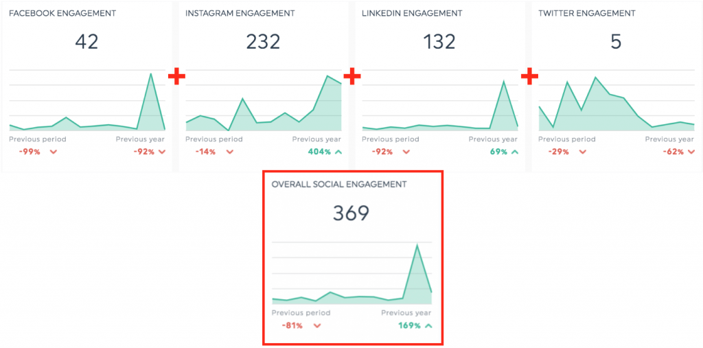
Right off the bat, clients can see how these channels stack up against each other.
6. Give the data context
Incorporating contextual information into reports provides additional detail without requiring the client to send a separate email asking for help.
Add contextual notes in your report to explain random spikes or erratic data. Hover to the metric and click the dropdown arrow > Add Note.
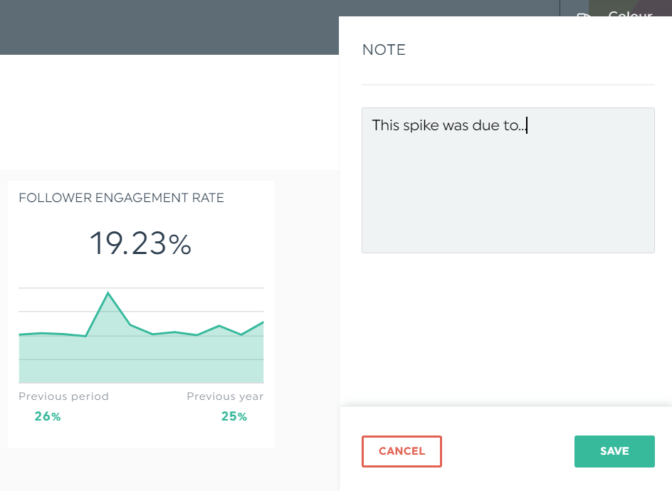
In view mode, DashThis will display your note as an orange tab. Clients will see the full version on the right side of the dashboard after clicking it.
7. Consider your audience
The client's experience with your agency determines their long-term loyalty. The more difficult it is to work with you, the lower the odds of a contract extension.
If your client is a busy SaaS ecommerce founder with zero marketing expertise, add key takeaways at the end of the report. They will appreciate your effort to save them time.
On DashThis, click Static Widgets > Comments to add your key takeaways in bullet points.
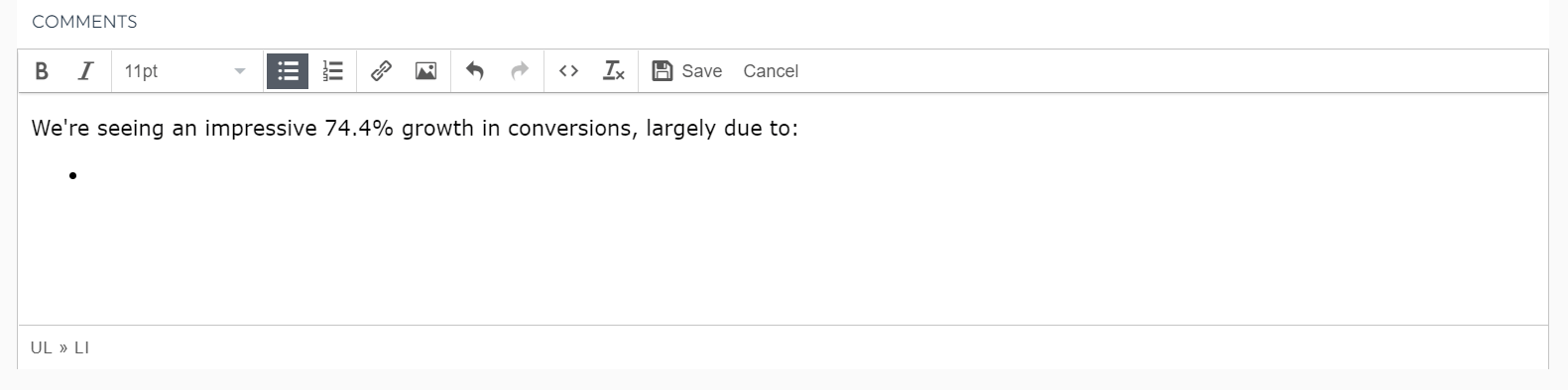
Click Save at the editor menu tab.
Better yet, add another comment box at the top of your dashboard layout to show a high-level report overview.
How to Create a Perfect Dashboard + Dashboard Example
Designing a dashboard shouldn’t take hours of your time. When you use an automated reporting tool like DashThis, you can quickly gain back hours of your time and create reports in the blink of an eye.
Here’s how it works:
- Pick a template
- Connect your favorite marketing tools with DashThis
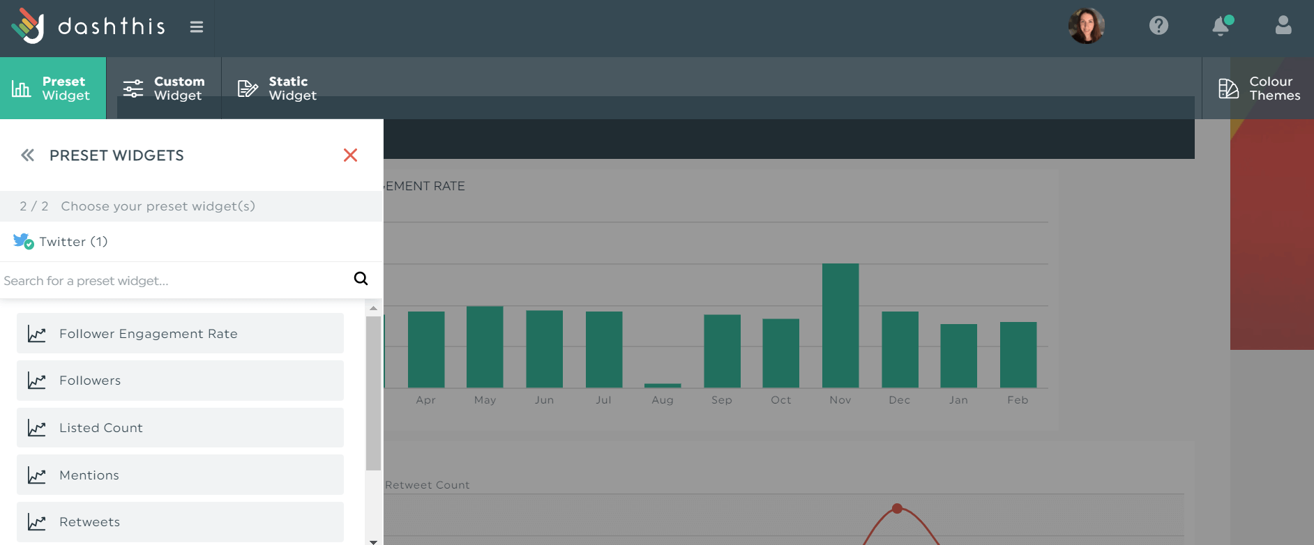
- Click Preset Widgets on the top left to select your metrics
Drag and drop the metrics to create a cohesive look (or even to fill up the white space!).
Turn your bar charts into line charts. Create one widget to show the overall performance of multiple metrics. And give stakeholders real-time access via a shareable URL link.
Creating a dashboard has never been easier.
Dashboard Designing Made Simple
You don't need a professional graphic designer or data scientist to create an impressive report.
A powerful automated reporting tool like DashThis and a few best practices are all you need.
Gather your data from multiple channels into one beautiful report, wow clients, and gain back hours of your time.

Ready to create a powerful dashboard design?
Read More

Don’t miss out!
Follow us on social media to stay tuned!
Automate your reports!
Bring all your marketing data into one automated report.
Try dashthis for free