9 Executive Dashboard Examples for CEOs to Power Up

TL;DR: An executive dashboard is a single, real-time view of the KPIs that drive business performance: revenue, cash flow, financial health, and the few key metrics your C-suite actually cares about. In this guide, you'll see 9 executive dashboard examples, the must-track key performance indicators by role, and a 5-step process to build your own in DashThis.
What is an executive dashboard?
An executive dashboard is a real-time data visualization tool that shows your company's most important marketing KPIs in one high-level view. It pulls live data from your CRM, Google Analytics, ad platforms, and your accounting tool into clean graphs and tables so executives can make data-driven decisions in seconds, not days. Most teams start from a ready-made template and customize from there.
Think of it as the difference between flipping through 14 spreadsheets at 7am and glancing at one screen with your coffee.
See an executive dashboard in DashThis
What Should be on an Executive Dashboard?
An effective executive dashboard includes revenue-driven key metrics.
Ideally, you should present these metrics in a readable and interactive format. That way, you can extract actionable insights without any difficulty. It’s a business intelligence tool, after all!
A robust dashboard software helps you analyze profitability data sets without requiring you to squint your eyes. Take that, Excel.
In other words, make sure these marketing metrics show how your marketing efforts impact your business’ bottom line distinctly.
Why executives use dashboards
The average C-suite leader sits through hundreds of decisions a year. Most of those decisions hinge on the same handful of metrics: revenue, profitability, conversion rates, cash flow, customer satisfaction. The problem isn't a shortage of data. It's that the data lives in 12 different tools, refreshes on different schedules, and arrives in PDF reports nobody has time to read.
A modern executive dashboard fixes that with three things:
- Real-time data that automatically pulls from every data source you care about
- Visual reporting with graphs, drill-downs, and color-coded thresholds so trends jump out
- One link you can share with the executive team, your board, or stakeholders
According to McKinsey, data-driven companies are 23 times more likely to acquire customers and 19 times more likely to be profitable. The difference is rarely the data. It's the speed at which leaders can see it and act on it.
Looking for a deeper data strategy primer?
What should be on an executive dashboard?
An effective executive dashboard includes revenue-driven key metrics.
Ideally, you should present these metrics in a readable and interactive format. That way, you can extract actionable insights without any difficulty. It’s a business intelligence tool, after all!
In other words, make sure these marketing metrics show how your marketing efforts impact your business’ bottom line distinctly. Here's the universal starter set, broken down by what each role tends to track most:
| Role | Top KPIs to track |
|---|---|
| CEO | Revenue - gross profit - runway - customer satisfaction (NPS/CSAT) - retention rates - key initiatives status |
| CFO | Cash flow - profit margins - performance metrics vs. forecast - financial health - burn rate - AR aging |
| CMO | Pipeline - conversion rates - CAC - MQL to SQL ratio - marketing efforts ROI by channel |
| COO | Operational efficiency - supply chain health - bottlenecks - project completion rates - churn |
Notice what's missing: vanity metrics.
An effective executive dashboard does not include impressions, raw page views, or follower counts unless they tie directly to revenue growth or a strategic decision. If a metric doesn't change a behavior, it doesn't belong on the dashboard. Skip the metric noise. Keep the actionable metrics.
The best executive dashboards also include:
- A clear time period (last 30 days vs. previous period works well)
- A single source of truth for each KPI so finance, marketing, and ops aren't quoting different numbers
- Drill-down capability so a CFO can click "gross profit" and see the underlying data sets
- Notes and context because raw numbers without explanation create more questions than they answer
9 Executive Dashboard Examples
Here are nine real executive dashboard templates pulled straight from DashThis. Each template is one click away.
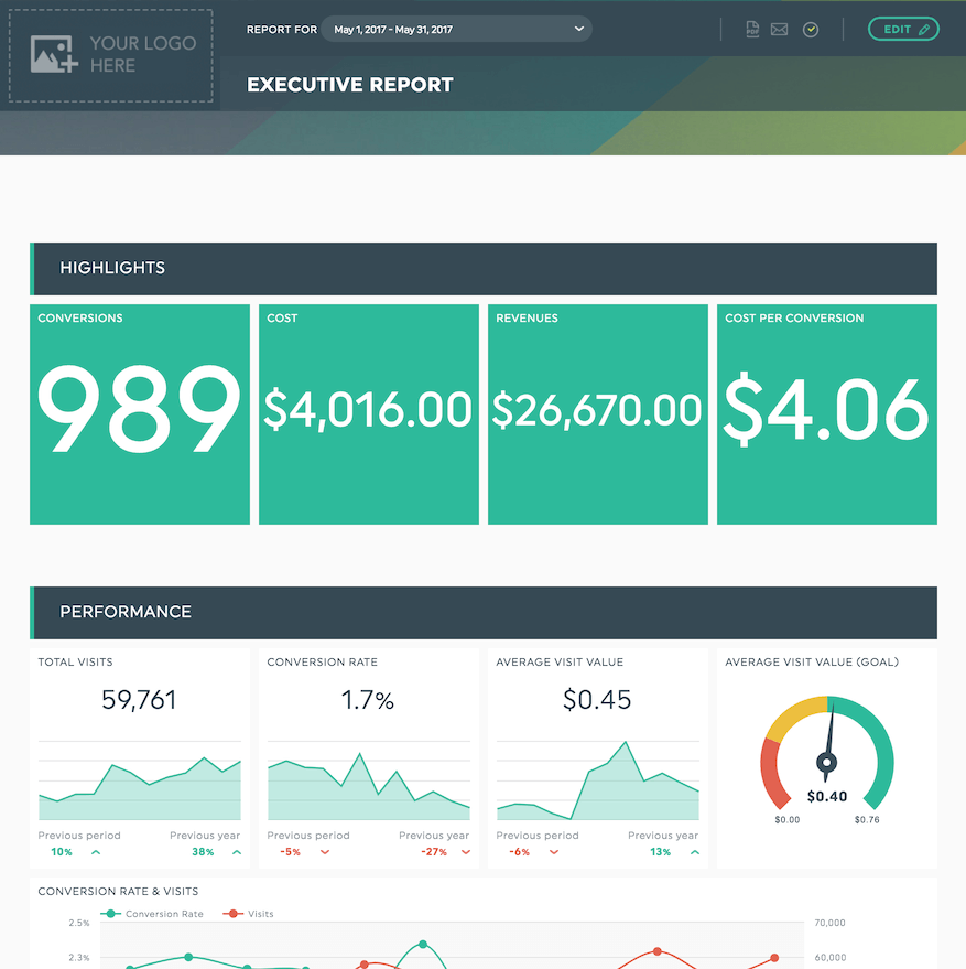
1. The All-Purpose Executive Dashboard (CEO View)
Grab this business executive dashboard with your own data!
Best for: CEOs and founders who want one screen that answers, "are we winning this month?"
This template combines top-line revenue, gross profit, cost vs. revenue, and key initiatives in a single view. The cost vs. revenue bar chart is the star: it gives your CFO an immediate read on profit margins without opening a single spreadsheet.
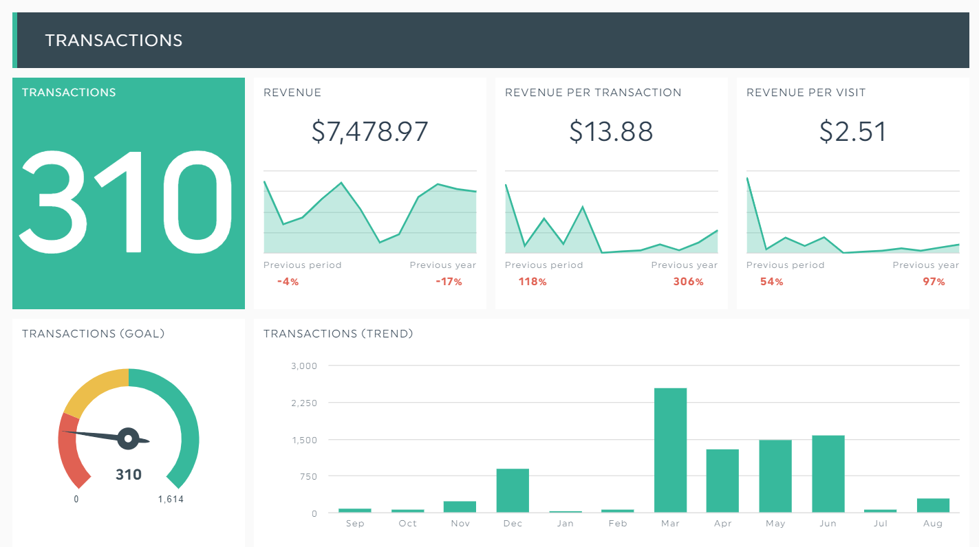
2. Ecommerce Executive Dashboard
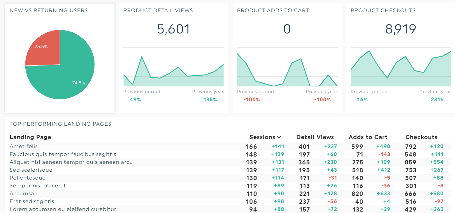
Grab this ecommerce dashboard with your own data!
Best for: DTC brands and online retailers who need to track shopping behavior alongside revenue.
This ecommerce template breaks down product detail views, total checkouts, conversion rate, and average order value. Use it to spot exactly where shoppers drop off so you can optimize the funnel and lift retention rates without guessing.
3. Digital Marketing Executive Dashboard
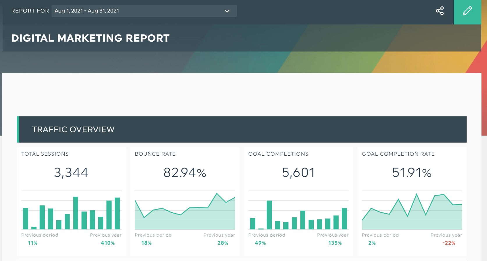
Grab this digital marketing dashboard with your own data!
Best for: CMOs running hybrid SEO + paid + content strategies.
This digital marketing template shows how every channel and campaign rolls up into one view. SEO traffic, PPC spend, social engagement, blog conversions, all in real time. It's the dashboard most CMOs use to defend marketing spend in a quarterly board meeting.
4. SEO Executive Dashboard
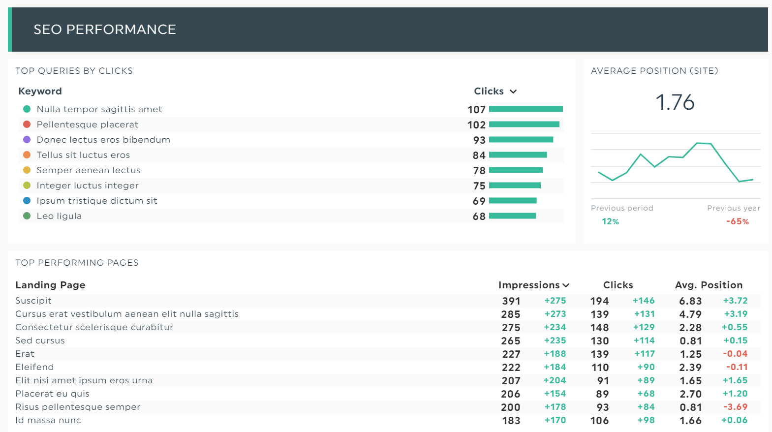
Grab this SEO dashboard with your own data!
Best for: Marketing teams that need to translate SEO into revenue, not rankings.
This SEO-focused template tracks organic traffic, top pages, money keywords, and backlinks alongside lead and conversion data. The point is to connect SEO performance to business performance so the executive team can see the ROI without learning the difference between an H1 and an H2.
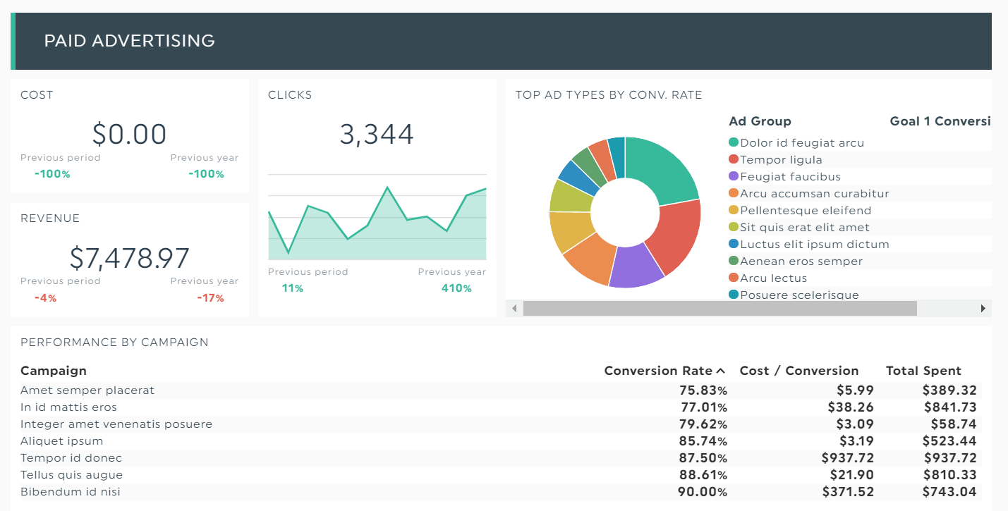
5. PPC Executive Dashboard
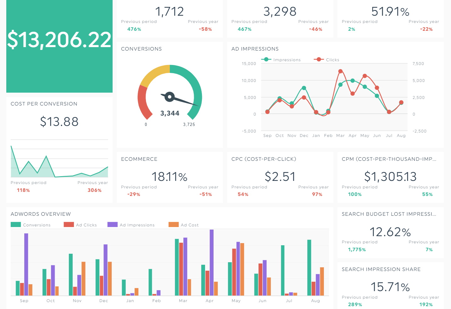
Grab this PPC dashboard with your own data!
Best for: Paid teams reporting up to a CMO or CFO.
This PPC template turns every key metric (CPC, CTR, ROAS, cost per conversion) into clean visuals that spot trends fast. The forecasting widget projects month-end spend so finance never gets surprised, and the same forecasting model works for next-quarter planning. Bonus: side-by-side Google Ads, Meta, and LinkedIn comparisons let you reallocate budget to whatever is working this week.
6. Social Media Executive Dashboard
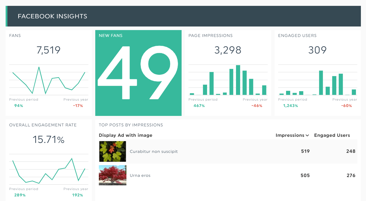
Grab this social media dashboard with your own data!
Best for: Brands reporting across multiple platforms to a single executive.
This multi-channel template combines Facebook, Instagram, LinkedIn, X, TikTok, and YouTube. You'll see engagement, follower growth, top posts, and most importantly, social-driven revenue. You can zoom into the specific post that brought in the highest impact, image and caption included.
7. LinkedIn Business Dashboard
Grab this Linkedin dashboard with your own data
Best for: B2B companies and agencies selling to enterprise.
LinkedIn is home to 61 million senior decision-makers, which makes it non-optional for B2B. This LinkedIn template tracks page followers, post engagement, lead gen form fills, and InMail performance. If your sales pipeline depends on LinkedIn, this template is mandatory.
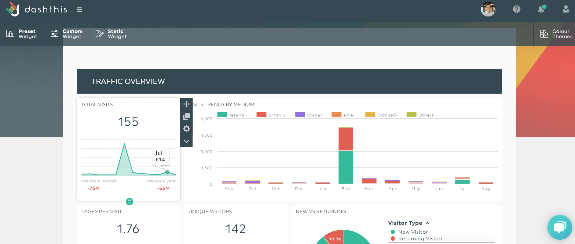
8. Analytics Executive Dashboard
Grab this analytics dashboard with your own data!
Best for: Anyone who lives inside Google Analytics 4 but wants a calmer view. Use this template if GA4 makes your eyes water.
This analytics dashboard breaks down web traffic, conversion data, transactions, and source/medium without making you click through 14 GA4 reports. It's the executive view of your website's traffic: one screen, no exploration required.
9. Email & Marketing Automation Dashboard
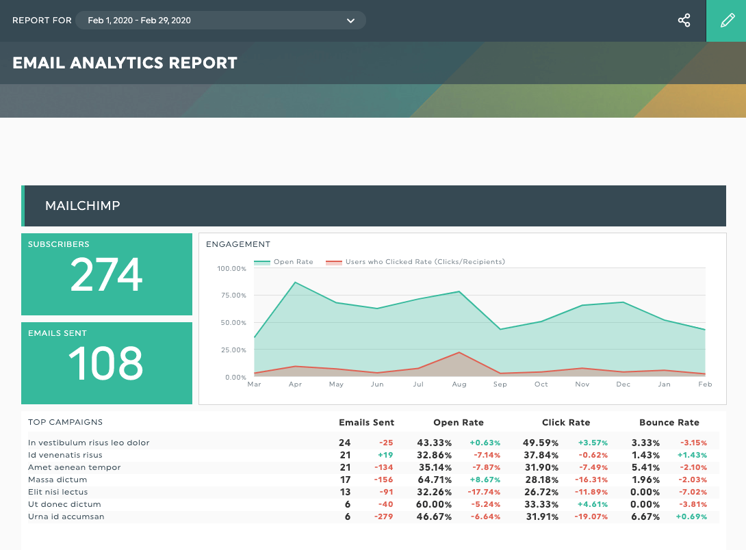
Grab this email report with your own data!
Best for: Lifecycle and CRM marketers reporting to a CMO.
This email template pulls open rates, click rates, performance metrics, and revenue per email from your email and automation tools. Use it to spot the welcome sequence that's underperforming, the triggered email that's printing money, and the segment that's about to churn. It's a goldmine for CMOs who need to defend retention spend.
How to build an executive dashboard in DashThis (5 steps)
Building an effective executive dashboard does not require a BI engineer. Here's the entire process:
Step 1: Connect your data sources. Pick from 40+ integrations including Google Analytics, Google Ads, Meta, LinkedIn, HubSpot, Salesforce CRM, Mailchimp, Stripe, and your own database. Connections take under 60 seconds each.
Step 2: Choose a template. DashThis has 40+ free executive dashboard templates organized by role and reporting need. Pick a CEO template, CFO dashboard template, CMO template, or COO version closest to your use case instead of building from scratch.
Step 3: Pick your KPIs. Click the metrics you want. DashThis automatically turns them into the right graphs, charts, and visualizations. No formatting, no fiddling.
Once you click the KPIs, DashThis will automatically turn them into beautiful graphics within your dashboard
Step 4: Add context. Use the static widget to drop in notes, explanations, and action items. Your CFO will love you for it.
Step 5: Automate and share. Schedule the dashboard to email itself as a PDF every Monday at 8am, share a live link with stakeholders, or password-protect it for board meetings. DashThis handles the rest.
Executive Dashboard Best Practices
Now that you’ve learned the different types of executive dashboards, let’s continue with some of our favorite dashboard best practices.
1. Less is more
A great executive dashboard answers three questions in under five seconds: How are we doing? What changed? What needs attention? If a stakeholder has to scroll twice, the dashboard is too long. Cut the metric, or move it to an operational dashboard your team uses day to day.
2. Visual first, numbers second
Executives scan. They don't read. Use bar charts for comparisons, line graphs for trends, and number widgets for single key metrics. Reserve tables for granular financial data only. And make sure your color coding is consistent (green for good, red for bad, the universal language of every CFO).
3. Add context, every time
A 14% drop in revenue means nothing without a note explaining the cause. Was it a broken checkout flow? A new pricing test? A holiday weekend? Add comments inside your dashboard so the executive team gets the story, not just the data set.
4. Pick the right cadence
Most executive dashboards refresh in real time, but the review cadence matters too. CEOs typically scan daily. CFOs deep-dive weekly. Boards review monthly. Build the dashboard around the audience you're serving, and automate the delivery.
5. Connect KPIs to initiatives
Numbers without strategy are trivia. Every key metric on the dashboard should map to a strategic initiative. If churn is up, link the dashboard to the retention project. If gross profit is down, link to the pricing review. This is what turns a dashboard from "interesting" into "actionable."
For a deeper playbook on dashboard design, read The 7 Golden Rules of Dashboard Best Practices.
Executive vs. Operational vs. Strategic Dashboards
| Type | Audience | Time horizon | Example KPIs |
|---|---|---|---|
| Operational dashboard | Team leads - project managers | Hourly to daily | Tickets open - queue time - ad spend pacing |
| Strategic dashboard | Executive team + board | Quarterly to annual | OKR progress - market share - retention cohorts |
| Analytics dashboard | Analysts - growth teams | Ad hoc | Funnel drop-off - A/B test results |
The biggest mistake we see: trying to build one dashboard that serves all four audiences. It always ends in a bloated screen nobody trusts. Build separate dashboards, link them together, and let each audience drill down when they need to.
Your next move
If you've made it this far, you don't need another article. You need a dashboard.
DashThis lets you connect your tools, pick a template, and ship a CEO-ready dashboard in under 10 minutes. No SQL, no spreadsheets, no Microsoft licensing headaches. Just business intelligence your executive team will actually use, built on top of templates you can clone in one click.

Read More

Don’t miss out!
Follow us on social media to stay tuned!
Automate your reports!
Bring all your marketing data into one automated report.
Try dashthis for free